[” Pictures are pictures, not shorthand for words.“] Continue reading
W.G.Sebald – Not so Great with Pictures
1
[” Pictures are pictures, not shorthand for words.“] Continue reading
The way the Prix Découverte at Arles is set up is that a group of photography worthies are invited to select less-known artists for a solo exhibition promoted and visited within the context of the festival. The potential boost to the careers of those chosen is obvious. This year, in keeping with the theme of the Rencontres, centred around photographic education and one school in particular, the worthies were all distinguished teachers. It was disappointing that so many of their selections were of their own pupils or former pupils: it looked sleazy even when it wasn’t.
Nevertheless, five selectors managed to choose fifteen artists for exhibition. Continue reading
[Arles at a crossroads of sorts, with a choice between embracing contemporary art and its non-specialist interest in photography, or remaining sheltered in a traditionally photo-specialist but much less open world.] Continue reading

The Rio Club 1968
As you take the Docklands Light Railway back to London from David Bailey’s new exhibition it is all too easy to fall into pools of irony as deep and as dank as the great docks themselves. Continue reading
[On a peculiar but wonderfully-executed oddity by Cindy Sherman.] Continue reading


Nobody thinks of those profusely illustrated mid-lavish recipe books as photobooks. Yet perhaps we should. They contain as many pictures reproduced just as prominently as many a photographer’s monograph. Here’s one: Plenty, by Yotam Ottolenghi. Published by Ebury Press in 2010 at £25.00. Not only a hardback, but a hardback padded in squidgy white plastic, intended I think to be kitchen proof, and also to carry the overtones of a precious album. It makes me think rather the other way, I must say, of a catalogue of swatches of motorcar upholstery, perhaps, or a mid-market range of bathroom fittings: horribly tasteless pursuit of ‘good taste’. But, hey, sales figures don’t lie in the modern publishing world, and this thing has sold gazillions.
Let’s see inside… Not all but most spreads conform to the pattern: text on the left, full-size picture bled to edges of the paper on the right. Double-page pictures, bled to the edges all around, punctuate that rhythm. Smaller pictures are occasionally used, one, two or three to a page. Text is surrounded by acres of white space and is obviously tied to each picture. If the pictures haven’t sold this thing on their own, they’ve certainly carried their share. This is self-evidently a book of photographs. Yet we are somehow invited not to think so. To call such a book a photobook is a sin against marketing. I don’t see why.
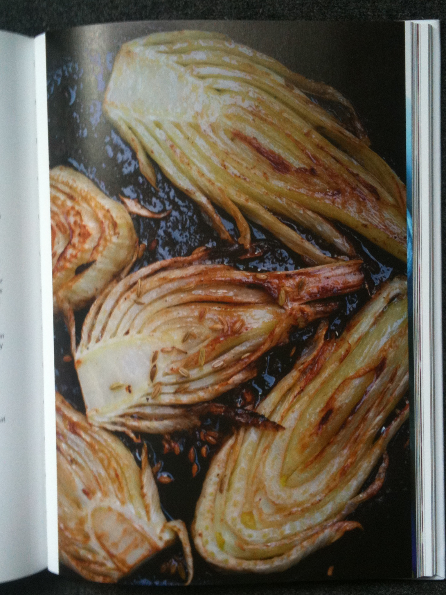
Let’s keep going. The pictures also conform to a series of types. Most are direct plunging views straight down, either onto pans purportedly ready for serving, or onto plates of food purporting to be just served and ready to eat. These are given a stylistic identity of a sort by a recurring trick that I might call acceptable grubbiness. A number of them are photographed on a background representing a Country Kitchen Table (or is it an Inner Urban Regenerated Industrial District Kitchen Table?) which has spots of paint on it.
These spots are important. They speak of energetic creativity, of people so concerned with the eternal verities of ingredients each more achingly authentic than the next that a little errant paint is neither here nor there. The vine leaf, herb and yogurt pie is shown on a lightly chipped plate itself on a surface of lightly chipped paint. There are carefully indicative minor spillages in many pictures (designed to convey the artistic and creative nature of a process not entirely controllable to the last degree). Utensils have a degree of visible wear. This is photography by allusion. Comfortable use is to be applauded; shining newness is just ever so slightly…nouveau.
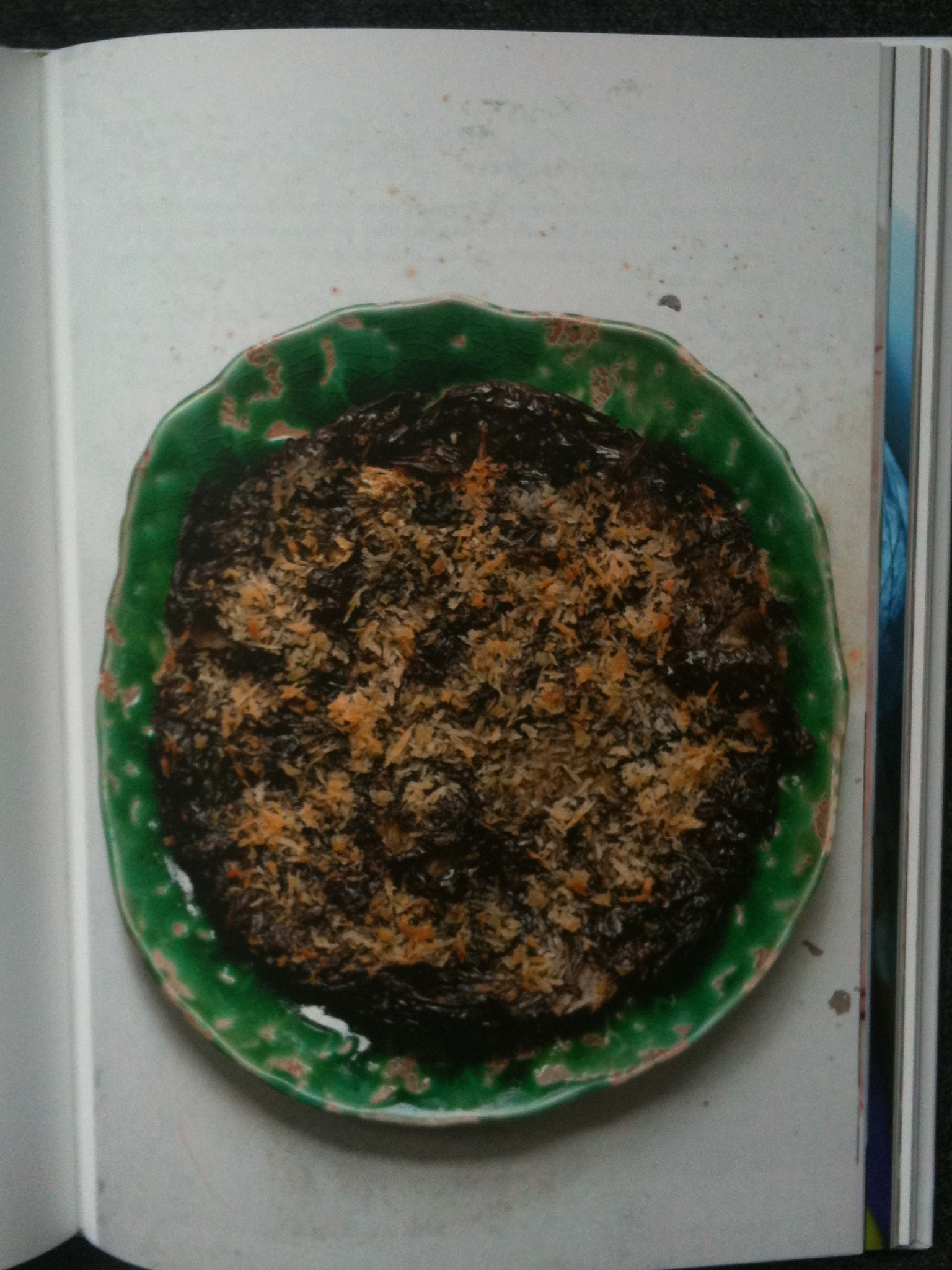
Acceptable grubbiness is an art of innuendo and sometimes the photographer has overplayed his hand. (Acceptable grubbiness was perfected by Irving Penn, by the way, in the food pictures he made for Vogue, who deployed it with a touch which ran more to a few genteel crumbs and the occasional joke mouse: a far lighter sprinkling than this out-and-out mugging). Ottolenghi’s ‘smoky frittata’ is shown in a pan that has clearly been allowed to accumulate highly carcinogenic carbonized deposits for a number of years. A dishcloth (with an oily stain) is artfully disposed to protect the imaginary hand of the imaginary cook from the imaginary heat of the pan which was no doubt stone cold by the time the picture came to be taken. And beyond all of that? A surface, which might conceivably be Corian or some similar fancy worktop, but which I suspect of being a roll of wallpaper lining paper disposed for its neutral texture and colour, shows oily stains of its own.
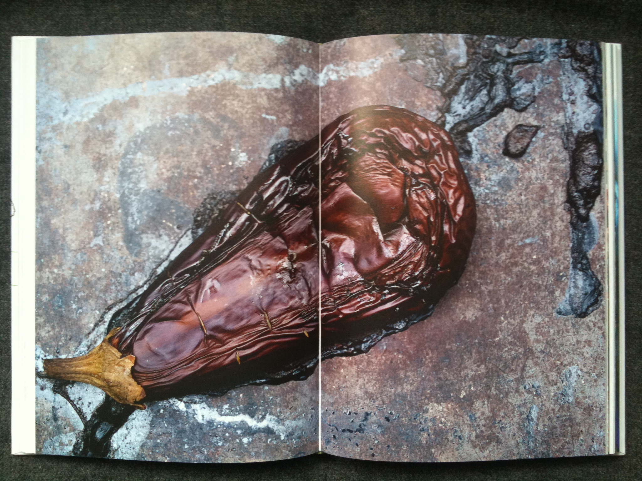
The picture has been open at my elbow for the two or three minutes it has taken to write these words, and let me tell you, I would no more eat the depicted smoky frittata than I would lick the linoleum in my local A&E. I have seen cleaner burger vans in lay-bys on the long slow drive down to Cornwall. This is grubbiness pushed too far. On the double spread pp.118-119 (in a section entitled without hint of either irony or wit The Mighty Aubergine) is a picture which looks at first sight, and at second, and at third, exactly like a horrified, peering, too-close-for-comfort view of road kill. It is actually an aubergine.
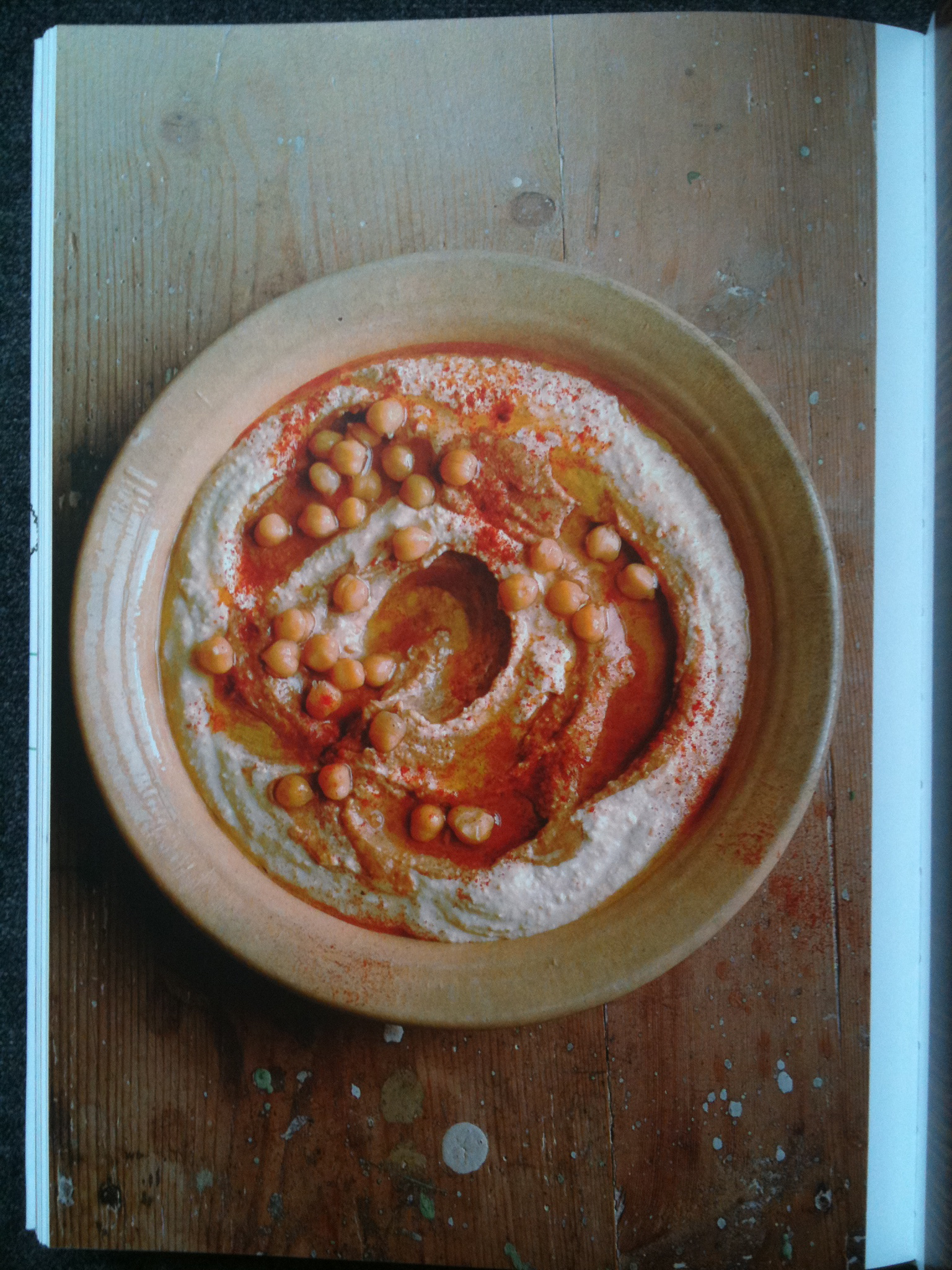
And then there’s the oil. My god ! The oil ! I am told that Plenty is quite a good cookbook. But there is a chasm between cooking food and photographing it. Pictures which glisten and gleam and shine are attractive in a porny way. These certainly have the wet thing going on. I can’t believe that the food stylists and the photographer followed the recipes with due restraint when it came to the oil. Or if they did, the food is simply inedible.
The pictures in this book are competent in a dreary sort of way. The man who made them is a craftsman, of considerable standing in his speciality. They do a job. But as illustrations of a light modern imaginative new style of multicultural cooking, they simply aren’t credible. It’s as though the publishers failed to see that they were using Rubens to illustrate a Pilates manual.
Yet this is not a hopeless outfit well down the Isthmian League. This sold as one of the great exemplars of words and pictures working together. And nobody seems to have minded that the photography is of a standard only just above poor. It’s an endless accumulation of coded ‘lifestyle’ hints masquerading as an attempt to communicate enthusiasm for the subject. The pictures are full of dotty non-sequiturs, of which the acceptable grubbiness is only an example. On page 45, a dish (of black pepper tofu) looks for all the world like a grisly something Susan Meiselas might have uncovered in Nicaragua. It’s dished up on a table which has inscribed plainly upon it, and plainly left there for us to read, the single word ‘JURY’. What on earth this means, I have no idea at all. Was this revolting-looking dish served up in some contest, to be judged? It cannot have been. Was it adduced in evidence in a war crimes’ tribunal? It looks like it ought to have been. What kind of demented picture editor allows the single word JURY to make a mad mystery out of a perfectly simple picture, even of tofu? What on earth possessed the photographer to allow such a thing to go forward?
This is one of the top-selling picture books of this year or last. The photographs (all plunging and oily as they are) are an essential component of that success. It is a hugely successful photobook. It begs to be judged as a book of pictures. Yet nobody has applied even the slightest suggestion of informed thought to the pictures, either during the production process or since. The chef-author is feted as a poet in tofu, but the photographer is just a good name in the trade. I have not seen more than a word of serious criticism of these pictures since the book came out (and that word has, more often than not, been ‘luscious’). It seems the pictures are assumed to be OK because they couldn’t be expected to be better than OK. No wonder photography is still treated as marginal.
The photographer, in fact, is Jonathan Lovekin, who has been the photographic servant of a food writer, Nigel Slater, established longer than Yotam Ottolenghi. Slater particularly asked for Lovekin when Slater was working for Marie Claire, and Lovekin had some stuff published in Elle Deco. Observer, Observer Food Monthly, Appetite, Real Food…Where Slater has gone, Lovekin has followed, can of oil always at the ready, like an Indian railway man or a San Fernando Valley deputy assistant director in the adult film business. Success breeding success as it does, it must have been obvious that Lovekin was the right man for the Ottolenghi job. The publisher probably didn’t even ask if the imagery was appropriate in feeling, or tone or skill. Just get the guy to do the gig. If it’s good enough for Slater….
Lovekin has on his website a showreel (he makes food films, too) which is beyond parody. Spermy liquids and metaphorically exhausted foodstuffs (such as figs), all soused in a soundtrack of Alison Goldfrapp shouting about sex in Ooh La La. There are several separate credibility gaps here. Jonathan Lovekin’s film clients include Bird’s Eye and Macdonald’s. Blow the genteel multicultural sensibilities of the Tel Aviv beaches as lauded by Ottolenghi. It’s just a job. It’s far from clear that even the photographer takes his pictures seriously.
The big appreciation of food has become a substitute for culture. Who needs to read books or even newspapers about complicated places abroad when all you need to do is go shopping more sensitively than your neighbours? Who needs to think through complex matrices of history and economy to understand elsewhere, at least as messy as home? So much easier to enjoy the one-upmanship of food. Bet you don’t know what Shakshuka is. I do, now. Ottolenghi, Plenty, p. 87 (illustrated on a double page following). It’s a North African dish with many variations, of course; I’m surprised you’d forgotten. “In a tiny alley in old Jaffa there’s a little restaurant serving food to customers sitting outside at shared shabby tables….” Abroad, safely wrapped up. The pretension of culture with none of the work, the risks, or the long slow accumulation. That packaging of culture calls for a particular kind of photography, apparently.
Photography in some of its forms has a long tradition of showing things as they really are. In other forms it has a long tradition of showing what somebody wants us to buy. Either way, it used to be the very minimum that the words and pictures worked harmoniously, pulling the reader in the same direction. This food stuff seems to have been put together by people who don’t even consider that pictures carry complex meanings. They can’t be bothered. They use photography as the lowest kind of space filler, capable of bright colours and that awful gloopy sheen and nothing remotely more subtle than that. We need perhaps to sharpen our eyes as readers. If the most successful food book of the moment can get away with pictures which are craftsmanlike but nothing more than that, it is because in that market we have come to accept that we need not really look at the pictures at all. All that glistens isn’t gold. It really isn’t. As viewers we are entitled to pictures which reward careful seeing, whatever the work they are doing. We shouldn’t have to run to “photobooks” to see proper photography. We shouldn’t be fed on slop, even in a cookbook.


Boris Malafosse is not a full-time photographer. He hardly counts as a professional. A schoolteacher in Marseille, he happens to make interesting photographs, some of which he sells as unique artist’s books, and more of which he deliberately puts without commentary on a web-site remarkable for its lack of context. ‘Amateur’ carries overtones of poor standards, of trivial irrelevance or of self-indulgence. Malafosse is a kind of amateur, but none of those overtones apply. By earning his living elsewhere, Malafosse preserves his freedom to photograph exactly as he wants, with neither commission nor client to show him the way. That’s all. For quality, for standards, and perhaps for relevance, Malafosse is the real deal. I could certainly name many and many full-time photographers who fall far short of Malafosse’s level, whichever way he pieces together the elements of his life.
In September 2011, Malafosse had a show at Le Lièvre de Mars (the March Hare), a bookshop in Marseille. I’m not even sure it wasn’t his first show. I missed it, but I saw the releases, and I found myself intrigued. Here was a photographer working in Polaroid – a medium now rare and formally obsolete, at least until the efforts of the Impossible Project bring some derivative of it back to currency. Here, too, was a photographer apparently making collages. The self-imposed clash was flagrant: Polaroid ( at least in its original configuration ) was made to be easy. It was famous for its immediacy. Collage is by definition a slow way of making images: it’s done by layering, and the meaning and the emotion are contained in the accumulation of all the layers together. There’s a big contradiction there, and Malafosse seemed to welcome it.
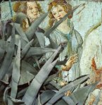
Another contradiction is in his subject matter: Renaissance paintings are often held to demand an exaggerated respect, as a distillation of classical mythology or Bible stories or sometimes just the heavy aspirations of donors or other wealthy patrons. Painting was weighty, each piece pregnant with meaning at the time it was made, and the passage of time has only added to the freight that each carries. Malafosse lacks nothing in respect, yet he often couples bits of these paintings with the scruffy, anonymous, hot-country vegetation of the south of France where he lives. Agaves, cacti, scrubby brush, holm oak and tough pines: these are plants which collectively mean a lot, but which are almost never taken individually. So what is Malafosse doing when he puts the elements of the one in the other? What are a couple of holy Botticelli ladies doing in the agaves?
I think there are three answers. Botticelli was a fabulist. He told stories in paint, for very particular reasons. Put a factual, scientifically accurate gloss on that — and one specifically tied to the hot landscapes of the Middle East in which his stories were supposed to be set — and you immediately throw doubt on our comfortable, habitual reading. The very different bits of picture set each other off and the careful composition is designed to help you notice it happening. Malafosse supplies a modern proscenium through which to admire again in a new context pictures which are so familiar they might not reach us with full vigour without some such reintroduction.
Secondly, he has an unblinking concentration on surfaces. If you put Adam and Eve in a jungle lush even by the standards of Thomas Struth’s Paradise series, you ask questions about the frailty of flesh compared to long thorns, and more obliquely, about the customs of unrealistic depiction even in the most nearly ‘real’ traditions of paint. It works both up and down, too: just as the realist work is contrasted against the greater realism of photography, so other pictures here are phantasmagoria contrasted against the unimaginable but nevertheless simply accurate fantasies of natural selection.
And thirdly, I think I discern something less rooted in art history. Malafosse wants us to have a picture experience which is fresh and which he, as ‘our’ artist (I mean that in opposition to the old masters he samples from, who are in a sense everybody’s), can claim as properly his own. Beyond the clever construction of the ideas in these Polaroids, we have to notice the confident, even rather easy construction of them just as pictures. They fit. They have points of humour and points of pathos. They balance. They are, in other words, real pictures as well as real meditations.
Boris Malafosse’s website is HERE and the particular series is called Ut Pictura. Several of the other series are interesting, too, notably a black and white 35mm one called Notes Pour Le Voyage en Belgique which is more plainly indebted to a surreal inheritance than Ut Pictura, and another called Couleurs, which plays more between three dimensional objects and the flat planes of photographs and other graphics re-photographed.
All three of these series could bear interesting comparison with pictures by a number of different photographers current and earlier. There is certainly a widespread revival of ‘manipulated’ or ‘altered’ photography at the moment. I put it down to a certain consciousness that everybody is now a photographer of sorts. ‘Straight’ photography is now available to all. Therefore those who would distinguish themselves have to make something different. Embroidering on photographs does it for some, but there are a hundred variants. Malafosse has found his way, in sympathy with some tendencies of the moment, in counterpoint to others. He is plainly highly literate in a certain kind of imagery, and is certainly not any kind of outsider artist. I suppose he’s just a good artist who hasn’t found his dealer yet, and there’s no shame in that.
The artist’s books are available HERE, and as usual, I feel I should add that I have no commercial connection with the artist, the bookshop, the website which represents him or anybody else concerned.


The London gallery Purdy Hicks (working in tandem sometimes with the German publisher Hatje Cantz) has hit a vein of tremendous photography from Finland. A large enough number of artists associated with the Helsinki University of Art and Design have developed for it now to be possible really to speak of a ‘school’. Indeed, the gallery has recently shown and the publisher recently published several times on the Helsinki school as a coherent group. The current (Spring 2012) show at Purdy Hicks is of splendid landscapes by Sandra Kantanen, also the basis for a book published by Hatje Cantz. I hope to write about these, too, before the show is over.
About a year ago, Purdy Hicks showed one particular very fine series by Jorma Puranen, who has been associated with the school ever since he attended as a student in the early 1970s, and who is in some senses the founding father. I liked his show well (and have seen enough pictures from it since at art fairs and so on that I know that I am far from alone in doing so). For whatever reason, that was not published in the paper I write for, the Financial Times, so I publish it here:–
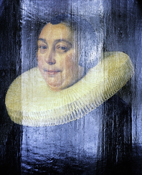
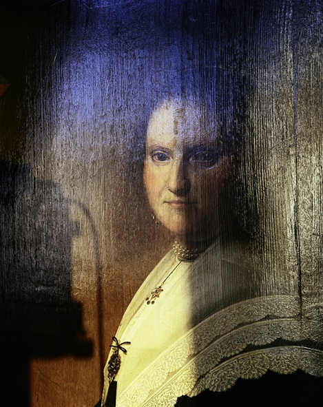
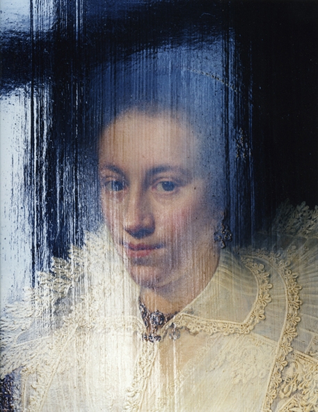
It’s a familiar experience to be in a gallery or museum and to have to bend one’s knees and crane one’s neck to avoid the harsh glare bouncing from the shiny surface of a painting. I had always thought it a mildly irritating experience: why can’t these people take more trouble with their lighting? Now a photographer of great imagination has taken that simple experience and turned it into the main subject of a thoroughly exciting series of pictures.
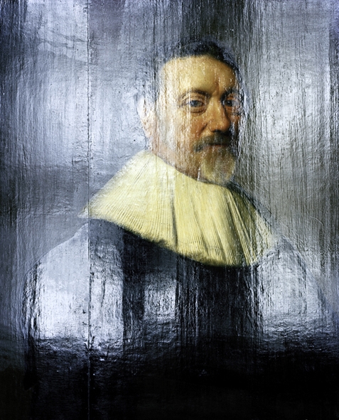
Jorma Puranen has for some years been a distinguished professor of art in Helsinki, and as such is often cited as among those responsible for what amounts to a golden period in Finnish contemporary art photography. One way to describe his own practice is to say that he has worked at a remove from straight photography. He achieved a previous lovely series by painting a rough surface shiny black and photographing the landscape reflected in it. The new series applies similar principles to a group of paintings. Puranen has deliberately sought the glare of light and manipulated it to make a veil or curtain through which we have to peer to see the paintings beyond. We’ve all made photographs which are spoiled by the shine off the surface that we wish to see. Yet in Puranen’s hands we’re miles from those plain errors. He composes with light, blending it into different consistencies and colours. Sometimes he makes it a gauzy sheen, sometimes an impenetrable solid block. It can be harsh or feathery, a flavour in its own right or a condiment to lift the flavours it touches. Puranen’s light is a perfectly proper photographic effect, as much so as the sprocket marks Cartier Bresson liked to leave on the edges of his prints. All photographers deal with light, all the time. Not many dare to treat light as their actual material.
The paintings Puranen has chosen are a group of mainly Netherlandish portraits in oils of the seventeenth century, although I was proud to spot a mildly anomalous Pollaiuolo in there, too. He brings them to us with names of neither painters nor sitters. They share dark backgrounds which serve Puranen’s purposes well, and they all have a single sitter isolated within the picture space. Almost all were like that when Puranen found them: not for him the nice photographic game of finding overlooked but interesting figures in obscure corners of paintings. But they are overlooked all the same. Old master portraits en masse are not thought terribly exciting by most people, and lots of museums all over Europe have long rows of Dutch portraits getting no more than passing glances. This is Puranen’s real subject. He has found a way to bring these portraits back to life. As he once put it in an interview, the act of photographing became a form of knocking on the frame to ask if there was anybody within. Using daylight only, Puranen draws a curtain around each portrait which he then partially pulls back to invite us in.
The principal effect is to find joy in the many textures in each picture. Flemish paintings are particularly good for surfaces, and Puranen dives headlong into that pleasure: here are Mechelen or Cambrai lace, velvet, and coarser cloths like broadcloth with accents of knotted rep. There are the many textures of skin, too. All that’s before he starts to explore the textures of representation itself: light bounces differently from board or canvas, from brush strokes applied with bravado or careful dabbing. In one picture an impenetrable flood of reflected light is punctured only by the half dozen blobs of a necklace in the original painting, poking through like a string of volcanic islands in a glassy sea. In another the craquelure on the surface of the paint has become a rather Dorian Gray-like commentary on the beautiful complexion it depicts. Two of them are in fact of the same portrait revisited, a stern looking Mevrouw with scallopped lace on her shoulder and a pendent necklace. In one version, she peers over a solid wall of light which reaches almost to her eyes and looks like nothing so much as a modern Moslem veil. But it takes a fifth and sixth look to notice that she is the same: Puranen’s treatment is not automatic or formulaic, and he can make thoroughly different art works from the same original just as good photographers have always been able to make widely different prints from the same negative.
There is tremendous respect in this treatment of Puranen’s. Photography so often overwhelms its subjects. Photographs are accurate, and can scream that accuracy too loud. Not here. Here the finished emotion in the viewer is compounded of elements rooted equally in the original painting and in the photograph. The gravitas of the portraits is certainly an element, but it’s a gravitas rebuilt not merely borrowed. The particularly Flemish accuracy of the different ways light strikes different surfaces is echoed by the raking glare of Puranen’s light. If it took virtuoso skill to paint a ruff of a thousand folds, it takes no less to make something new out of that with light. This is not merely accurate photography of existing art: Puranen’s miracle is to use the same glare both to hide and to reveal. He has found a way of paying his tribute to masters of light in their own currency, light itself.


