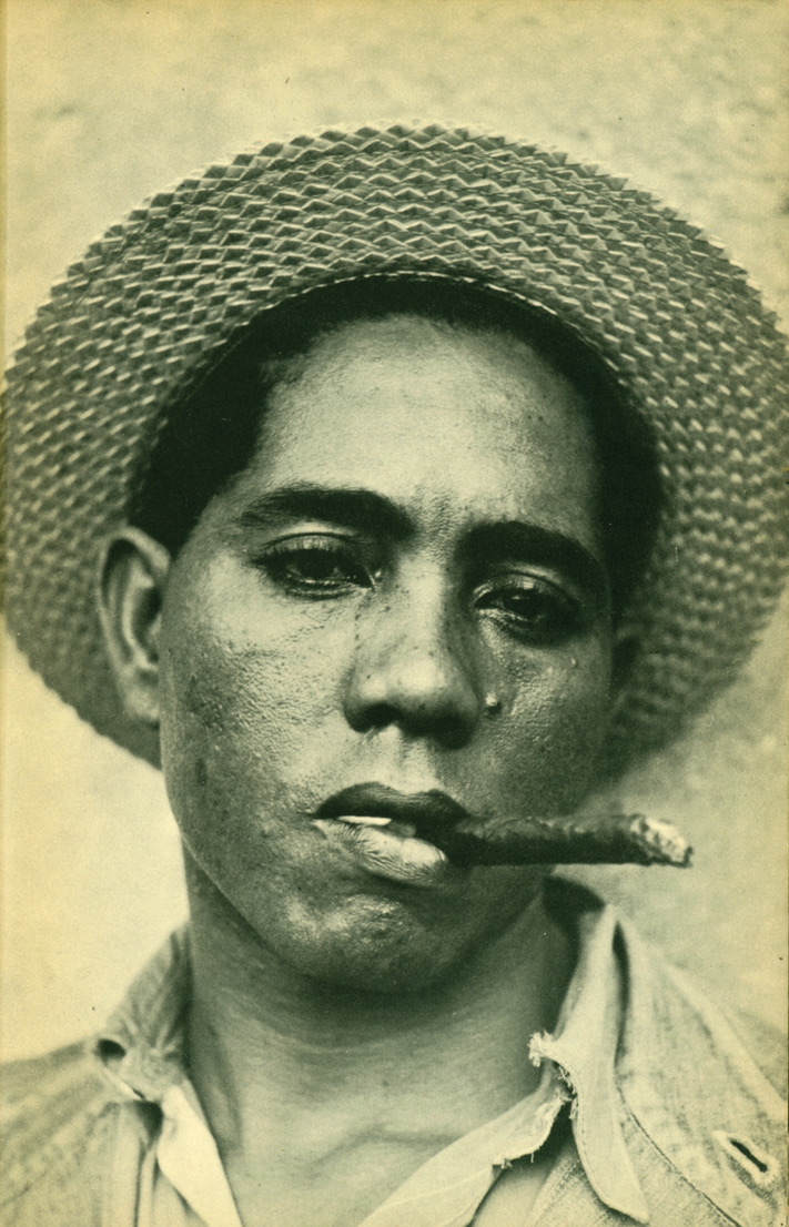
Images for Hugh, by Matthew Dalziel

This is one series that has been swirling lazily around in my mind for so many years that it’s now obviously a part of my mental scaffolding.  I first saw them when I worked at the Photographers’ Gallery and I was moved by them.  So the series goes straight into my virtual collection, and not just a single picture.  I absolutely love them and have loved them consistently, so I’m having all of them.  They’re by Matthew Dalziel and they’re called called Images for Hugh

Matthew Dalziel, from the Series Images for Hugh, 1986/1987

About ten years ago, I wrote to Matthew to ask a little about them, and this is how he answered :

“Thank you for getting in touch and giving me the opportunity to reflect on images I had completely forgot about but which were very important to my development as an artist.

The exhibition was called Mysterious Coincidences and was at the Photographer’s Gallery, London from the 4th December 1987 to 16th January 1988. The exhibition was curated by Susan Beardmore (now Susan Daniel McElroy) and Alexandra Noble. My work was called ‘Images for Hugh’ which was dedicated to a close friend who died a young man in his twenties. Hugh and I worked together in an engineering factory in Cumnock in Ayrshire, Scotland. I left engineering to go to art school in Dundee but I returned every now and then to see old work mates. On my first visit back which was about two months after Hugh’s death they told me that Hugh’s milk bottle with his oily fingerprints on it was still on the shelf where he left it, no one would touch it or remove it. That image remained with me and when I was studying documentary photography at Newport College I spent a lot of time photographing with 5x4inch cameras in the dock area particularly the engineering sheds. Similar traces abounded throughout these sheds, as had been where Hugh and I worked. This subject matter was normally always presented in black and white and making it a colour work seemed to be quite innovative and unusual at this time as I was included in this big show with big names in British photography while I was still a student at Newport. “

They were innovative, indeed, and it was a departure to use colour for such a subject. The Mysterious Coincidences show is well worth remembering and the catalogue is well worth digging out – the young Dalziel was in wonderful company. And what Dalziel can’t properly have said, I can: they’re exceptionally beautiful pictures as well as innovative. As photographs often do, they bring beauty to subjects which had none of their own. Although it’s great to see an artist whose interests and tools move on, I rather regret that the series is not better known. You can’t, for example, see these even on Dalziel’s current website (https://dalzielscullion.com/), no doubt because they predate his collaboration with Louise Scullion.

I don’t need to add much more except maybe this.  I feel there is a peculiar quality in these grubby close details which invites very concentrated looking.  They both imitate and reproduce the little emotional shock one gets when something small or trivial or unremarkable suddenly reminds us of someone no longer alive. The photographer – because of the memorial quality lurking under the work – had done his looking harder than normal.  Hence the relatively slow and cumbersome large format, the nearness, the precision, the absence of much background, and the colour.  Somehow that hard looking invites viewers to look very hard back.  By my reckoning, these add up to a far more powerful series than many better known. They’re one of the great memorials that I know. So I’m having them.

Matthew Dalziel, from the Series Images for Hugh, 1986/1987

Viral Landscape by Helen Chadwick

Helen Chadwick from the Viral Landscapes,1989

I don’t remember when I first saw Helen Chadwick’s Viral Landscapes – I suspect I went to the Museum of Modern Art in Oxford and saw them there in 1989 – but I do know that I have never forgotten them.  

I think there were only five of these extraordinary pictures in the series, although I surprise myself now by finding what seem to be variants online.  They were exhibited in a long straight line without any space between the frames, and the effect they had was very strong.  They came from an artist’s residency Chadwick had won on the Pembrokeshire coast, and they combined so many things that have become commonplace since.  That they were somehow medical is obvious from the title; they were rooted in the fear of HIV.  As always with Chadwick, the process that underlay them was far more meticulous and far more formally researched than the apparent violence of the surface suggests.  She wrote pages of notes on what she was trying to achieve, and arrived at her results by a meticulous (and very scientific) staircase of small changes based on previous results. I believe I read somewhere that she even posed herself on the shore in postures from Old Master paintings to more properly match her body to the developing pictures she was making. 

To arrive at the painted parts of the picture, Chadwick spread paint on the water and ‘harvested’ it on canvas a bit in the manner of marbling paper; she used photographs of cells from her own body (hence the long thin shape of a microscope slide).  She made the landscape elements with that very steep curve of the horizon to remind us that the self is made of cells – little round tight balls of surface tension.  And she bound the lot together using early computer programmes: the whole a process perfectly blending scientific practice and artistic.   

To my eye, the Viral Landscapes take their place in several different families of imagery.  They’re autobiographical in some oblique but important way; they’re plainly scientific; they are specifically to do with the environment and a sustainable human relationship with it, questioning our place in the world; they belong with that marriage of technique and delight in the natural world that drives people like Susan Derges; they have their place in the (related) list of sea-scapes made orderly by technique, ranging from Turner through the mighty Atlantic headlands of Thomas Joshua Cooper or the featureless wastes of Hiroshi Sugimoto.  In my own personal mental collection, they come very close to the lovely painted Cibachromes David Buckland made of the headlands in Dorset where he learnt to push his kayak beyond safety.

Helen Chadwick died absurdly young in 1996.  She had by then been a teacher at Chelsea, the Royal College of Art, Goldsmiths, St. Martins.  She was plainly highly influential on those grounds alone.  She was written about by critics of the calibre of Marina Warner, and that in itself is a form of influence. But the generation (shall we lazily tag it the generation of the Young British Artists?) which was directly influenced by seeing her work fresh, in all its sharpness and wit, its anger and self, is itself waning now, and its high time we paid her attention once again to Chadwick.  

Frank Horvat has died

Frank Horvat. Drugstore Entrance New York, 1984

Frank Horvat. Sealed Building, 55th St E New York, 1983.

He was full of years and we need not be too sad. But what an eye he had.

Maybe it’s enough just to remember that he was brilliant, in colour as well, as many people forget. In colour, he was as good as Harry Gruyaert.  As good as Saul Leiter.  Of these, the one that goes into Hodgson’s Choice is the Drugstore Entrance because it’s complicated enough I’d never get bored of it. It’s busy and still, and it makes me think of Sonny Stitt.

And maybe he quite liked yellow. 

All these pictures come from his book SideWalk, published by Hatje Cantz this month (in 2020!  Horvat was born in 1928. )  

Frank Horvat. A Homeless Person in a Yellow Sleeping Bag, Tribeca, New York, 1984.

Frank Horvat. A Yellow Cab in New York, 1985

Frank Horvat. A Little Girl in the Back of a Car, New York, 1985.      Reminds me very much of Helen Levitt’s great Spider Girl, also from New York, but perhaps a few years earlier.  She could do colour, too, come to think of it. 

Bus Riders, by Cindy Sherman

2011_NYR_02482_0219_002(cindy_sherman_untitled_d5495753)

Cindy Sherman, from the Bus Riders, 1976.

[Another in my irregular series Hodgson’s Choice. Do note that this was first published in the Financial Times in 2013, and that references to ‘recent’ events are no longer all that recent, and that sales prices will have changed a lot. Things change – but one of those which has never changed is my affection for this great series and my undying, greedy wish to own it.  Luckily, according my own rules, I do now.] Continue reading

Fish-Eye Business


Hiro Betta Splendens 08048 NYC 1984

Hiro.    Betta Splendens 08048 NYC 1984

These magnificent pictures are of Siamese Fighting Fish, Betta Splendens, photographed by Hiro in the early 1980s. Continue reading

Plague Doctor, 2011, by Erwin Olaf

Erwin Olaf Plague Doctor

Plague Doctor, 2011, by Erwin Olaf

There is a pleasant game in these days of enforced isolation against the spread of the coronavirus. Lots of people are posting their COVID-19 relevant images – and one day someone should make an attempt to inventory them.  This is mine. Continue reading

Kandinsky, 1937, by Paul Outerbridge, Jr.

Paul Outerbridge - Kandinsky - 1937

Paul Outerbridge, Jr – Kandinsky – 1937.

You’d hardly call Paul Outerbridge a nearly man, yet he really was.  Continue reading

La Luz de la Mente, by Luis González Palma

Gonzalez Palma 1624

Luis González Palma. 1624, from the series La Luz de la Mente, 2005. Película orthocromática y láminas de oro.

Continue reading

Iago, or Study from an Italian – by Julia Margaret Cameron

iago1

Julia Margaret Cameron           Iago – or study from an Italian 1867       Science Museum Group collection

What follows is the next instalment of my re-posting of the various pieces that first appeared in the Financial Times in early 2013, in my discontinued series Hodgson’s Choice.  I have had some misgivings about this one, not because of any doubt that the picture is wonderful – it is, and my insistence on having it in my ‘collection’ is unchanged.  But re-posting reminds me of the deficiencies of my own scholarship – and nobody much likes that. Continue reading

The Red Bustle, by Nick Knight

Nick Knight Red Bustle for Yohji Yamamoto 1986

Nick Knight            The Red Bustle, 1986

The colours of a bullfight as the sun finally goes down. It’s not complicated. The elements of this photograph are controlled with a curious mix of indulgent austerity, and it remains seductive long after the clothes it was made to sell have passed into the archive. Continue reading