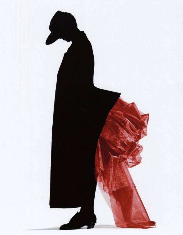
Nick Knight The Red Bustle, 1986
The colours of a bullfight as the sun finally goes down. It’s not complicated. The elements of this photograph are controlled with a curious mix of indulgent austerity, and it remains seductive long after the clothes it was made to sell have passed into the archive.
The picture comes from early in the series of clothing catalogues Nick Knight made for Yohji Yamamoto and is dated 1986. The model was Sarah Wingate and Knight was an outsider. He’d made a documentary series about skinheads (the disaffected right-wing youth movement which was both scary and deeply fashion-conscious) and a series of exaggerated portraits of a new London in-crowd of the early 1980s in a commission for i-D magazine. Still not thirty when the Yamamoto commission came his way, his collaborations with graphic designer Peter Saville and with art director Marc Ascoli were relatively new.
The catalogues were an experiment in how these confident, even arrogant talents could work together, and they were a departure for the client, too. It is always a wrench for a fashion house to publish pictures which give no very clear idea of the garments.
These pictures were a reaction against a period when fashion had been for a while even more overtly all about sex than usual. They are deliberately non-sexy in the same way that a Mohican and a pair of Doc Martens had been a few years before. They have technical brio. Knight flirted between flat representation and three dimensional: almost all of the girl, her cap, her long coat, most of her shoes are in inky black silhouette. It could have been drawn with a Rotring. The bustle that flares out behind her is glittery translucent pink net, and every pleat catches its full complement of zinging highlights and dark shadows. The pool of shadow on the floor reminds us that this is a person, not just a graphic. The little highlight on the heel is important: that’s where the flat blankness finally begins to curve into relief, and it’s the only place which shares something of the rival qualities of a map (on the left) and a sculpture (on the right). There is originality here, but there are debts, too, most obviously to Erwin Blumenfeld, the great innovator. It’s a cultured picture as well as a brash one.
Later in the same series of catalogues, Knight made a set of four pictures of Naomi Campbell in a red coat, the shapes as full as the sails of a J-Class yacht. Those are perhaps better known than this one, but in the Red Coat, Knight made a formal error which jars badly: he cut the girl off at the ankles, and in one version, at the top of the head, too. This is better. There is no slippage here. This is a collision of punky daring with a very British Puritanism.

Pingback: Diseñar sin sufrir – Kenichi Sato
“…the shapes as full as the sails of a J-Class yacht” — wonderful!
LikeLiked by 1 person