
Berenice Abbott. An Asymmetrical Object Behaves Symmetrically. Loaded Swinging Wrench, 1958

Berenice Abbott. Reflection of Waves, 1950s
[A text accompanying an exhibition at the University of Brighton on some of the many various ways that thoughts and information are presented visually.]
We’re told – and it seems very likely – that the third age of the internet will be the visual age.
At a recent edition of the annual LDV Summit, Evan Nisselson confidently said “Ninety percent of the data Artificial Intelligence needs to succeed, I believe, is going to be visual”. Nisselson’s a booster. As the founder of LDV, a venture capital firm investing in visually-driven new technology, he plainly has interest all over statements like that. Seen from where most of us stand today, the ‘internet of things’ is fairly restricted. Fridges might have cameras to read the sell-by dates on milk cartons and doorbells might be connected to apps to allow you to see your visitors when you aren’t at home – but we don’t for the most part yet see far beyond those fairly trivial gadgetty developments. Yet Nisselson most assuredly has a point: we’re heading to a visually driven internet, and it’s been coming a long time. Big data is a thing; and it’s here. We’re getting to the place where seeing things displayed intelligibly is going to be the only way to have any understanding of them at all. Have a look even at some of the simple tools of graphical display; look at the tools on Gapminder.com, for example. If you haven’t checked in with this stuff for a few years, you’ll be amazed at what is now routine. At the other end of the process, computers are acquiring the facility to make use of more and more information gathered visually. Quite soon – if we haven’t got there already – more pictures will be generated by machines to be read by machines, with only occasional human inspection or audit, than are made by people for people. Computers deal in numbers so huge we can’t really see what they’re up to.
The one thing you can say with certainty about a computer is that it doesn’t understand what it tells. Garbage in; garbage out used to be the litany but you could write a parallel one: big numbers in; big numbers out. No need for the computer to make metaphors, use allegory or innuendo. Computers don’t allude or suggest or imply or remind. They just puke out the numbers. For the humans among us, with slower mathematical processors but far more complex and complete systems all the same, there has always had to be a more satisfactory interface between the data and our understanding. Since the first story from the Bible was stained into glass and positioned to catch the sun high on a cathedral wall – long before that, in truth – that interface has as often as not been visual. What we like to do, when we don’t understand something completely, is make a picture of it. It seems clearer that way. We can see obvious flaws in a picture that we can’t in a stream of numbers, a syllogism, or a few pages of code. Computers fast enough to process huge volumes of data (just-in-time supply chains; facial recognition; fly-by-wire systems; virtual reality; global positioning and geo-tagging…) will do things that we can’t. But we’ll keep in touch with those things in pictures because that’s the only way we can understand or hope to keep up. The visual, in other words, is expanding.
We think of research as an occupation which finds its expression in writing (classically in the Research Paper published in an Academic Journal) but it can take many other forms. Think of an old map with its large patches marked Terra Incognita or – better – Here be Dragons. By marking what wasn’t known, that made a clear statement of where previous research had stopped – as well as an invitation to go in the future to find out what might be there. A university such as the University of Brighton, where I work, is filled with people using imagery in their research and using it in all sorts of different ways. A pie chart clumps numbers of instances of something in conveniently legible form. An organigram might well be the first expression at a time of corporate change: it shows a complex set of relationships in a single sheet, graphically rendering something invisible visible. A moving pointer shows sound levels – or any of one thousands of other variables.
We can simplify and say there are two kinds of images in research. There are those that show things which the researcher intends to address. We can think of those as input imagery. A collection of still photographs of broken turbine blades, for example, might be a very valuable beginning of an enquiry. Different in kind are the charts and graphs and myriad other expressive ways of showing the results of research: this number did that; another number did something else. This behaviour was expected; this actually resulted. A given group of variables can be grouped this way; another that other way. We might think of those as output imagery, helpful to transmitting the research process or results with clarity and speed.
But a simple taxonomy of this kind doesn’t begin to address the range and scope of possible visual expressions that come into research or come out of it. That’s why we have brought together a few examples of colleagues’ work just to begin to suggest the scope of a vast subject. How research comes to be visualised will be at the core of the new dependence on the visual – and we can expect a new literacy in the visual to make sense of it. We’re putting on a little exhibition of current images to show how central is the role taken by images and imagination in the research processes.
It started a long time ago. Our contemporary researchers are advancing habits of thought which already exist; are already old. You’ve heard of Florence Nightingale? Remember her, the Lady with the Lamp, patiently ministering to wounded soldiers in the Crimea? The convenient (but essentially sexist) view is that she was a nurse; she tended to men far from their loved ones who had been hurt or fallen sick in service. Buried beneath that Ladybird view is another. Florence Nightingale made herself a most remarkable statistician, and used her mastery of data to campaign for change – with success. Florence Nightingale invented the rose chart, a strong representation of data by area, and she used it to devastating effect. One example among very many of the ways in which visualisation wins the challenges of understanding.

‘Assessed Valuation of Taxable Property Owned by Georgia Negroes’. Chart Prepared for W.E.B. Du Bois to Exhibit at Paris Exposition Universelle of 1900. Library of Congress.
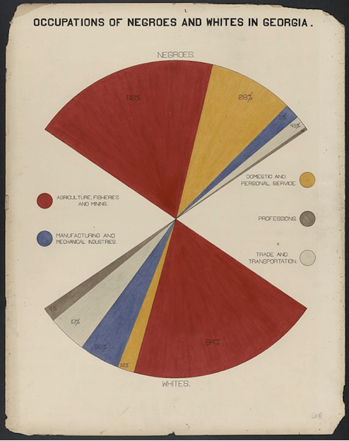
‘Occupations of Negroes And Whites in Georgia’. Chart prepared for W.E.B. Du Bois to display at the Exposition Universelle in Paris, 1900. Library of Congress
A similar one a few years later comes from another great social reformer, W.E.B. Du Bois, who prepared elaborate charts to express the economic condition of the black population of the United States for the Paris Exposition Universelle in 1900. It’s tempting to push the point: the famous pump in Broad Street in Soho whose handle was removed in 1854 by John Snow once he’d plotted the occurrences of cholera round about it was an actual pump with an actual handle. Stopping it from working was a physical way of stopping the dirty water from being consumed, and it certainly slowed the spread of the epidemic. But it was also a strongly graphical representation of the results of his research: Snow the meticulous data-cruncher found the perfect illustration to make his point. Stop the pumping and you stop the disease. A pump: cholera. A pump amputated of its handle: cholera diminished.
Many specialists can do you a history of infographics more complete than I can, and many other universities have assembled groups of research pictures. There is a well-travelled formal history of this stuff, of course. A lot of what is called by the portmanteau word infographics ( information graphics ) derives from sources perfectly known.
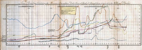
‘Linear Chronology Exhibiting the Revenues, Expenditure, Debt, Price of Stocks and Bread from 1770 to 1824’ by William Playfair.
The English political economist William Playfair invented or perfected in the late eighteenth century many of the familiar charts we use still today. A Playfair chart had perfectly recognizable elements : named regular values along an x- and a y-axis for example; careful use of colour; the certainty (as he put it) that ‘whatever can be expressed in numbers, may be expressed in lines’ . Playfair was a far more colourful figure than many researchers: so much so that he would make a tremendous subject for a racy filmed Life. He was at one time apprenticed to Boulton and Watt, the refiners of the steam engine, and at another so active in Paris that he was rumoured among those who stormed the Bastille. More certainly he ran a business making gun-carriages and was also convicted of fraud. Playfair’s important; but he did not invent it all.
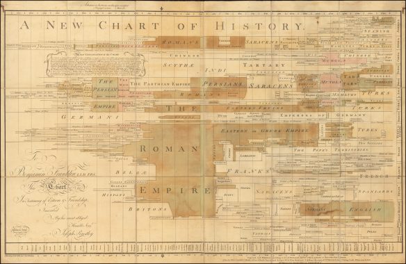
Joseph Priestley. A New Chart of History. Published April 1769. This copy via ‘Boston Rare Maps’.
Some of his chart work derived from some by Joseph Priestley, the greatest of all British enlightenment savants: Dissenter, Member of the Birmingham Society of Lunar Men, friend of Benjamin Franklin, discoverer (or co-discoverer with Lavoisier), of dephlogisticated air – what we now call oxygen. For people trying to offer ready grasp of exponentially more data than had been normally dealt with even a generation before, it seems natural that late eighteenth century scholars would devise versions of charts. As in our own generation, there was then such a quantum jump in the information calling to be processed, that a heavier reliance on picturing seems a reasonable and – if you can overlook a momentary historicist elision – almost an inevitable outcome.
Again and again, we see the forms of visualisation become more influential in each specific area than might have been predicted. I am told by an ophthalmologist that photography (my own area) had at one time been a useful possible form of note-taking in her work, as in many others. But the sweep of inference rapidly to be drawn from the pictures had pushed the role of photography ever deeper into the field. Now, I understand, photography is the primary diagnostic tool for ophthalmologists – and far from furnishing a simple aide-memoire, it is central. That is a familiar history in photography. Imagery helps to make things clear to the specialists; imagery becomes the prime way to make things clear to the non-specialists. What I hadn’t realised is that the same expansion has been familiar in so many other fields, too.
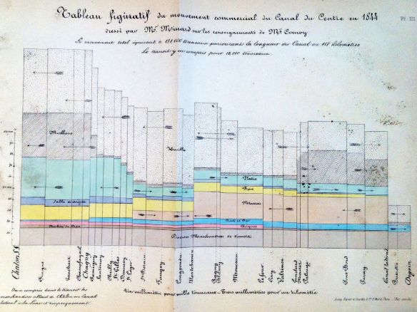
Charles Minard – Mouvement Commercial du Canal du centre 1844 (Traffic movement on the Canal du Centre in 1844). In the same way that French schoolchildren are convinced the potato was brought into regular use by Antoine Parmentier whereas British children think of Raleigh in that context, so Minard (rather than Playfair) is the father of chart data in France. Parmentier, by the way, was a contemporary and correspondent of Voltaire. Raleigh died more than a century before Parmentier was born, although as usual in these national claims to priority, each can be credited with part of the story.

A ( to me ) wonderfully unreadable contemporary chart of Economic Growth plotted against Deforestation. It gives lovely order; but perhaps rather less understanding. Many images in research contexts do the same – or the opposite.
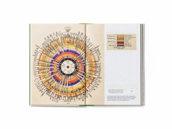
The Crust of the Earth as Related to Zoology. Louis Agassiz and A. A. Gould, 1870. This lovely anti-Darwinian arrangement shown simply as a page reproduction from Animal Vegetable Mineral: Organising Nature, A Picture Album: Tim Dee, Anna Faherty, Wellcome Collection, 2016
Much of the inventiveness to date has been in fields we know. Playfair worked a lot on economic data, and we all know the familiar figure of the newsreader airily guiding us around charts of the economic news (unemployment figures; inflation; foreign exchange rates…). I mentioned maps, and there have been generations of new types of maps, all seeking to present a particular kind of clarity. The very idea of a map projection, flattening the globe, is an attempt to visualise research data; different projections have different uses. Harry Beck’s famous map of the London Underground from the 1930s does the same thing: it strives to make sense of the wiggly complexity of a system too big by then to be readily held in the head of a traveller.

One Section (of a dozen) of Charles Booth’s ‘Poverty Maps’ of London, 1898. London School of Economics
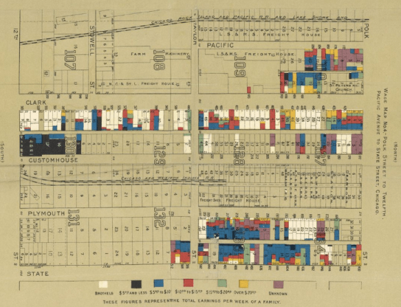
Florence Kelley – Hull House Map of Poverty in Chicago – showing brothels on Clark Street, published in 1895. This work was indebted to the Booth maps.
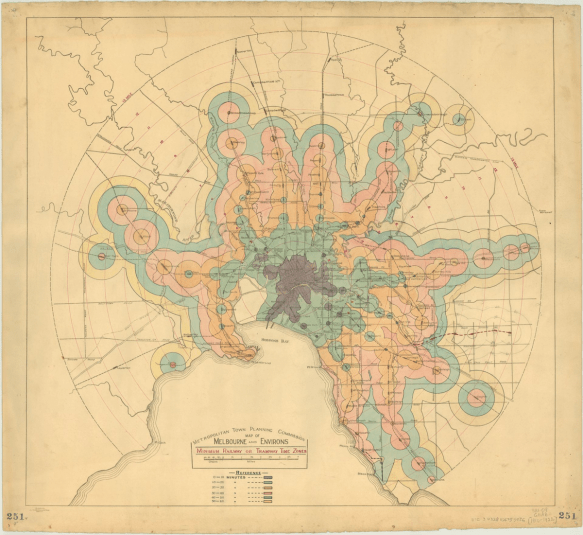
Metropolitan Town Planning Commission Map of Melbourne Time Zones, c.1910.
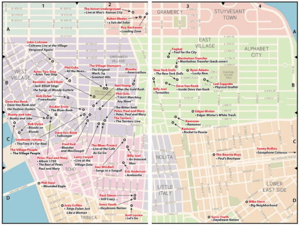
Map of Locations of Record Cover Photography in Greenwich Village and in the East Village from popspotnyc.com
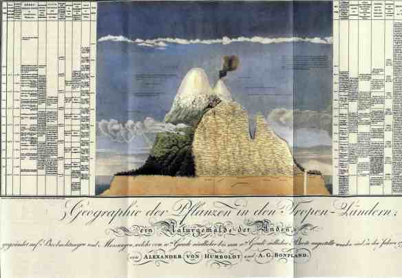
Alexander von Humboldt. Chart of the Flora and Fauna Found at Different Altitudes on Chimborazo. 1805.
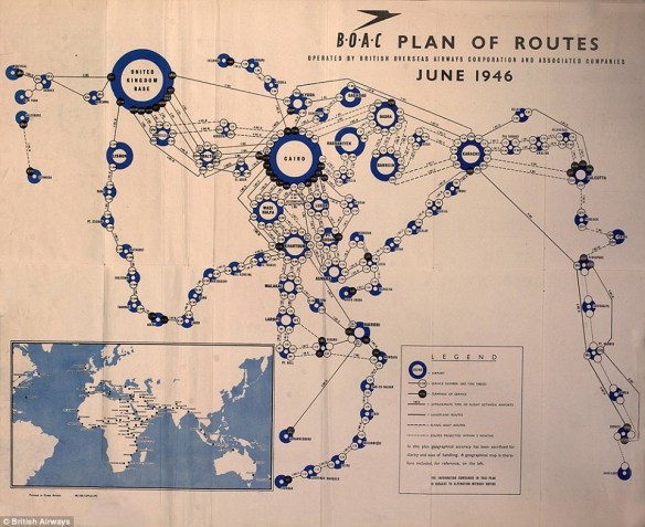
Schema of Operation of Routes by the British Overseas Airways Corporation shortly after the War and Corporate Mergers, 1946. Via Paul Jarvis, Mapping The Airways, Amberley Publishing, 2016
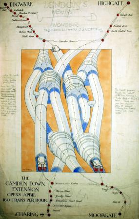
Charles W Baker. The Underground railway junction at Camden Town, drawn in 1924 as ‘London’s Newest Wonder’ for a poster – to boast 160 trains per hour.
Is it too much of a generalisation to say that mapping is the area where experimentation to make the visual expression of the widest range of variables has been most developed? It may be so. A map of the Melbourne suburbs shows travel time as more important than distance, always true for commuters. The great Alexander von Humboldt makes a famous combination of a map and a table as he climbs laboriously up Chimborazo, then thought the highest mountain in the world, a truly momentous announcement of the ecological relationship between altitude and latitude.
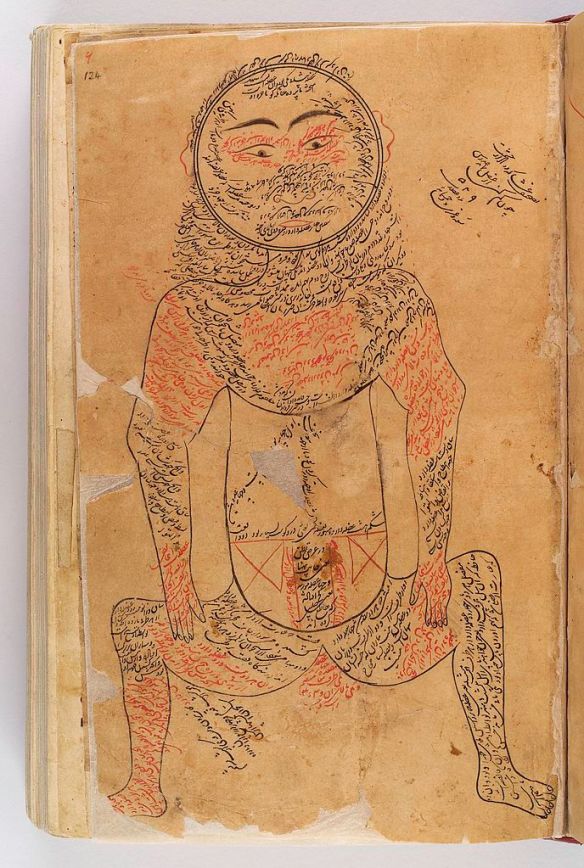
Sixteenth century copy of an illustration by Avicenna (eleventh century) of the muscular system. Wellcome Collection.
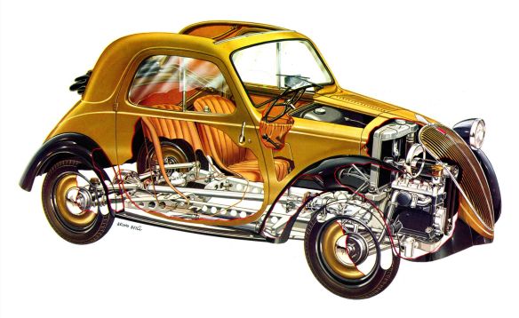
Modern cutaway drawing by Bruno Betil of the 1936 Fiat Topolino. I have never seen a history of the cutaway drawing although I’m sure there are many good ones. It was once a highly original and remains now a very effective way of depicting that which you can’t see.
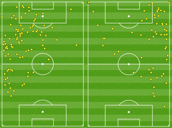
Touch Maps of the Chelsea players Eden Hazard (L) and Willian Borges da Silva (R) in the Premier League match vs Burnley in September 2016. Charts via the Premier League
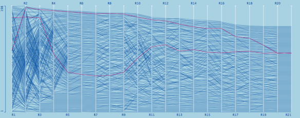
Rank of the riders on successive stages of the Tour de France cycle race, showing the difference between relatively uneventful days and those with more movement in the field.
But there has been plenty of this work in other fields, too. In some areas, data has become almost a parallel to the main activity. Medicine of all sorts relies on data: think of the chart at the end of a patient’s hospital bed – the completing of which sometimes feels more important to the staff than any interaction with the patient.
Stephen Jay Gould wrote a famous essay on statistics and baseball, and many discussions about sport start and end with the stats. The advances are not just in display, but in data collection: Premier League soccer players are routinely tracked around the field as they play, and remarkable statistics evolved (and made available for sale) about their movement. This in a sport famous – unlike cricket, for example – for the simplicity of its scoring system and therefore its apparent resistance to statistical overload. Cricket has been at it longer: the elegant formulae of the cricket score-book have passed into the language, with the ‘dot-ball’ moving from the stats to the sport, rather than the other way as is more usual. In a piece on the new possibilities for football managers to monitor increasingly complex data from the players while the game is actually in process, my colleague Peter Lloyd quoted the philosopher Julian Baggini in talking of the quantified self, ‘an approach to living which encourages the relentless gathering of data about everything related to our wellbeing, from health and fitness indicators like heart rate and cholesterol levels, to time spent on social media or learning new skills. All this data is supposedly used to make us leaner, fitter, happier, more efficient.’ We all know at least one person who chooses to suspend their free will in such matters as what to eat (or when) in favour of the unknown designer of the app they look to for guidance in that area. Everybody with an Apple Watch knows what it means to live as much in the graphs as in real life.
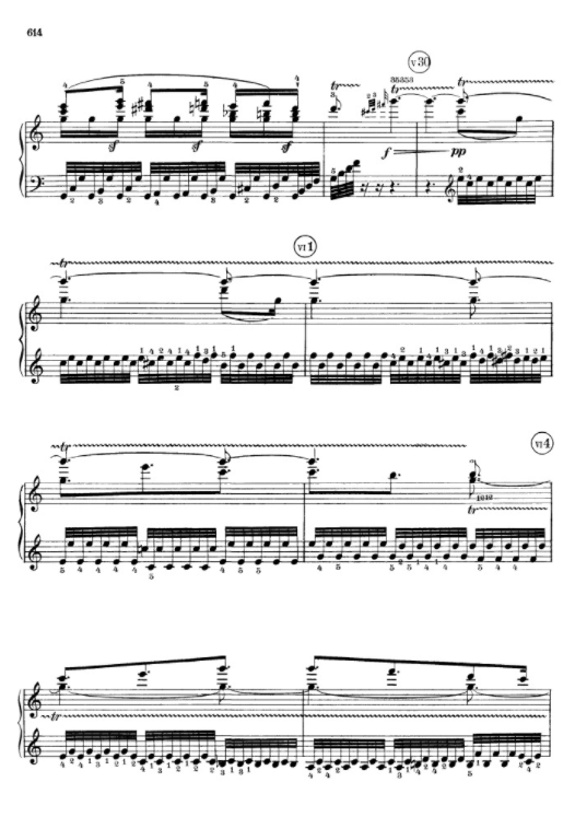
A page from Beethoven’s Piano Sonata 111, op. 32.
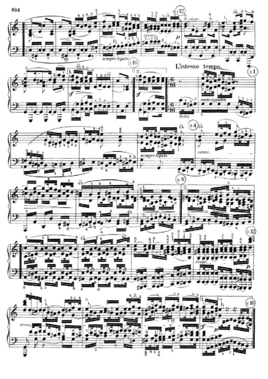
Another page from Beethoven’s Piano Sonata 111, op. 32. With a few more such illustrations, we could easily begin to see how Thomas Mann might have described (he put the words into the mouth of Wendell Kretszchmar in the eighth chapter of Dr. Faustus) this great sonata as the one which killed off the sonata altogether.
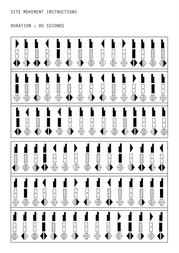
Ninety Seconds of Dance, annotated by Rudolf Laban
Some visualisations, it has to be said, are more successful than others. Western musical notation is a graceful and readily understood transcription of the mathematics of pitch and rhythm. To watch a fluent sight-reader making music from an unknown score is to be readily convinced of the precision of the ideas conveyed. Musical notation is a little less successful at transcribing tone, perhaps. The sight-reader knows the tone because of his or her own instrument; the notation has little to say about the colour or voice of the music to one who might not know the instrument intended. Still, it’s precise compared to dance notation, say, which seems to leave room for interpretation in the very fundamentals of the art: gesture, movement, and expression.
Visualisation is always metaphorical, allusive. Any way of visualising complex effects will have slippages. The question is which ones are built in to the research and which are not. I’m reminded of the oft-quoted tag attributed to Laszlo Moholy-Nagy who is supposed to have said “The illiterate of the future will not be he who is ignorant of the pen but he who is ignorant of photography”. Walter Benjamin gave this phrase its impetus, and his version was this “Nicht der Schrift-, sondern der Photographieunkundige wird, so hat man gesagt, der Analphabet der Zukunft sein.”
The researchers of today are furiously accumulating the data, as we know. With the help of computers on steroids, they are accumulating it in such quantities that we cannot easily process the results. So at the same time, they are inventing the new visual grammar of the future. And it’s fair to notice that neither their Dr. Johnson nor their Noam Chomsky has yet appeared. We simply don’t yet know the codes by which we, the visual generation of the new machine age, will analyse and make sense of the pictures which will have such an important part in controlling us.
Historically, much of that work has been done in photography. People have always read pictures; but photography is the place where we learnt to read pictures at high speed, across cultures, for usable relevant information urgently needed. It may well be that other vocabularies and syntaxes are going to be developed; but they will stand on the piles of photographs we have already tried to make sense of. It is in photography that we learnt to process visual information in bulk – and it may well be that we need to look to the habits of mind we acquired there to help us make sense of the new mountains of information we are heaping (we already have heaped) up around ourselves. Those mountains of data, like the dust heaps in Our Mutual Friend, are the potential source of both great prosperity and great menace. So it is urgent that we know how to make use of them.
We need to develop new and revelatory ways to picture data; and that seems to be happening at a great rate. But we also need to develop new and reliable ways for humans to read those pictures, and that may not be happening quite so quickly.
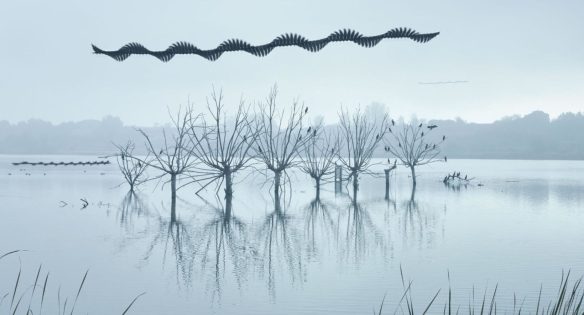
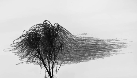
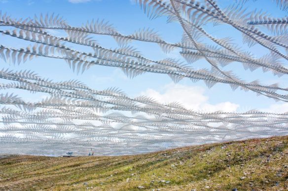
Three photographs of the tracks of birds, by Xavi Bou, from his series ‘Ornithologies’ (seen via http://www.laboiteverte.fr/ – to whom thanks). Even the familiar world does not look familiar when its images take a less than usual relationship between time and place.
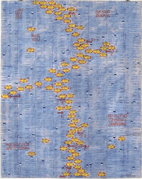
An ‘outsider’ graphic by George Widener, known as a ‘lightning calendar calculator’. Widener is widely held in art galleries and there are films about his work. Is his seeming incomprehensibility different in kind from that of many makers of graphics we recognise more formally as ‘researchers’ ?

Another disruptive graph, this time by the great ( and weird ) maker of artist’s books, Ulises Carrión. This one, from about 1972, is Untitled (Margins). It is perhaps a graph whose inhuman regularity has been interrupted to leave some room for the human.
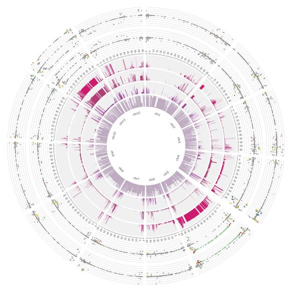
Circos is software for visualising a whole genome: “Displays large volumes of genomic rearrangement data. Circos is a visualization tool that applies a circular ideogram layout to display relationships between genomic intervals. The software provides a scalable means to illustrate relationships between genomic positions and is designed to allow flexible and easy rearrangement of elements in the image.” Brayton Orchard, The Ohio State University. As often happens, this image implies a lot that was simply unthinkable a few years ago. Good or bad? We don’t yet know. But if only researchers can read it properly, how can the ethics that apply to it and the social adjustments that derive from it be adequately sorted out?

A small estuary seahorse – Hippocampus kuda – drifts in the polluted waters near Sumbawa Besar- Sumbara Island- Indonesia. Photograph by Justin Hofman. tThis kind of imagery goes back to an older version of visualisation of data. Knowing about plastic pollution and seeing a picture like this are different things. For pictures of this weight – hard not to see something is badly wrong here – we know how to extrapolate the thousand words the single view is supposedly worth.
Show and Tell – the Image in Research. 29 April – 10 May 2019
Under the auspices of the Creative Futures of the University of Brighton
At the Edward Street Gallery in
the School of Media of
the University of Brighton: BN2 0JG – UK.
Open Monday – Friday, 10am – 6pm; and 10am – 4pm on Saturday
There is a not-at-all-Private View on 26th April 2019 in the evening, 5:30pm – 7:30pm. Anybody who is interested and within reach of Brighton is welcome.

Hola Francis. As always a very interesting blog !! I was just thinking on older scripts such as Egipt hieroglyphs or Mayan ones as other uses of images and the different ways of thinking they may have allowed. Or even the Quipu, Inca’s graphical way to book the taxes. Closer in time, I think works such as Xavier Ribas’s ‘Salitre’ are proper historical research but written more with images than text. Photobooks are the arrowheads in this drift towards image based texts, specially if we consider school textbooks to be a form of photobooks too.
LikeLike
Hola, Luis – thanks ! And lovely to see you the other day. I guess I was saying partly that so many different kinds of visual ‘languages’ are sold to us as ‘effective communication’ that we may need more practice in – and more lessons in the grammar of – each before we can really sure that they communicate with the legible complexity we take as standard in other kinds of communication. But it certainly seems apparent that it’s in photography that much of that syntax was worked out and still is being worked out. I like your thought about textbooks. A suivre … FH
LikeLike
Pingback: Abstract Reality (Working Title) – Research Project Proposal – Critical Research Journal
Pingback: Abstract Reality (Working Title) – Research Project Proposal – Critical Research Journal
Much (very much…thank you!) proof that a picture carries as much, or more information as 1,000 technical and specialist words, and more vividly!
LikeLiked by 1 person