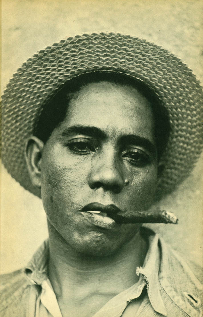
A stevedore photographed by Walker Evans in Cuba in 1933. Evans’ time in Cuba was interesting and complicated – there’s a fine essay by John Tagg in Photographies in 2009 to give just a taste of how complicated, and it’s there I refound the picture.
Great photographers control our readings of pictures. See how two blemishes on the left ( his left ) of his nose, one smaller by the corner of the eye and one larger by the nostril, and the line of freckles on the right ( his right ) of his nose simply demand to be read as tears running down the face. There’s even a glisten from the eye to that larger lower blemish, and a runny-nose gleam along the philtrum. The hat is an obvious halo, and the beautifully highlit golden face plainly alludes to religious imagery, too. The absence of background says this is a face of sorrow about all such people not just this one person. A secular saint, then, the martyr of the long politics of colonialism and the plantations, and the short politics of what Tagg called “the fading days of a brutal dictatorial regime propped up only by the money of American banks and corporations.” It’s all there in the picture – because Evans took responsibility for our reading of the details. They’re there to be read.
And yet. It seems that Evans was maybe not particularly interested in Cuban politics nor in the plight of its underprivileged people. He was sent there by the Philadelphia publisher J.B. Lippincott to provide illustrations for a book by the radical American journalist Carleton Beals entitled The Crime of Cuba, a book which squarely put much of the responsibility for the corrupt dictatorship of Gerardo Macheda on the United States, and on American imperialism. Beals had worked all over Latin America and had been very involved in the left-wing intelligentsia in Mexico, where (by the way) he apparently had a relationship for some time with Tina Modotti’s sister Mercedes. Evans travelled separately from Beals, but was glad to get the gig. He stayed longer in Cuba than his contract specified because he became friends while there with Ernest Hemingway who paid his expenses for an extra week. In an interview years later, to the Yale Alumni Magazine of February 1974, Evans said of the Cuban dockworkers he had photographed “Those people have no self-pity. They’re just as happy as you are, really.”
Evans made great work in Cuba. This is one of many studies of dockworkers, for a start. He learnt a lot, including the use of several different sorts of cameras. He seems to have been particularly interested in the work of Eugène Atget at the time, and there are fine studies of Havana shopfronts which are very Atget-derived or Atget-conscious. It is certainly possible to make good arguments that Evans was a man of the left, even if non-aligned. But it may be wrong to read that political inclination into every picture that he made. In another interview, in 1971, he said “It was a job. It was commissioned. You must remember that this was a time when anyone would do anything for a job. This was a job of a publishing house publishing a book about Cuba and a friend arranged that I should do the photography. So I grabbed it”.
I think there’s a lesson there. I like nothing more than reading a picture, in great detail, and I’ve done it all my professional life. I’m glad to think that this stevedore looks like he’s weeping. I think it’s a great and very moving portrait. But I also think we (and I) need to be careful when inserting our own readings into photographs. It’s true that I am completely entitled to read this as a study of an oppressed working man – and a wonderful one, at that. But perhaps it’s not right to say that’s what it is. Evans didn’t seem to think so. It may just be that Evans wandered lazily down to the dockside in the heat, in the intervals of drinking with his buddy Ernest, to point his camera at the nearest subjects who would get the job done.
If you visit the website set up to showcase Bradford as the 2025 City of Culture, the very first page that you come to – at least at the moment (February 2025) – celebrates the major photographic commission awarded to Aïda Muluneh and the resultant exhibition at Impressions Gallery. Those websites are not sequenced by chance. This means in effect that Muluneh can be considered the lead visual artist of the City of Culture. There is an exhibition of David Hockney’s joiners and the later multi-screen films he derived from them at the newly reopened National Science and Media Museum, the sad relic of a once-brave museum which has shifted its mission over the years from its collections to the cheery ‘experiences’ it can offer. Hockney is a leading son of Bradford, and his joiners are always well worth seeing. Yet I venture to open these lines by asking this : how many people reading this had any awareness of Muluneh’s show? I wish I had the attendance figures, but how many people have visited it so far – perhaps excluding Yorkshire schoolchildren on worthy trips?
Something has gone wrong. Nomination as City of Culture for a year is a way of promoting culture, of course, but it is perhaps primarily a way of bringing attention and with it a variety of economic benefits to the titular city. Visitors and the jobs that go with them are the name of the game, and ambitious targets for both are set. In the UK, the City of Culture is administered by the Department for Digital, Culture Media and Sport, the spectacularly feeble DCMS, a department which has been starved of funds and high-placed allies throughout the succession of Tory ministries recently ended, and which has been led on the whole by a long, long procession of useless placemen and placewomen hoping only to move to more senior cabinet positions. It may be worth recalling that the idea of the City of Culture was originally a European one, and indeed that a number of UK cities were booted off the shortlist when the UK left the European Union. The credit for the origination of such a scheme is usually given to Melina Mercouri, the Greek Minister of Culture of the 1980s, although I have a shapeless memory that it was also very much initially driven by Jack Lang, her French counterpart. Neither Mercouri nor Lang were place(wo)men; any contemporary UK citizen might well look with enormous envy at ministers of culture with that degree of energy, with that obvious concern for culture, and with that level of cabinet support. Lucy Frazer, anyone? She was the last of that long line of Conservative Secretaries of State for Culture (the department has gone under a series of names, including at one point being the Department for Culture, Olympics, Media and Sport, as though the Olympics were somehow not a sporting event). Ms Frazer’s achievements in the field of culture have not, as cricket commentators used to say, troubled the scorers. I don’t know how far back the planning for Bradford as the City of Culture went, although the announcement was made in May 2022 – during the tenure as Culture Secretary of Nadine Dorries – a placewoman if ever there was one. However far back we go, the Department has made over £15m available to Bradford – and that without counting substantial further funding from the Arts Council and various of the National Lottery funds. Add Bradford council’s own money and money from the region and it begins to add up. It’s small, small money in national terms, but it’s relatively big money for Bradford and for culture.
Aïda Muluneh. The Loud Silence, 2024 Photographed in the courtyard of Castell Coch in Cardiff
I called Aïda Muluneh’s show a commission: it was new work made for this occasion, and it is scheduled to tour after Bradford to one city from each of the home countries. It will go to Belfast, to Cardiff and to Glasgow. The whole show is called Nationhood: Memory and Hope. It opened in Bradford in January 2025, and will close in December of this same year. Because of that nationwide tour, Muluneh sought to make pictures based on her understanding of the cities of the tour, and that’s her main series, called The Necessity of Seeing. She made brightly coloured tableaux in each of them, and those pictures directly address her knowledge and impressions of those places. In addition, she made simple black-and-white portraits of people who helped her to understand the unfamiliar British cities in which she worked. In another addition, a number of emerging portrait photographers, chosen deliberately as representing those same cities, are included in Nationhood: Memory and Hope.
All in all, I’d call that a relatively big deal. Aïda Muluneh is a very well-travelled Ethiopian artist, now based in Abidjan, in the Ivory Coast. She has lived in Yemen, studied in the United States, curated a lot in Africa. Her work is in major institutions and she has a number of considerable achievements to her name (such as curating and contributing to the exhibition accompanying the Nobel Peace Prize in 2019). I don’t know how one could sensibly rank such things, but I’d say that she is pretty high in the list of those African artists with a reputation on other continents. It was a very considerable feather in the cap of Impressions Gallery and its distinguished director Anne McNeill to be able to commission Muluneh. So then, how come there has been zero attention given to this show? I may be wrong already now, and blog pieces such as this one certainly have a habit of going out of date, so I’ll certainly be wrong later, but there has been almost no national press for this exhibition at all. I find a short notice in Creative Review, plus local notices in the Bradford Telegraph and Argus and the Yorkshire Post, with elsewhere trifling mentions as part of the general publicity noise about the opening of the City Culture on a freezing night in January. Richard Morrison in The Times liked Aïda Muluneh’s show, but he had a scant paragraph to devote to it.
Plainly, some mistakes were made. It is relatively cheap and relatively straightforward to produce a catalogue. A catalogue of Muluneh’s show would have helped to circulate the ideas in it and would have kept them current after the tour had come to an end. There is no catalogue. There is not even a complete online listing of the pictures she made. Still, many shows without catalogues garner more attention than this.
The United Kingdom is comparatively rich in broadsheet papers. Yet none of them really manage to take photography seriously. There are many reasons for that, among them the fact that vigorous and thriving review activity seems to happen only where there are major or monolithic cultural institutions pumping out what is now increasingly known as ‘content’. Major publishing houses get reviewed; so do record companies and opera-houses and theatres. But photography still remains in large part a set of overlapping cottage industries. There are some very big players : the Victoria & Albert Museum, for example, or Getty Images. But they don’t dominate their space as Random House or Covent Garden do theirs. Lots of different smaller content-producers defeats the national reviewing system.
Still, for £15m of national public spending to be led by a show by an international artist with a year-long nationwide tour and then for that show to get next to zero attention is a pretty spectacular failure not just of the reviewers and their editors, but of the legions of marketing and comms people who were available to Impressions Gallery, to Bradford, and to the national government to promote it. One can like or admire or be intrigued by Aïda Muluneh’s new British work – or not. It is certainly very intriguing to have a distinguished outsider contemplate four British towns, their history and their present. But before it can be liked or admired, it has to be seen. Muluneh has every right to feel that the work was well commissioned but not nearly well enough publicised. Not enough people have seen it yet. Here’s to hoping that when it re-opens in Belfast in June it will get a relaunch that generates the attention it merits. It was, after all, done with our money.
====
List of the other (portrait) photographers included in Nationhood: Memory and Hope
Well, here is a rare and rather enjoyable thing. I’m used to writing about pictures whose author is known, whose subject is known, whose date is known, whose cause is known, whose customer is known or any or all of those things. The experience starts as that which is familiar to anyone who has finger-walked through shoeboxes of old post-cards, or cartes-de-visites or stereos : here’s something that catches my eye – I wonder what it might be. If it has a place in photographic history beyond what I can see, that might be interesting; if it has a connection direct to me, that, too, might add something. But without more evidence, it’s just me and the pictures, eyeball to eyeball.
And what pictures they are. There is something about these kids, in the tense pull between still, even stilted, poses and gestures and clothing against the lively contrarian energy bubbling up beneath their superficially calm faces.
Pierre-Louis Pierson, Portrait of A Child, 1860s or 1870s. Courtesy Roland BelgravePierre-Louis Pierson, Portrait of A Child, 1860s or 1870s. Courtesy Roland Belgrave
These portraits of children were taken to the PhotoLondon art fair in 2024 by the dealer Roland Belgrave who asked me to write something to accompany them. Almost all we know so far about this group of posh children is in the pictures themselves. There is one exception, itself helpful. We know that they come from the files of Adolphe Braun. It says so on the backs of several. Braun is relatively well-documented. But Braun, as well as being a person, was also a company. These pictures are not among those known to be by Braun the person – and therefore may most likely properly to be ascribed to Braun the corporation. We simply don’t yet know.
Adolphe Braun (born in 1812, died in 1877) was originally a textile designer. (Several photographers came into the new medium through that same route, among them Charles Aubry.) Braun came from Mulhouse, in Alsace in Eastern France, a centre of printed cottons to rival the English producers. A promising early career in Paris, where he had been sent to develop skills and a network, was cut short by the death of his wife in 1843. A widower with three small children, he came back to Mulhouse and gave up the independent or freelance route by becoming the in-house designer for Daniel Dolfuss-Ausset, a major figure in the textile industry, but also an enthusiastic early-adopter of photography. Dolfuss-Ausset’s other passion was the high mountains, and specifically the study of glaciers. Not only did he pay for a hut on the Aar glacier in Switzerland; he brought daguerreotype photographers there to make some of the very earliest pictures made on a high mountain summit. He was instrumental, in fact, a little later, in the early 1850s, in persuading the Bisson brothers into the Alps. The likelihood is that is it was Dolfuss-Ausset who persuaded Braun into photography.
Adolphe Braun took to that as he did to everything else, doggedly and ultimately successfully. In 1854 he produced a book of 300 plates (beautiful deep albumen prints from collodion negatives, admirably skilfully done for such an early stage in a new career in a new technology) of flower studies nominally issued “à l’usage des fabriques de toiles peintes, papiers peints, soieries, porcelaines” – for the use of makers of printed textiles, wallpapers, silk manufacturers, or makers of porcelain. As one historian has put it, Braun’s Fleurs Photographiées were ‘a design resource for the French luxury industries’. But they were taken up, among others, by the influential critic of photography Ernest Lacan. As a result, they were also appreciated as decorative art objects in their own right. The flower studies became the bridge for Braun. Before the album of 300 of them, careful patterns based on flowers had long been a staple of the printed-cotton trade – and Braun had certainly worked on many of these long before he became interested in photography. Once they were published, Braun was quickly accepted among the first rank of photographers – and, as befitted an ambitious professional in a boom market, expanded both his subject-matter and his technical resources enormously.
From the 1860s, Braun made studies of animals, genre scenes, mountain panoramas, topographical studies, still life. These were all popular subjects for an expanding middle-class audience. He became adept (and enormously prolific) at stereoscopy, took out a licence to operate the Pantoscope (a patented English panoramic camera), learnt and used the Woodburytype process, and bought the rights to another carbon process from Joseph Wilson Swan. In a period of constant technological upgrades to photography, he checked every new improvement.
Braun was not necessarily interested in his own eye being recognised and admired: his main commercial speciality became the reproduction of art works. That sounds a dry business – but it was perfectly timed for the great expansion of travel through steamers and the railways and the expansion of education through travel. Every new art school needed sets of Braun reproductions – and some still have them. Indeed, Braun allied himself closely to the railways. He made albums of the places they reached, and he also made, in the Gotthard, a remarkable series chronicling the feats of engineering it involved to build them. As a result of all these expansions into new branches of his field, Braun became a considerable entrepreneurial success, and his corporate holdings in existing photography grew and grew.
In effect, he was an entrepreneur in the new media of the day, always ready to check a new trend or build a new market. The Braun factory at Dornach, outside Mulhouse, was steam powered (for such things as grinding the pigments used in carbon printing) and was regarded as one of the great photographic establishments of its day. A busy working photographer in the present, his previous work became the basis of a stock-photography operation and as reproduction became easier and cheaper, he made sure he was always on point for the imagery which customers wanted. He hired his close family as camera operators; from very early in his photographic career, his brother Charles and his son Gaston were working for him. Both worked on the strongly patriotic Album d’Alsace in which he made a record of the great sites of his own region. (Remember that Alsace was made over to Bismarck’s expansive Germany in 1871 after the humiliations of the Franco-Prussian war, including the French defeat at Sedan, the capture of Napoleon III and the siege of Paris. Alsatian patriotism was a much more live sentiment in the 1870s than most English speakers are likely to recall.) More relatives were added to Braun’s operation through the years, as well as leading professionals, poached if necessary from existing photographic operators.
By the end of his career, in the 1870s, it becomes perfectly possible to trace a Braun corporate history. For our purposes here, this would notably contain a note that Gaston Braun, his son, married the daughter of the favoured society portraitist Pierre-Louis Pierson and that Adolphe Braun bought into their shared studio under the name Ad.Braun & Fils. That reformed under Adolphe Braun & Cie., and eventually became Braun & Cie. which survived well into the twentieth century as one of those many ‘applied’ photographic companies with a similar genesis in the entrepreneurial exploitation of the great new medium of the nineteenth. As such, the Braun history is parallel to that of the Alinari in Italy, maybe to Francis Frith in the UK or to Underwood & Underwood in the US: in modern terminology, these are not so much artistic careers as business models seeking to marry customers to new technologies and new markets.
In 1871, after Germany invaded and occupied Alsace, Braun made a series of studies of a figure of Alsace, a striking female representation of the uncrushable regional identity, like a more local Britannia or Marianne. This became and remained very popular, being reproduced in formats large and small and reappearing in various guises in painting and even on ceramic plates. Again, the photographer has allowed the model, under a perfectly respectable, even demure, exterior, to exude a certain fierce independence. The German authorities felt so, any any rate, as they are known to have tried to discredit the model by claiming her to be the girlfriend of a German officer.
The last connection to be made is not with Braun himself so much as with the younger partner of his company, Pierre-Louis Pierson. Pierson became the society photographer of Napoleon III and by that fact the society photographer of the Paris of the Second Empire. By the later 1860s Pierson’s studio in the Boulevard des Capucines (with his partners the Mayer brothers) was frequented by everybody who was anybody. Pierson’s long, long collaboration with the Castiglione (briefly mistress of Victor Emmanuel and for a longer time of Napoleon III, and a considerable figure in nineteenth-century history in her own right) has attracted the notice of several fine historians of photography as one of the very early partnerships in which a woman came to direct her own photographic autobiography – taking charge of the mise-en-scène to represent herself as she wished to be seen. Although those particular pictures remained private for many years, no doubt that Pierson knew how to walk the tightrope between proper and informal and that his sitters were encouraged to act themselves out to the camera at least as much as they were expected to dress and be accoutred in the manner of their class. It may be that he learnt some of that from Braun’s earlier successes of the kind. Wherever it came from, I see a lot of that nice balance in these portraits.
So. What do we have here, reaching the market at PhotoLondon in the hands of Roland Belgrave?
Pierre-Louis Pierson, Portrait of A Child, 1860s or 1870s. Courtesy Roland Belgrave
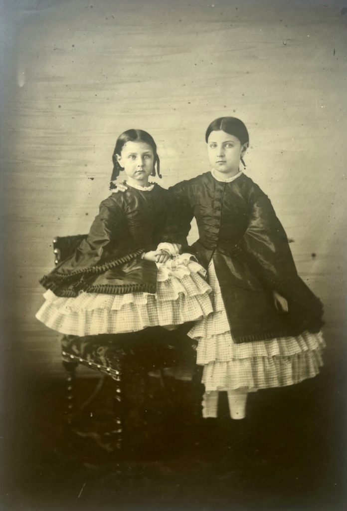
Two little boys in a studio, brothers, maybe twins. They wear luxurious clothes based on the military frogging of a hussar or a dragoon (complete with miniature gaiters), softened by a white curly frill at the collar. Their hair has been ruthlessly brushed, probably within the last few minutes, just before the picture was made. I suspect a governess remains inches out of shot. The hair cut slightly long, just long enough to cover the ears but cut high over the nape, identical side-partings. The boys look at the camera with what looks like a touch of hauteur – but I think is more likely apprehension. The elbow of the standing brother rests on the shoulder of the seated one and there is no space between them. Together they have a mass, a solid girth across the middle which makes them less frail than they might otherwise be.
Pierre-Louis Pierson, Portrait of A Child, 1860s or 1870s. Courtesy Roland BelgravePierre-Louis Pierson, Portrait of A Child, 1860s or 1870s. Courtesy Roland BelgravePierre-Louis Pierson, Portrait of A Child, 1860s or 1870s. Courtesy Roland Belgrave
Hard not to be enchanted by these wonderful portraits. To a modern eye, they have something of the feel of Diane Arbus: we get to stare at specimens from a life lived otherwise. Picture after picture with a lovely triple combination of highly polished luxurious conventional clothing marking very high social status; the visible workaday evidence of the workings of a busy studio; and the utterly compelling – and slightly weird – gaze of these children facing us over the gap of years.
Our prints come from a substantially later printing of a group of portraits of children – associated with Braun in pencil annotations on the back. They bear numbers, probably negative numbers, either on the images themselves or on their backs. Those numbers have not yet been matched to any list.
Pierre-Louis Pierson, Portrait of A Child, 1860s or 1870s. Courtesy Roland BelgravePierre-Louis Pierson, Portrait of A Child, 1860s or 1870s. Courtesy Roland BelgravePierre-Louis Pierson, Portrait of A Child, 1860s or 1870s. Courtesy Roland BelgravePierre-Louis Pierson, Portrait of A Child, 1860s or 1870s. Courtesy Roland BelgravePierre-Louis Pierson, Portrait of A Child, 1860s or 1870s. Courtesy Roland BelgravePierre-Louis Pierson, Portrait of A Child, 1860s or 1870s. Courtesy Roland BelgravePierre-Louis Pierson, Portrait of A Child, 1860s or 1870s. Courtesy Roland BelgravePierre-Louis Pierson, Portrait of A Child, 1860s or 1870s. Courtesy Roland BelgravePierre-Louis Pierson, Portrait of A Child, 1860s or 1870s. Courtesy Roland BelgravePierre-Louis Pierson, Portrait of A Child, 1860s or 1870s. Courtesy Roland BelgravePierre-Louis Pierson, Portrait of A Child, 1860s or 1870s. Courtesy Roland Belgrave
The children are certainly well-to-do. Their clothing is fine, even super-fine. They have deeply expressive faces, certainly sometimes a little apprehensive about the frightening business of being photographed, sometimes a lot more confident than that. I assuredly see disdain in one or two of them; and one (the little girl whose head is cradled by the respectfully bowed assistant behind) looks like she has just been told off one time too many. Don’t move. Stop wriggling. Look at the camera. One instruction too many – and out came that glare. Their expressions are what first held my own eye: direct contact with young people a century and a half ago is still pretty uncanny. There is some business going on between singles and pairs: two girls in matching outfits, darker above and lighter below. The smaller one has been told to hunch her legs up uncomfortably to bring her eyes to roughly the level of her (putative) sister’s. Those gentle respectful servants I suspect belong to the studio and not to the children. It looks like they use a practised over-and-under grip, the grip of people who have held a hundred squalling children for the relatively long exposure time required. Their clothes look arty-workaday rather than grand livery or uniform. No doubt those assistants were fated to be blown away in a nineteenth century forerunner of Photoshop – double printing or overpainting – as they would surely not have been intended to stay in the view.
I wish I knew more. The children are nicely behaved, all of them. But that’s for the picture: the child is itching to get out. The eldest of the young ladies, in her bonnet and richly layered skirt, has mastered the rudiments of poise; but even she, you can see, is daring the photographer to need another plate. They remind me of many photographs and of none. In the end we don’t know. But I defy you not to enjoy meeting these kids. They’re splendid and yet slightly weird. They’re completely of our own own acquaintance and not at all.
Pierre-Louis Pierson, Portrait of A Young Lady, 1860s or 1870s. Courtesy Roland Belgrave
I’m sure a costume historian will be able to date them more accurately, but they seem to my very approximate eye to be from the 1860s or maybe from the 1870s. The prints themselves are considerably later and are silver prints, not the original albumen. I suppose the prints to be from 1910-1920, although again scholarship has not yet been turned loose on them. The same historian will correct me, but the children look to be wearing expensive and well-made clothing, as clean as could be. Remember that nineteenth century clothes were heavier than our own (no central heating) and tended to be worn far longer in the absence of labour-saving washing machines. It’s not at all rare to find heavy creasing and soiling in nineteenth century portraits, and these have almost none of that. Even allowing that they spruced-up for the pictures, these children are turned out in high style. They had lots of servants, whoever they were.
Many elements recur: the footstool occurs often. The heavy turkey carpet flung over a table or lectern to lean upon through the long exposure; the chair with tassels on its shoulders; the straighter chair with barley-twist members and heavy nails to its upholstery; the spindly metal chair. These things are fairly standard studio props of the time: used as much for steadying wobbly sitters as for any intimations of class or caste. The carpets are not always sharp, but they seem to recur as well.
There is also just visible in the picture of the two boys a metal stand, seen only as an extra leg under the chair. That is is also seen again in the series. I even wonder whether the various props of childhood – the hoop, the ball, the hobby-horse, the dolls – were not also studio props. They don’t seem quite to entrance the children as they would were they their own. At first sight, we’re not going to get so very far with these. But wait.
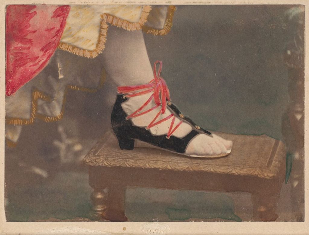
I think I’ve seen that footstool before. It’s only a little footstool, not rare, not fancy. But it irritates me. I can’t find it, can’t quite place it in memory. But I’ve been thinking of Pierson and it’s worth a trawl. Bingo – and in close-up! In the collections of the Metropolitan Museum, a group of pictures for that time risqué – even now oddly provoking. The Countess of Castiglione’s foot in a curious shoe, credited as it should be to Pierre-Louis Pierson. Laced and buttoned, with the toes exposed and a low heel. The Met calls these shoes Les Cothurnes – a rare word normally translated as ‘half-boot’ but sometimes used to describe those vaguely Roman military sandals with endless criss-crossing of lace up the calf. But I don’t really care about the shoe any more – although I nod once again in passing to the Castiglione’s superb flouting of convention. The shoe is resting on our footstool. I’m sure it’s the same.
Pierre-Louis Pierson, Les Cothurnes, 1861-1870. Metropolitan Museum.The Countess of Castiglione in Collaboration with Pierre-Louis Pierson. La Castiglione – Funérailles 1861-1870. James Hyman Gallery.
And there are others, at the Met and elsewhere. The fine English gallerist James Hyman showed a variant print of the same shoe on the same footstool, this time without the overpainting, in his splendid exhibition devoted to the Castiglione (June-August 2022). So I look there. His website is almost as well-ordered as that of the Met. In another print, the Castiglione is in deep mourning. She turns her back on a little cluster of studio equipment to be cut out of the finished print when the time comes. A black curtain. A low support of a recognisable shape, metal, curly. And that support, although it’s far less clear than the footstool, might easily be the one propping up our little child here on the hobby-horse and lurking in several other of the pictures here. The height which we see clearly in the Castiglione picture would explain why it was used. In the picture here, we see it only as a shadowy structure below the horse and therefore not obviously useful for steadying the subject. But once we know how tall it is, we see how it’s height would be all-but concealed behind the centaur of horse-and-child and yet still offer good support through a longish exposure.
Pierre-Louis Pierson. L’Enfant Blanc, 1860s. Metropolitan MuseumThe Countess of Castiglione in Collaboration with Pierre-Louis Pierson. La Castiglione – Alta, 1861-1870. James Hyman Gallery.
It goes on: the same stand clearly appears in several Pierson studies of a boy with curiously brushed-out hair (L’enfant Blanc) in the collections of the Metropolitan Museum. In another view by Pierson of the Castiglione from the Hyman show, the Countess reclines on a heavily-embroidered straight chair with heavy tacks spaced exactly as they are in our pictures here. Is it definitely the same chair? I couldn’t swear to it, but it looks too much like it to be a coincidence.
Plainly, more research is needed and more research can easily happen. Who are these children? That seems the first question. These are later prints, probably – as I say – of the period 1910-1920, and they are silver prints not the albumen prints they would originally have been. We don’t know why they were re-made, and we certainly don’t know why the finishing and finicking – which would have removed the two solicitous young men holding still the heads of a pair of very young sitters in one picture, and probably removed also that intriguing metal stand which props up several of those sitters most likely to wobble – was never done before these were reprinted.
It may well be that some of these faces recur, in photographs or in paint and can be certainly identified (although not yet by me). But I think we have seen enough to believe that these pictures come from the studio of Pierson, society photographer to the Deuxième Empire, and these haughty children are absolutely the kinds of people he specialised in working with. They’re wonderful for character and that in itself might be enough to say they’re by Pierson. The connection with the Braun name is easily explained. The Braun corporation is in question, not the person. Pierre-Louis Pierson was Adolphe Braun’s son-in-law. Adolphe Braun invested in Mayer & Pierson, and Pierson was eventually to be a director of the Braun firm. These pictures were to be held in the Braun archive, reprinted for sale in the Braun darkrooms or later on the Braun presses, marketed and sold in Braun catalogues. The connection with Braun is real. But I don’t think they were actually made by him. It hasn’t been proven yet, but there’s little room for doubt. These are portraits of super-privileged children – maybe even imperial French children or royal European children from beyond France – by Pierre-Louis Pierson, whose glittery Paris studio was to become one outlet of the commercial empire that Adolphe Braun built.
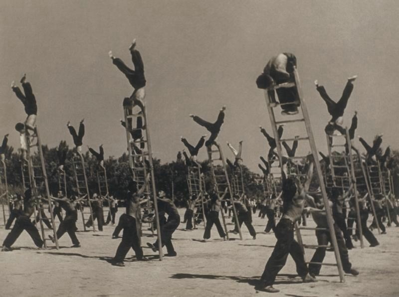
Collective Gymnastics on Ladders, by Max Penson, 1930s
With PhotoLondon opening this week, I found myself remembering that great photography was shown at Somerset House before PhotoLondon was ever a thing. There used to be housed in the Embankment Galleries at the lower level the great hoard of the Gilbert Collection, since then moved to the Victoria & Albert Museum. The Gilbert Collection, for reasons which were not very clear, hosted a succession of very good exhibitions of photography of Soviet origin, curated by Olga Sviblova of the Moscow House of Photography (as was) and paid for – and this might indeed explain why they happened at all – by Roman Abramovich. One of them was devoted to Max Penson, and this picture is his.
Penson was born in 1893 in Velizh, about half-way between Moscow and Riga. He went to art school in Vilnius in Lithuania before he was forced east by the anti-Jewish pogroms of the first world war. He settled in Uzbekistan and worked from 1926 until 1949 as an official photographer for Pravda Vostoka, the “Truth of the East”. His pictures were circulated by TASS, and he had more than one spread in the famous Soviet magazine “USSR under Construction”, a journal whose uninspiring title conceals a goldmine for anybody interested in the history of Russian photography. So Penson found himself in the privileged (and dangerous) position of being paid to chronicle the upheaval as Uzbekistan was dragged kicking and screaming into the Soviet century. The clash of cultures between the traditional Uzbek and the Soviet is the subject of Penson’s work.
Penson’s manner was modest, but we learnt that he had a quiet streak of non-conformism that was amazing when what you were supposed to conform to was laid down by Stalin, with the very present risk of not complying. In the catalogue essay of that exhibition from 2006, Olga Sviblova drew attention to the way some of Penson’s retouching work seems so exaggerated as to be ironic, and the same impression comes from much of the photography itself. We see a photographer who knew how to make the images that his masters required, but who seemed to build into them a degree of whimsical irony. Is it only hindsight that imbues these pictures with the seeds of their own parody? Penson’s compositions are strikingly graphic, sometimes in a kind of dutiful but rough homage to Soviet social realist tendencies (although he never seemed quite to commit himself to those in full).
This picture of collective gymnastics does not show the kind of perfect harmony that was expected from such displays. Instead, the acrobat nearest to us has very visibly lost his balance and his supporting partners are within an ace of dropping the ladder. It might have spoilt the display a bit, if you were minded for military precision. The minute you notice it, you can’t help but see that all the others are more or less teetering, too. Ladders are definitely not parallel. One or two athletes didn’t get the order to wear the dark trousers. Suddenly, the whole scene is punctured a bit. That little wobble, and Penson’s courage in preserving it, makes all the difference to the picture. It’s the wobble that survives.
This is one series that has been swirling lazily around in my mind for so many years that it’s now obviously a part of my mental scaffolding. I first saw them when I worked at the Photographers’ Gallery and I was moved by them. So the series goes straight into my virtual collection, and not just a single picture. I absolutely love them and have loved them consistently, so I’m having all of them. They’re by Matthew Dalziel and they’re called called Images for Hugh.
Matthew Dalziel, from the Series Images for Hugh, 1986/1987
About ten years ago, I wrote to Matthew to ask a little about them, and this is how he answered :
“Thank you for getting in touch and giving me the opportunity to reflect on images I had completely forgot about but which were very important to my development as an artist.
The exhibition was called Mysterious Coincidences and was at the Photographer’s Gallery, London from the 4th December 1987 to 16th January 1988. The exhibition was curated by Susan Beardmore (now Susan Daniel McElroy) and Alexandra Noble. My work was called ‘Images for Hugh’ which was dedicated to a close friend who died a young man in his twenties. Hugh and I worked together in an engineering factory in Cumnock in Ayrshire, Scotland. I left engineering to go to art school in Dundee but I returned every now and then to see old work mates. On my first visit back which was about two months after Hugh’s death they told me that Hugh’s milk bottle with his oily fingerprints on it was still on the shelf where he left it, no one would touch it or remove it. That image remained with me and when I was studying documentary photography at Newport College I spent a lot of time photographing with 5x4inch cameras in the dock area particularly the engineering sheds. Similar traces abounded throughout these sheds, as had been where Hugh and I worked. This subject matter was normally always presented in black and white and making it a colour work seemed to be quite innovative and unusual at this time as I was included in this big show with big names in British photography while I was still a student at Newport. “
They were innovative, indeed, and it was a departure to use colour for such a subject. The Mysterious Coincidences show is well worth remembering and the catalogue is well worth digging out – the young Dalziel was in wonderful company. And what Dalziel can’t properly have said, I can: they’re exceptionally beautiful pictures as well as innovative. As photographs often do, they bring beauty to subjects which had none of their own. Although it’s great to see an artist whose interests and tools move on, I rather regret that the series is not better known. You can’t, for example, see these even on Dalziel’s current website (https://dalzielscullion.com/), no doubt because they predate his collaboration with Louise Scullion.
I don’t need to add much more except maybe this. I feel there is a peculiar quality in these grubby close details which invites very concentrated looking. They both imitate and reproduce the little emotional shock one gets when something small or trivial or unremarkable suddenly reminds us of someone no longer alive. The photographer – because of the memorial quality lurking under the work – had done his looking harder than normal. Hence the relatively slow and cumbersome large format, the nearness, the precision, the absence of much background, and the colour. Somehow that hard looking invites viewers to look very hard back. By my reckoning, these add up to a far more powerful series than many better known. They’re one of the great memorials that I know. So I’m having them.
Matthew Dalziel, from the Series Images for Hugh, 1986/1987Matthew Dalziel, from the Series Images for Hugh, 1986/1987Matthew Dalziel, from the Series Images for Hugh, 1986/1987Matthew Dalziel, from the Series Images for Hugh, 1986/1987Matthew Dalziel, from the Series Images for Hugh, 1986/1987
It’s been quite a time that I’ve been obscurely dissatisfied with ordinary photographic monographs. I suppose I shouldn’t complain: I’ve written texts for dozens of them, usually as an introduction before the pictures, and usually found much to like in the pictures concerned. No doubt the good ones still keep coming; the great ones, too, and probably at the same very slow rate as ever. But I’m getting a bit lost.
Photography books have boomed. Anybody who goes to any of the interminable book fairs that have latched on to all the major festivals of photography will see that at a glance. Interchangeably at Arles or at the Tate while PhotoLondon is showing or at ParisPhoto, tables seemingly hundreds of yards long piled high with books. There are too many of them to keep up, and the median levels of quality or intrigue or even beauty seem not always to be high. Monographs are too often paid for by the photographer or their gallery, so I don’t even see the commitment of an outsider’s time and budget that happens when a publisher takes a book on. Too many of them are simply promotional material and I’d often rather wait to see the exhibition if it ever comes. Too many of them are printed only in tiny print runs which seem to me aimed at the handful of collectors of photo-books and not really intended to circulate the ideas of the photographer. I often find that monographs smell of ‘projects’ to me – sets of pictures made in defined circumstances really just to see if a set of pictures could be made in those circumstances.
I dismiss nothing and nobody here; but I observe my own dissatisfaction with books of this kind. Instead of chasing them, I’ve rekindled an old enthusiasm for one subset of photographic books which maybe don’t get quite as much attention as they could. Look at this wonderful spread:
Spread from pp 356-357 of Une Collection, Maison Européenne de la Photographie, ActesSud/MEP 2015. On the left, Matthieu Pernot, Implosion, Meaux, 24 Avril 2004 On the right, Mohamed Bourouissa, L’Impasse, 2007, de la série Périphérique.
All these pictures come from books quickly scanned or photographed by me. I am aware that the quality therefore leaves much to be desired. Sorry about that.
A speedy photograph of something that will vanish before it can be studied, next to a slow photograph of something whose normal existence is quick. The one is wholly documentary in execution but tends to reverie in meaning; the other which seems factual was wholly acted by the subjects and classically composed by the photographer. Both comment (if you’ll overlook my crude shorthand) on the urban environment. Each is changed by being next to the other: the staged, almost sculptural grouping of Bourouissa’s boys reminds us just how many more tower blocks need to be torn down, and how the realities of social urban planning have fallen short of the dreams it was launched upon.
No one photographer could have done this. This is the experience of selection, of comparison. It is a harmonic display of photographs compared to the single melodic line of most monographs. It comes from a book which is simply titled ‘Une Collection’ – a sampler edited in 2015 from the many thousands of works held by the Maison Européenne de la Photographie [MEP] in Paris. I think it’s a very fine example of a genre which has slipped a bit away from the highest visibility. Unlike a monographic study, a sampler from a collection has a past of its own, separate from whichever history may be referred to in the pictures. The MEP derived from Paris-Audiovisuel, itself a curious co-dependant of the Mois de la Photographie in Paris, which started in 1980. The holdings, in other words, from which the book picks a few, were not assembled in one gesture, seamlessly. A collection has a curator who may or may not be the editor of the book. A collection has one or more stated purposes, but is also always plentifully affected by the chances of networks and markets and financial necessity. The result is that pictures are thrown together in ways which are often not quite deliberate. And those collisions can seem quite odd even a few years later. Curators and editors have to make sense of them in original and personal ways. This bypasses that curse of modern art practice, by which creators have to justify so much of what they do in research terms that they seem almost to build-in the critical response to their work in the texts they prepare to go with it. I persist in thinking that many monographs are ruined by this. It’s defensive and pretentious and in the end reduces pictures to a supporting role illustrating the words that accompany them. That does them no service. I believe in pictures; we should be able to trust them to carry all the burdens of communication, however complex or sophisticated. They don’t always need academic parsing or glossing.
Books of collections, then, reflect multiple and sometimes contradictory impulses. I’m tempted to call these books polygraphs – not just by contrast with monographs, but also because the lie-detector is so-called precisely because it measures many different impulses at once, which is exactly what books of collections do. They often show passages in the building of the collection which were maybe less successful or simply weird. They resist the simple tag-lines so beloved of press releases and invite readings which are nuanced, perhaps even critical. You can like or dislike a monograph, it seems to me, but anybody who merely likes or dislikes a collection has really not got beyond the surface.
I worked on a book of this sort, devoted to the very curious photographic collection of the Musée Réattu in Arles. It was a revelation. Only years after the museum had begun to collect did its curators even loosely begin to think about what they should add and what was not for them. A peculiar relationship with the Rencontres literally meant that many pictures which had been shown at the festival but which photographers could not afford to ship home afterwards were simply given to the museum.
This vision of the museum as a respectable skip or dumpster is offensive to those of a sensitive disposition – but one can’t forget how often collections are started or driven by a single person at a time. If that person has prejudices or simply circumstances which tend in one direction or another, the collection will infallibly reveal how those worked. One example which I take to be fairly representative would be in the collecting interests of Beaumont Newhall, the historian and curator of both the Museum of Modern Art in New York and of the Eastman House in Rochester and as such a figure very central to the entire history of collecting of photography in the West. Newhall, although he spoke good German, began to collect for his major history in the 1930s. For that reason, as noted by the historian Marta Braun, he was not able to visit photographers and collectors and dealers in Germany as much as he usually liked. The resultant gaps in the United States in the mainstream appreciation of German photography have simply not yet been fully plugged.
One thinks of all the brilliant curators who have worked with tiny budgets to do something – anything – photographic in institutions which had not yet really ‘got’ photography. The collections of the New York Public Library and of the Library of Birmingham which are both incredibly rich, even on the world scale, were both started by archivists (Julia van Haaften in the former case; Pete James in the latter) combing through the holdings to re-classify important photographs from whatever subject they had been filed under to a new and specifically photographic order. Again quite literally, there has in these cases been the generation of incredible photographic riches simply by altering the library index cards which alluded to them.
So collections have histories of their own – individual and institutional mixed. When books come out of them they may acknowledge those histories or may loftily or blindly ignore them for us to find later. The great English picture editor Bruce Bernard, had connections with journalism and specifically with the Sunday Times which quite overtly underpin his magisterial Sunday Times Book of Photodiscovery. When he put together a collection for the Barbican (it was called All Human Life and was shown in 1994) it was sourced from the Hulton collection – the descendant of Picture Post and Lilliput – and necessarily still journalistic in flavour. But by the time he came to putting together the private collection for James Moores which was published in part as One Hundred Photographs (Phaidon, 2000), the rules were looser whatever his own roots. One memorable sequence in One Hundred Photographs runs like this:
Jeanie Wilson, Calotype by David Octavius Hill & Robert Adamson , 1845A Gisele Freund colour portrait of Matisse, 1948Jacques-Henri Lartigue, A Bord du Dahu II, Bibi et Denise Grey, 1926
There’s Bruce Bernard in that sequence, for sure.
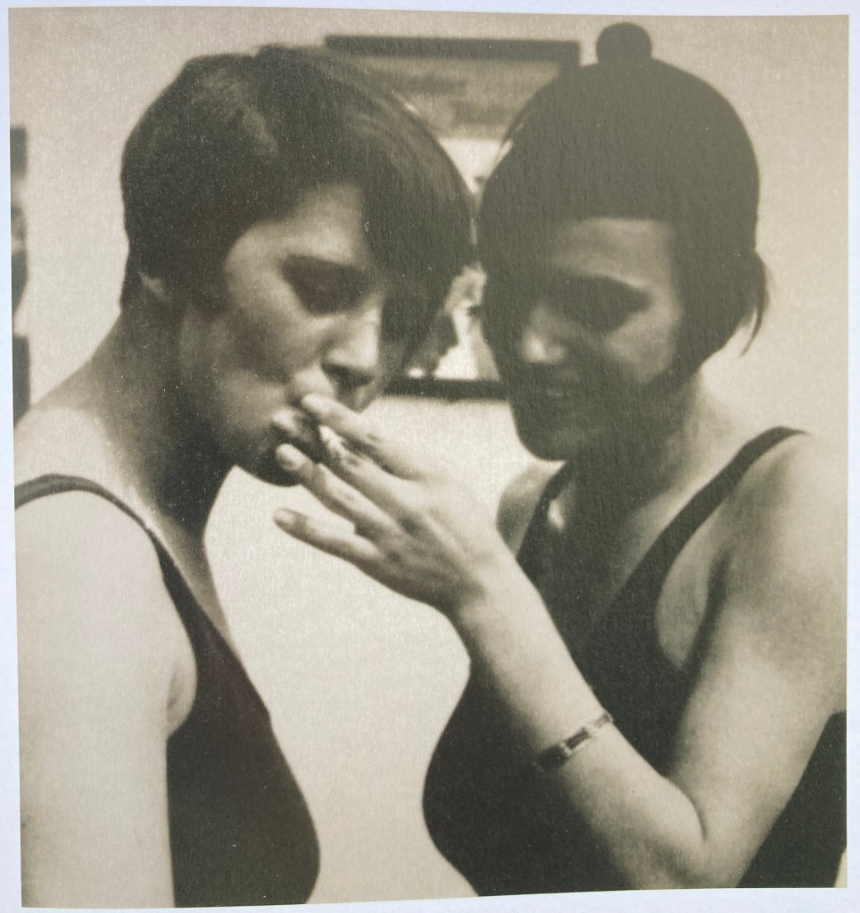
Henry Guttmann, Two Girls Smoking, Berlin 1929
Great collections show traces of their antecedents, too. The English gallerist Michael Hoppen produced a lovely and quirky and lightly scholarly book of his own collection (Finders Keepers, 2012) and sure enough, Hoppen found a print of Two Girls Smoking by Henry Guttmann some years after seeing it in All Human Life – and reproduces it with a generous credit to the importance of Bernard in the formation of his own tastes. There are often great lines within collections of that sort, many of them yet to be traced. Be they curators or dealers or less formally just mentors, there are dozens of links down through time. To trace the influence of Sam Wagstaff or Weston Naef or Pierre Apraxine or Ute Eskildsen or Helmut Gernsheim beyond the works they owned (or cared for) would be a monumental but very revealing task. Who, for example, was not influenced by the incredible proselytism of Harry Lunn? Lunn was the great American dealer (and CIA man) who in later life lived in Paris and who patiently built the markets in early photography, in particular, and also in such later photographers as Ansel Adams or Robert Mapplethorpe. Lunn proceeded with great generosity by lending works, explaining processes, researching biographies. I know it because he was often so generous to me, most especially when I worked at the Photographers’ Gallery in London as a tyro print dealer. But he also shrewdly developed the cult of the limited print, and pioneered the wholesale purchase of photographic estates. Look out for traces of Lunn wherever you go in photography for, although he died in 1988, we are not yet out of his shadow. Is it possible still to say that the whole market in photography is a reflection of Lunn’s tastes and habits and circumstances? An exaggeration, but not maybe by much. It might be fun to collect the mentions of Harry Lunn in the acknowledgements pages of the books of the collections he inspired or enabled.
In Viewpoints, the catalogue of his personal collection made over to the Museum of Fine Arts in Boston by the great New York dealer Howard Greenberg, the following sequence appears.
David Seymour (“Chim”). Child in Residence for Disturbed Children, Tereska, Poland, 1948Gjon Mili. Picasso Drawing with Light, 1949Ralph Eugene Meatyard, Untitled, 1956Manuel Alvarez Bravo, The Daughter of the Dancers,, 1933Henri Cartier Bresson. Madrid, Spain, 1933
The caption suggests that the squiggles made by Chim’s subject are meaningless. But we remember enough to cast doubt: one of the more famous of Jackson’s Pollock’s paintings comes from that same year. It was called No.5, 1948 and was for a time the most expensive painting ever sold. Not all squiggles are deemed to be meaningless. The next page is explicit: in one from the series of their great collaboration, Gjon Mili catches Picasso drawing with light at Vallauris in 1949, a perfect minotaur in his own manner. Squiggles tamed. We turn a page, and Meatyard invites us look at two squiggles, not one. A twisted wire on the wall (familiar to later viewers as a motif that recurs often to Roger Ballen) looks vaguely rude, but is impromptu, informal, ‘found’. Above it, a window grille (wrought iron or cast iron, I’m hazy on how to tell them apart) gives a kind of Moorish delight in the tight restraint applied to its own curlicues. In the next picture, the little window has been brought down to eye level and the squiggles have loosened to little more than marks. Then Cartier-Bresson still has one figure looking at the wall with his back to us, but his windows are aligned like musical notation, a kind of hymn above those children nearer the camera. This is a soaring sequence of pictures, taking small pictoral gestures and twisting them like a fugue through each next picture. Greenberg and his editors are showing us how order can be given to the seemingly endless happenstance of photography. It’s a wonderful demonstration, and one paralleled many times in the kinds of books I’m alluding to.
That Meatyard picture, by the way, is itself a huge reminder of how published and circulated pictures carry links within themselves – and how those links are themselves a lurking or subcutaneous part of the collection which goes on to house them. Meatyard made the Georgetown Street series (they’re from Lexington, Kentucky, where he lived) in company with a still-young Van Deren Coke, and the pictures were exhibited in 1957 at the Photographers’ Gallery – a short-lived gallery in West 85th Street in Manhattan run by Ann Kuriakin who was Roy de Carava’s first wife. In the year of the picture, 1956, Meatyard and Van Deren Coke attended a summer school run by Henry Holmes Smith at the University of Indiana, where they met and began largely to be influenced by Minor White and Aaron Siskind. Those are some of the connections right there which made Greenberg the gallerist he was. To trace them through his collections seems obvious – and not merely as a dusty exercise in doctoral writing.
Greenberg wrote as the epigraph to this particular volume of his collection (he has put together several others over the years) “When something special comes along, I know it. But the collection was never about scholarship. I wasn’t trying to collect the history of photography. I never had a thesis. It came from the heart.” That’s clear: many collectors have followed the same principle. Others have tried to follow a theme. Sometimes these are dutiful: a museum of this or that will collect this or that by right. Joachim Bonnemaison collected only panoramic images, and although the old book of his collection is masterly, it is still a little prim. But how can you not be seduced by the collection of Henry M. Buhl, in which the prime collecting thread was that the pictures should always show hands? Or the collection of William M. Hunt, which only admitted pictures in which eyes should be hidden or closed? Both, by the way, are beautifully published, with two very different and equally exciting forms of writing to go with the pictures.
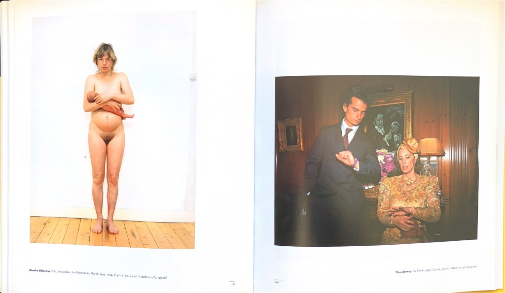
Here is just one spread from the Buhl collection. It asks for no especial commentary, I think.
On the left, Rineke Dijkstra, Tecla, Amsterdam, May 16th 1994. On the right, Tina Barney, The Watch, 1985
And here is one single image from Hunt’s collection, of Alice Neel, photographed as Hunt puts it “exhaling and escaping the weight of her being”.
Alice Neel by Robert Mapplethorpe, 1984
Hunt includes, by the way, a great punch to the stomach of a Joel-Peter Witkin – a headless male cadaver on a stool, nude but for a pair of dark socks. It’s shocking, and Hunt discusses why it shocks in careful, thoughtful sentences (“Possessing this photograph seemed unthinkable. Whatever the limits of taste may have seemed, this passed beyond. Possessing it was my statement of independence from all conventional considerations.” Is something changed by the fact of Hunt being the collector of this and not the photographer?
At their best, polygraphs – books of collections – do something that individual monographs cannot. They allow pictures to crash or nestle together in ways which are telling. They do miss the first-hand encounter with pictures direct from the photographer, sequenced or otherwise presented as the photographer wanted – and that’s something. But they provide much else that I’m enjoying at the moment. I’m staring at the delightful scholarly volume on the collection of Julien Levy by Katherine Ware and Peter Barberie (Dreaming in Black & White). I think I feel a bit of a browse coming on. Or maybe I’ll just have a look a Jeffrey Fraenkel’s The Plot Thickens, on his own collecting. Plenty to choose from.
I don’t remember when I first saw Helen Chadwick’s Viral Landscapes – I suspect I went to the Museum of Modern Art in Oxford and saw them there in 1989 – but I do know that I have never forgotten them.
I think there were only five of these extraordinary pictures in the series, although I surprise myself now by finding what seem to be variants online. They were exhibited in a long straight line without any space between the frames, and the effect they had was very strong. They came from an artist’s residency Chadwick had won on the Pembrokeshire coast, and they combined so many things that have become commonplace since. That they were somehow medical is obvious from the title; they were rooted in the fear of HIV. As always with Chadwick, the process that underlay them was far more meticulous and far more formally researched than the apparent violence of the surface suggests. She wrote pages of notes on what she was trying to achieve, and arrived at her results by a meticulous (and very scientific) staircase of small changes based on previous results. I believe I read somewhere that she even posed herself on the shore in postures from Old Master paintings to more properly match her body to the developing pictures she was making.
To arrive at the painted parts of the picture, Chadwick spread paint on the water and ‘harvested’ it on canvas a bit in the manner of marbling paper; she used photographs of cells from her own body (hence the long thin shape of a microscope slide). She made the landscape elements with that very steep curve of the horizon to remind us that the self is made of cells – little round tight balls of surface tension. And she bound the lot together using early computer programmes: the whole a process perfectly blending scientific practice and artistic.
To my eye, the Viral Landscapes take their place in several different families of imagery. They’re autobiographical in some oblique but important way; they’re plainly scientific; they are specifically to do with the environment and a sustainable human relationship with it, questioning our place in the world; they belong with that marriage of technique and delight in the natural world that drives people like Susan Derges; they have their place in the (related) list of sea-scapes made orderly by technique, ranging from Turner through the mighty Atlantic headlands of Thomas Joshua Cooper or the featureless wastes of Hiroshi Sugimoto. In my own personal mental collection, they come very close to the lovely painted Cibachromes David Buckland made of the headlands in Dorset where he learnt to push his kayak beyond safety.
Helen Chadwick died absurdly young in 1996. She had by then been a teacher at Chelsea, the Royal College of Art, Goldsmiths, St. Martins. She was plainly highly influential on those grounds alone. She was written about by critics of the calibre of Marina Warner, and that in itself is a form of influence. But the generation (shall we lazily tag it the generation of the Young British Artists?) which was directly influenced by seeing her work fresh, in all its sharpness and wit, its anger and self, is itself waning now, and its high time we paid her attention once again to Chadwick.
Dreaming Difference, by David Williams Scottish Photographic Artists #2, Published by the Scottish Society for the History of Photography and Edinburgh University Press 2023.
David Williams, ‘Is’: Ecstasies #V
David Williams, ‘Is’: Ecstasies #VI
David Williams, ‘Is’: Ecstasies #XIV
The first of David Williams’ series that I came across was ‘Is’: Ecstasies I-XXII. They were in the Print Room of the Photographers’ Gallery when I came to work there at the end of the 1980s, needing exhibition and sale. I immediately understood that they were musical in their essence – neither abstract nor factual but both. He’d been a musician, I knew, and had been ill enough to make performing difficult, and this was perhaps a translation of something musical. I felt they were quantum photographs or Schrödinger’s photographs which managed to be both of their subjects and not of their subjects at the same time. This seemed to me then (and still seems to me now, so many years later) far more than a successful trick in a series of photographs: it was a big lesson to me. It was a lesson in the impossibility of keeping photographs in tidy pigeonholes. It seemed to me as foolish to look at ‘Is’: Ecstasies XIV and ask “But what’s it a picture of?” as it might be to listen to Art Tatum and ask the parallel question of the music. Photography is very often an applied art, no doubt of that. It does jobs for people, has uses, carries the power of messaging. It can be solid, practical, easy to read – and when it needs those qualities, it has them in spades. But those qualities won’t help you when you come to try to understand or even appreciate certain photographers. David Williams is one of that group. When I looked at those little dark pictures with their sharp scratches of light, my best chance of understanding them came from remembering how I approached music, how I sometimes felt I knew that it worked. I had never heard the description he has remembered in this book that his fellow boarder at a Cistercian monastery once came up with, of those pictures as blues photographs – but I recognise it absolutely.
There’s another thing. Williams has always defined the professional conventions of photography to suit himself – he is a photographic artist who has found a system that suited him, not a professional camera operator who has sometimes had the leisure to aspire to art. To try to get an impression of what I’m suggesting, ask yourself what André Kertesz’s job was. He sold pictures to magazines, sure enough. He worked for Vu, for years for House & Garden. But you don’t begin to understand what he was up to if you try to think of him as a photographic journalist. Lee Friedlander made brilliant record covers – and nudes of Madonna! – but you won’t get far if you think of him as a ‘commercial’ photographer.
Williams is like that. Professionally, he has found a long gig as an academic that allowed him to do certain things. Somebody might pay an air fare to Japan, for example. But quite quickly, he found a place with room for him that was more radical than it seemed at the time. As an academic practitioner, Williams is one of the pioneers of something which has become common since he tried to piece together the elements of a ‘career’. It’s very normal, today, to see photographers who have found shelter enough in an academic job to develop their careers as pure artists. It doesn’t even sound very radical. It wasn’t always so easy. There were fewer institutions with photographic courses, for a start. Yet from 1990 to 2017, a huge chunk of anybody’s career, Williams lived according to the peculiar seasons and stresses of an academic institution. That gave him security, presumably, and he was prepared to pay the price. Had I ever been a photographer, I would have given a lot to have been taught by him, to have had his eyes on my pictures at the outset of a career. That framework is important. Williams needed a context and he found one. But I think it’s essential that we refrain from thinking of each series that he has made from within that context as a ’piece of research’. That does the pictures no justice and reduces them to the staid procession of ‘outputs’ that academic convention requires.
So here we are. If we are not to think of Williams’ lifetime of work as ‘applied’ photography and not to think of it as ‘research’, it becomes necessary to think a bit what it might be. Of course it’s art – but that doesn’t get us very much farther.
David Williams, ‘To attract her attention… Do anything’. From the Series Findings…Bitter-sweet
David Williams, ‘Big things were easy… Wee things were difficult’. From the Series Findings…Bitter-sweet
David Williams, Stillness – Occurrence #11
David Williams, Stillness – Occurrence #3
There are one or two constants which can help us understand. In the first place, Williams has always been completely in step with the specific photographic media that he used at any one time. Those pictures from ‘Is’: Ecstasies I-XXII are silver prints, and wonderful masterpieces of that specific technique. They reek of shiny darkness and ooze light. I happen to believe that it is no coincidence at all that Williams was ill around the time he made them: they are pictures that battle against the hail-fellow-well-met fairground jollity of so much photography. Blues pictures, indeed. Roy de Carava would have recognised them straight away. I have no idea whether it ever happened, but I hope that de Carava had a chance to see them somewhere. And de Carava, I remind you, made a great, great book called The Sound that I Saw. Once again, we can see that transferring some of the habits of our appreciation of music to Williams’ images may help. Admiring the skill gets us started as it might with a Chet Baker or an Oscar Peterson. Once Williams had made silver prints like that, with a loving mastery that looks very like virtuosity to me, he switched to the wonderful Polaroids of Findings, whose clarity is just out of graspable reach, like photographs of the very act of yearning. He makes other pairs and triplets and sequences (again, the usual tools of music-making) all done with mastery. The virtuoso lighting and making involved in Source. The lovely only-just-seen of the series Stillness-Occurrence. And so it has gone on, never stuck in a rut, always learning a new instrument, always delivering total control, mastery, and (let’s use that word again): virtuosity in the particular registers and tonalities of each new process or technique.
The second constant is both more obvious and harder to rationalise. Many photographs (and the proportion only increases as the perpetual flow of imagery online gathers ever more volume) are made to be seen just once. You glance, you get it, and you move on. In the olden days before digital, nobody much bothered to pin a newspaper photograph to a wall the better to understand it (a few did, of course, but everyday readers did not). Nobody now, in the same way, much bothers to revisit a photograph seen on Snapchat or on Instagram, still less to print it. Williams’ pictures simply can’t be appreciated in that way. He asks precisely the same effort as musicians routinely get: you have to look many times at his pictures, to revisit them, to savour them, to allow your pace to be reset by them. He works, in effect, not by stories or commissions – but like the musician he still is – by moods gathered together in albums. What results is an invitation never merely to see the things that Williams has seen, but to really to absorb them and to see the wonder that he wants to show. The title of the book is a clue. Williams doesn’t really believe in difference. He rejects the binary oppositions of conventional thinking, and by extension he rejects the glib this-against-that of so much photography. He’s interested – in the lovely phrase found by Sara Stevenson for the introduction of this book – in the ‘inextricable links between difference and sameness’.
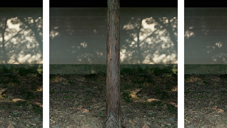
Cedar Tree Triptcyh #2 – Tofuku-ji Zen Temple (from the project series, one taste: (n)ever-changing)
I find I can discern all sorts of photographers with parallels to elements of David Williams’ pictures. He mentions many himself, peppered through Dreaming Difference : Paul Caponigro, Minor White and so on, all respectfully adduced. You could think of David Hockney in the Japanese temples, although where Hockney broke the image almost like a Cubist into dozens of fragments all seen from shifting positions over rapid time, Williams preferred a more formal break-up into much slower repeating tropes. The thought of Japan takes me naturally to the great émigré Japanese photographer Tomio Seike and his astounding series Overlook (nominally of dog walkers on Brighton beach, but in fact not at all to be limited to anything so humdrum as subject-matter); much of Seike’s thinking comes close to several different aspects of the work Williams has done around the beaches at Portobello. I could go on and on – there are echoes of Markéta Luskačová’s work with schoolchildren in the very early Pictures fromNo Man’s Land, or of Richard Misrach in that steeply plunging view from the land down to the sea. The point is not to compete in a referencing contest, of course. The point is that Williams throughout his career has deliberately and knowingly placed himself in the context of those others. He is not just a guy making pictures with a vaguely Zen or Eastern interest. He has volunteered to put himself in the crossed lines of descent of many predecessors, and that is a kindness to his viewers – it makes it infinitely easier for us to understand and appreciate what he has done.
So. What have we here, in this late career book of a photographer who has never been fashionable, but has been quietly and lastingly influential? We have a definite case made for slow steady seeing and for seeing, specifically, that doesn’t stop at the nominal subject. For Williams, the visible subject is a metaphorical springboard to thoughts often far beyond. It can take you to a philosophy if you want to follow him that far. Separately, we have the triumph of virtuosity, where the prints themselves (if you’re lucky enough to see them and not just their reproductions in the book) have the loving specificity of process that gives a material feel and size and even a smell that guides our understanding of what the images contained within those prints might point towards. And finally, we have an artist who invites us to make less of his originality, his topicality or his specificity at any one time than most photographers do. The pictures gathered here are not about what happened on the day they were made. That is an extraordinarily courageous stance to adopt: it’s a photograph, he seems to say over and over again, but don’t look first at what it’s of. Look (if you can) at what it’s about. And that will be worth your while.
I make sense of all that by imagining that David Williams has remained a musician all his career, even though he chose to use cameras rather than the sitar and other instruments which might have held him all this time. That seems to be the way he makes sense of his own work, and it works for me.
Erwin Olaf died on 20th September 2023. I wrote a number of texts for various books of his, notably for a splendid collection published by Aperture in 2014 called simply Erwin Olaf: Volume 2. What follows is remade from several of the drafts I wrote for that publication – and so is an expanded version of the text published. Of course it is out of date in some aspects: it makes no mention, for example, of the glorious series Im Wald, made after these words were written. It is also canted perhaps more toward melancholy than it would have been had it not been written at that time; but in the circumstances, I’m OK with that.
I need not explain that I was a huge fan of Erwin’s and I hope a friend. He taught me a great deal about pictures, about thinking, and about courage. Ave, Erwin, atque Vale.
I strongly wish for what I faintly hope;
      Like the day-dreams of melancholy men,
   I think and think on things impoossible,
  Yet love to wander in that golden maze.
                                          John Dryden, Rival Ladies, iii, 1.
The easiest way to see many important and fine pictures by Erwin Olaf (including many referred to in the text) is to go to https://www.erwinolaf.com/
Erwin Olaf, Self-Portrait at the Olympic Stadium, Berlin, April 2012
Erwin Olaf takes his place among the most garlanded Dutch photographers in a generation when photography in the Netherlands is both booming and spreading out in surprising directions. He’s the leader in a rapidly evolving yet highly competitive field there. He’s a wildly successful commercial photographer, widely respected also as an artist. To hold on to both of those is perhaps easier than it was some years ago, but it’s still a hard trick to get so right. Yet Olaf always insists that he treats both equally and that each adds much in his practice to the other. He works for himself; he works for others. I’m not sure that without being told, that I could invariably tell which pictures fell into which category. That’s as he wants it. He uses the same culture, the same skill, the same brilliant restrained communication on either side of a divide which leaves many photographers floundering. What he says he says with completeness and with clarity, whichever context it goes to. As it happens, this [Erwin Olaf: Volume II] is a book of his own work; but you could quite easily take any picture from here and put it in a commercial context without doing it violence.
Again and again Olaf has demonstrated spectacular skill in the technical aspects of photography. For Berlin, long after he’d reached the top of his game, and long after he had anything left to prove, he taught himself to make carbon prints, a steep task, since carbon printing is a nineteenth century technique that is demandingly arduous to do at all, let alone to do with any kind of elegance or savour. Olaf is a perfectionist photographer (he has spoken of the pleasure he gets from the flawless world in his viewfinder compared to the messy one outside it) and he starts always with the craft aspects of what he does. Large format cameras, digital manipulation, complicated lighting sets-up — he won’t use tools unless he can use them specially well. And he uses them all. He actively enjoys his own mastery.
It is routine to say of such people that they ‘make it look easy’. If you were to look only at the pictures here in this book you might think that this effortless cool, this almost constant stillness, this evenness of temper justified the cliché. But I don’t think Olaf makes it look it easy. I think it is our mistake to look for ease in the full and difficult range of a photographer who, if nothing else, has always managed to work the subtle complexities which interested him into pictures intended for less than subtle use. Even in a commercial job, Erwin Olaf takes it for granted that pictures should have depth and heft and that they should hit hard and be full.
It so happens that before I sat down to write these words I was leafing through photographs of Olaf’s while listening to an old recording of Maurizio Pollini playing late Beethoven piano sonatas. Pollini perfectly understands that late Beethoven isn’t Bach. Yet he delivers the most daring experimental music of its day, the music that effectively wrung the neck of the sonata form, on a rock-solid bed of mathematical assuredness. Pollini plays Beethoven op. 111 like soaring boogie-woogie on a heavy base of Buxtehude. Crucially, neither element trumps the other. Just so, Erwin Olaf can deliver contemporary reflections on Vermeer knowing that for many of us visual culture doesn’t go much beyond recent advertisements for Diesel jeans or Lavazza coffee.
In a number of series over recent years, Olaf has situated people alone, wrapt in inner contemplation either erotic or sad. These things have their antecedents in film or novels — and specifically in Vermeer — and they have been very well received as somehow reaching a shared level of deep melancholy beneath the gaudy sales patter of our must-rush era.
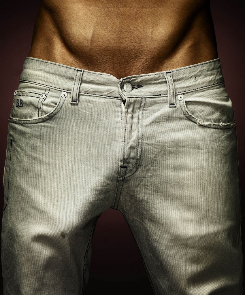
Olaf did make those pictures and they do represent something that struck deep. You can see many of them in these pages [again, I’m referring to the book, Erwin Olaf, volume II]. But before that he had also made a frankly bawdy series of close views of large cocks seen straining and bulging through jeans so tight they can barely restrain them. Those were pretty close to porn; but they were also striking for their wit, a certain joie de vivre, for unabashed hearty pleasure in things bodily. Olaf has worked very successfully with dance groups, often portraying them nude. (He has, though, had less luck with footballers. I remember a series in which Olaf managed to make the Dutch goalkeeper Edwin van der Sar, a great athlete but an earthy one the very opposite of showy, appear as camp as a row of boy scouts.)
Erwin Olaf, from a series he made for Linda magazine.
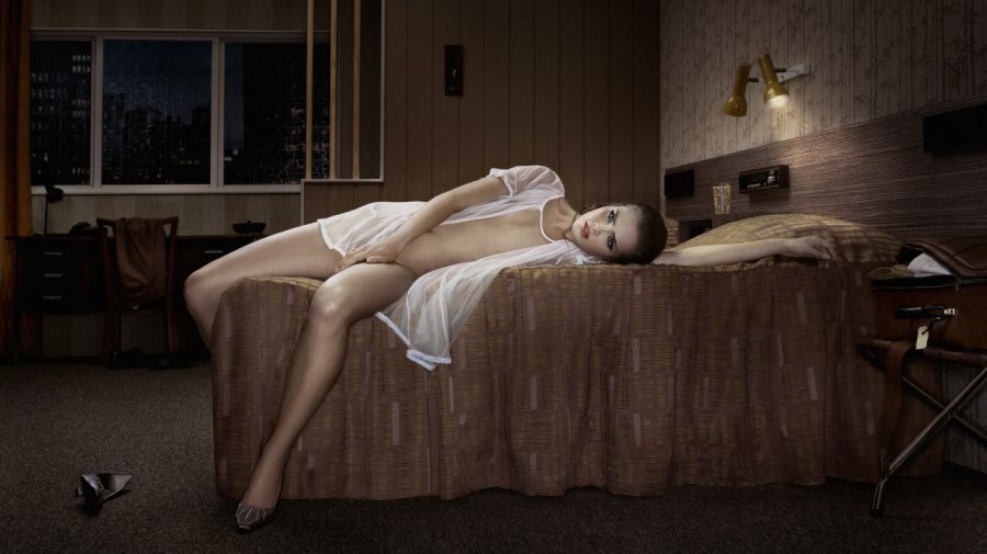
This Rabelaisian strand has not disappeared in Erwin Olaf’s later work. It has gone under; it’s under the chilliness of pictures such as the Keyhole and Waiting series. It’s under the longing wistful restrained sexuality of the Hotels.
Erwin Olaf, Kyoto, Room 211, from the Hotels series
The super-sophistication of Olaf’s late pictures that we have here — perfect 70s retro detailing in the furnishings, models of such superiority that they seem contemptuous even of the photographer; the whole made to be seen in fine art exhibitions of branded measured urban metrosexuality — is built upon layer upon layer of a different kind of photography. Remember that Olaf made in his early days a lauded book of portraits of people with mental disabilities. He’s made several unrestrained series where the bawdiness went well over the edge into bad taste — try a lookalike Princess Diana with the three-pointed star of the Mercedes she died in embedded in her flesh, for example; or try his variant of that hoary old pun of a picture where the nude man holds at waist height a champagne bottle which happens to be foaming up…). He’s made many more series where the ‘good taste’ was absolutely under control but the subject matter was close to wild: an ordinary family where parents and children are in head-to-toe black rubber (Separation) or a hysterically savage parody of the nip-and-tuck business in which a couple of bored ladies have comically extreme deformations of the features (Le Dernier Cri). Olaf has been face-to-face with lack of control and used to enjoy a Saturnalia. The cool is somewhat tempered by that; without all that hotter stuff behind it, the cool is just…cold.
Erwin Olaf made dozens of workmanlike steady portraits for commercial clients before he started to make the heightened, almost parodic portraits of his later years. I remember in particular a portrait of Princess Máxima (of the Netherlands) staring out of a window in a grey trouser suit, the very soul of Protestant royalty, respectable as could be. No doubt it was shot in a palace; but palaces look like five-star hotels because five-star hotels try to look like palaces. Only years later were we able to see that that serious picture had become the prototype for the unfulfilled mysteries of Olaf’s Grief series. I doubt that her Royal Highness’ head was filled with quite the cocktail of sex and longing and memory that Olaf put into the later series; but then, why suppose? OIaf found and worked a seam where melancholy was itself an attribute; the virtue of having once lived wildly.
Erwin Olaf, Her Royal Highness Princess Máxima of the Netherlands, 2011
I suppose that’s the point. Erwin Olaf has made no secret of two vital facts in his make-up. The first is that he is robustly gay, of the generation which knew the wildness before that world imploded with the fear and the reality of HIV. Olaf has himself said of his recent Berlin series that it was in part inspired by a terrible wistfulness for the Berlin he once knew, where he partied with the best of them.
Erwin Olaf also has emphysema. He sometimes struggles for breath, and his condition is steadily worse year by year. He asks for no great pity about this; it is a fact of his life as being a redhead might a fact of another’s. But there is no doubt that his lungs make Olaf acutely conscious both of the passage of time, and of the destructiveness of the aging process. For a person who believes as he does resolutely in the need for perfection and the value of it, a slow disease is a searing affliction not only for its physical effect, but for its constant reminder that the battle can’t be won. Olaf carries around his own pitiless Et in Arcadia every day. Olaf once made a searing triple self-portrait of himself aging. It was digitally done, of course, but it could just as well have been made in Dorian Gray’s attic.
Nostalgia, melancholy, outright sadness: they’re not abstractions for Erwin Olaf. They’re his daily bread. That man laboriously climbing Hitler’s private staircase at the Olympic Stadium, out of the darkness, and into the light? That’s Erwin Olaf, in another self-portrait, for whom a staircase is more of a challenge than it would be for you or I.
Erwin Olaf has elevated melancholy to a height reached by no other photographer. His melancholy is not that of Mathilde de la Mole (one of Julien Sorel’s two great lovers in Stendhal’s Le Rouge et Le Noir), “languissante d’ennui au plus beau moment de la vie, entre seize ans et vingt.” Olaf’s melancholy comes not from boredom, but from memory. For him, it’s not that it is fashionable to be blue. It is that Olaf has all that it takes to be fashionable; only his register is inescapably sad. When it comes to sadness, he knows whereof he speaks.
Few photographers deal as completely as Erwin Olaf in stillness. In a lifetime of making still photographs, he has only rarely even made the suggestion of movement, let alone depicted the thing itself. As we turn the pages of later works assembled here, we see a couple of figures laboriously climbing stairs, and for movement, that’s about it. Everything else is poised. No wonder one of his series was called Waiting. Not for Olaf the idea that a photograph freezes flashing glimmers of time. In series after series — and not just from these more recent ones — Olaf has invented a way of slowly filling photographs with deep melancholy, like an eye slowly filling with tears.
It is worth dwelling on this rejection of Olaf’s of photography’s customary fractions of a second. We are used to viewing pictures too fast. In the present-day never-ending flow of images, all good photographers look for ways to slow down viewers, to hold for long enough the twitching, jumpy eye that has become the standard receiver of photographs. Olaf is far from alone in that regard, although the particular solution is his. Olaf discovered that by making slow pictures, pictures which built mood and atmosphere, he had a chance of staying known to his audience. Otherwise, he was gone in that familiar flip of the thumb which turns thirty magazine pages in one go. Years ago, Olaf invented slowness as his brand, and it has served him well. A number of his great series — Hope; Fall; Rain; Hotel… — are built on the pause. We see a moment, of course — that’s all a photograph can do. But Olaf’s moments are big ones. There’s a little English phrase for that odd awkwardness when a hubbub of conversations, in a restaurant, say, or at a crowded party, all stop by chance at once. “In that hush an angel passed.” Erwin Olaf photographs those moments.
Erwin Olaf, from Rain
In his work in film, too, Olaf, has taken a rhythm slower by far than is usual. In Desire, a caper of an ad he shot for a firm called Vente Privée, in which a succession of well-heeled ladies struggling against boredom in a prosperous suburb are enlivened by the handsome delivery boy and whatever it is that he has in his box, the ultra-slow narrative was a silliness. It gave Olaf a witty way of wallowing in the languid mood of long afternoons where nothing happens beyond the silent growth of the capital in the bank.
If slowness suited Olaf as a branding trick at first, it has become something far richer. Olaf has changed; he used, by his own admission, to be a considerable extrovert. Now, partly under the sustained pressure of the long-term diminution in his health, he has become more reflective; contemplative, even.
By the time of his Berlin series (2012), everybody could see his skill at the reexamination of histories and myth. Berlin is full of quite open allusions: here is Jesse Owens, the famous athlete who embarrassed the racists in the Olympics in 1936; here is a vision from Christopher Isherwood via Liza Minelli, here another from Christian Schad or Otto Dix via Pina Bausch. But Olaf’s method has never been to say “look at the way previous people have looked at my same subject.” Instead, he shows that considering anything in depth is always also to consider the previous ways we have been told about it. Done fast, as Olaf learned to do it for commercial clients with limited patience for complexity, the risk is of borrowing a look or a style without the inner weight. Do that examination more slowly, as Olaf has liked to do it over many years in his own personal works, and the result is a lovely thick impasto of solid culture in every picture. The slowness has become an invitation to the viewer to think more deeply. We’re not asked, as we turn these pages, to see only the pictures before us. We’re asked to check our view against what we already know.
Checking previous culture has long been a mark of Olaf’s method. He has made brilliant reworkings of Dutch history paintings. His 2011 series on the vicious siege of Leiden of 1574 (every Dutch schoolchild knows about it), commissioned for the Lakenhal Museum there, is long overdue a new showing. An older series called Ladies’ Hats (1985), took the kind of heavy velvet hats of the Rembrandt self-portraits and placed them on nude upper body studies of men: classic Olaf, for simplicity, technical perfection, and a lovely twist to bind the past and the present together.
Erwin Olaf, The Plague Doctor, from the series The Siege and Relief of Leiden, 2011
Erwin Olaf, Hennie, from the series Ladies’ Hats
Previous culture does not flash through us. Previous culture seeps into the very fibres of who we are. That’s why Olaf’s allusiveness and his slowness go hand in hand. He has been able to ask us to consider not merely the overt culture of big moments in history or big painters, but the more concealed culture which makes up the person. Olaf has done a lot of work on family life (his film Separation, for example, of 2003, or the films which are seen within the Keyhole installation). Sexuality, memory, identity: these are the big themes of Olaf’s pictures because they are the big themes in of all of us.
Some time ago, he started mining his own work as well as that of others. The 2009 series Dusk, for example, was inspired in part by the pioneering Hampton Institute Album of 1899 by the wonderful American woman photographer Frances Benjamin Johnston. But when Olaf went on to make the companion series Dawn (we see some of each series here), he looked at Blacks, his own series of some twenty years before, and reversed the tonalities to a pale washed out whiteness that was wholly new. Blacks had the gorgeous rococo complexity of Grinling Gibbons; in Dawn that has become an echo, visible in a carved marble eagle, an alabaster ewer, or an ornate chair back.
Erwin Olaf, Jacques, from the series Blacks, 1990
Erwin Olaf, Still Life No. 1, form the series Dawn
This reworking has become a central part of his practice. Not only has he made a lot more films since the turn of this century; he has started to braid the films and the photographs much tighter together. The fullest development of this so far is the spectacular weaving of the several parts of the Keyhole series, in which his own work seems to have become the stimulus for the next part of … his own work.
The Keyhole photographs sometimes put us outside the scene, over the shoulder of someone staring through the keyhole, and by necessity unable to see what they see. Then sometimes we have jumped and have become the person stared at. Adolescents often feel that they are being looked at all the time; an uneasy mix of their own desire to be seen and a hesitation, a wanting to go back to that childhood refuge of being unaware of the gaze of others. That’s where the Keyhole series started. But in the two films that Olaf now projects within the installation that makes up the full piece in its latest form, he has moved further. A man takes up a child for a cuddle. A woman does the same. We see nothing untoward, yet there is no escape from a sense that all is not as it should be. Olaf is in the territory where psychology has coloured the pre-psychological readings that were familiar to all. All families have stories, he seems to say, but sometimes even the people in the family don’t know (or can’t admit?) what they are.
The Keyhole series is in one way very Dutch. When I asked him about this, Olaf cited the novel Van oude Mensen en de Dingen die Voorbij Gaan (Old People and the Things that Pass), by Louis Couperus, from 1906, in which a couple, retired from the Dutch service in Indonesia retire to The Hague. Everything seems fine, until slowly a horrible murder in their past is revealed. Olaf doesn’t need to reveal the murder: he knows that we have all read novels like Couperus’ or parallel ones in French or German or Czech or Russian or English or whichever language we did our reading in.
As it happens, the original tiny seed of the Keyhole series came when a child model on a shoot peeped through a real keyhole. His mother, present as a chaperone, put him on her knee. It might have been nothing, a blink. But every photograph starts as a blink. How big they grow is what the photographer gives us beyond that.
Erwin Olaf has become vaguely dissatisfied by the surfaces of photography, and finds in two parallel forms a relief. Photographs, protected by glass or perspex, always have an impenetrable sheen which to some extent repels the eye. We bounce off photographs, even when they are as beautifully crafted and as slow to read as his. When he works in film, that no longer happens. In film, we remain in contact with the artist for the few minutes that we watch; and Olaf feels that gives him a much better chance of saying what he wants us to see.
The extraordinary flower studies of the Fall series are a clue to Erwin Olaf’s other new direction. Still-life is by definition slow. As an artist, you pose those flowers with endless patience and they are only worth a viewer seeing if the viewer can give them time in return. As part of the vaguely hotel-derived interior-design schemes of that rich world Olaf has been describing for many years, in which money can’t buy happiness, studied vases have their place. But they become more than that in the hands of an artist for whom photography can no longer do all that he needs. At best, these studies, like the alabaster vase in Fall and a number of other pieces, show Olaf beginning to flirt with sculpture.
The little film of Karrussel (2012) is a move in the same direction. It uses a variant of that same clown that Olaf has used many times before. Clowns in Olaf’s work are Everymen, their exaggerated facial expressions standing for all of us, and their traditional compound of happiness and melancholy the perfect vehicle for the complex mix of emotions that Olaf likes to depict. In the film, we move steadily around the clown figure and his possible accoutrements, exactly as visitors to galleries of sculpture move around the pieces, the better to see the flex and bend of the material as one curve becomes another.
When I asked Olaf about the profile studies from the 2013 series Waiting (of which some are here), which very strongly made me think of the profile heads on old coinage, he laughed. I didn’t know it then, but Olaf had been working on the “Dutch face” of the new Euro coinage (the shared currency has one side used by all member countries, but each national mint is allowed to issue a design of its own for the other face), shortly to be released. It’s a great compliment to be asked, of course, but for Erwin Olaf it’s more than that. It’s another move towards sculpture, and by the same gold-and-silver token, a move away from photography, too.
Erwin Olaf is a perfectionist photographer and a virtuoso one who starts always with the craft skills of what he does. He has put together a wonderfully coherent visual language. To do that, he had to slow the photograph down until we learnt to look with the same slow steady respectful gaze that we reserve for film or sculpture or old paintings. As the creator of a host of pictures of great skill and beauty (not to mention wit), it may be that his larger achievement is that Erwin Olaf has never accepted that photography should be as slight or as quick or ultimately as trivial as the tendency of the time dictates.
All of the illustrations here are paper aeroplanes collected by Harry Everett Smith and photographed by Jason Fulford, from “Paper Airplanes: The Collections of Harry Smith, Catalogue Raisonné, Volume I”.
How information circulates is odd. This paper plane is from a collection by Harry Everett Smith. He was a Beat anthropologist, much admired, but very bearded and earnest. One source notes that “it is suggested that Harry enjoyed alcohol, cannabis, Desoxyn, dewamesk, hashish, LSD, mescaline, peyote, psilocybin ..” and that he had “difficulty maintaining a normal ordered life”. Those two observations may be connected.
I’d never heard of dewamesk, by the way, and I’d barely heard of him. Dewamesk is an edible spread containing pistachios, orange peel, butter, cinnamon, sugar, nutmeg, cloves and quite a lot of hashish. Stoner jam, in other words, and since we are still just about in marmalade-making season, it will probably be available at your nearest chi-chi deli. Dewamesk (it’s spelt in various ways) was roundly praised years before Smith tried it by Théophile Gautier, founder of the Club des Hachichins, who called it “an emerald which gave off millions of tiny sparkles” and was disappointed that Baudelaire sniffed it without taking any[1].
I wrote that I had barely heard of Harry Smith. The context in which I had is that he was the collector and editor of the Anthology of American Folk Music, culled from his own collection of old records and issued at first on Folkways records in 1952. The importance of the Anthology needs to be underlined: it was the means of introducing then deeply obscure musicians such as Blind Lemon Jefferson or the Carter Family to the new folkie crowd in 1950s and 1960s Greenwich Village. In typical fashion, Smith didn’t have the rights to most of the songs he re-released (he just owned the records with those songs on them). Through the Anthology, though, however dubiously, Harry Smith provided the links between Alan Lomax and Bob Dylan or Joan Baez. I have been aware of him in that context for a long while. I didn’t know the rest, and that means I didn’t know the half of it.
Smith was interested in shamanism, in the tribes of the Pacific North-West, in alchemy and the Tarot. He was a film-maker and a sort of dotty inspiration to a cast of thousands.
Harry Smith must have been a nightmare to have around. He collected Ukrainian Easter eggs, apparently, as well as paper planes. His finances, diet, and conversational style were all unconventional. He was at one time such a tiresome houseguest of Allen Ginsberg that Ginsberg’s psychiatrist told him he had to move out because he was bad for Ginsberg’s blood pressure. Kudos ! Managing to stress the lugubrious beatnik is a huge feather in Smith’s cap.
Anyway, Smith used to rush out into the street to collect paper planes from wherever he found them, including rubbish bins. Some of that collection survived. Jason Fulford was invited to photograph them and they were collected into a book[2] then some of them were shown as an exhibition in Terminal 3 of San Francisco airport in the summer of 2016. The book is too expensive at the moment: more than £50.00 on amazon.com and obviously rare or rare-ish. There must be Harry Smith fans out there, which is a delight. Do note, by the way, that the book is called Volume 1 of Smith’s collections. Volume 2 (I kid you not at all), also illustrated by Fulford and credited to the same editorial team) deploys for your deep interest and intellectual gain Harry Everett Smith’s collections of … string doodles. How I wish there had been one of Martin Gardner’s great Mathematical Games columns (from the Scientific American, if you don’t know them) on those, and for all I know, perhaps there was one.
Smith – like the good scientist he hardly was – often wrote the date and place of capture on his finds.
All of this I missed. There was an article in Wired. There was even an article in the New Yorker. Missed that, of course. I live in the UK and only see the New Yorker occasionally. Years passed.
Then a couple of days ago my news feed pinged up a reference from kottke.org : https://kottke.org/21/02/a-vintage-paper-airplane-collection . So here I am, incredibly late to the party, but now determined to find a cheap copy of Harry Everett Smith’s catalogue of paper planes, and very happy to join in circulating a little bit of information about him to those who may have missed him so far.
Is collecting paper planes a form of outsider art? A vernacular typology? A silly hobby or a manifestation of Obsessive-Compulsive Disorder? All of the above or none? I couldn’t care less. I’m glad Smith was drawn to doing it, glad that a number of people cared enough to keep the planes, glad that other people together with those same people were able to invite Jason Fulford to photograph them, glad that the photographs are so straightforwardly non-judgmental. Information has got to me the long way around. I guess I’m glad to catch up.
Harry Everett Smith (quite properly adhering to etiquette) died in the Chelsea Hotel. That was in 1991. Room number 328, before you ask. It seems appropriate when remembering Smith to remember the irrelevant details, too.
[1] « Mais l’idée de penser malgré lui-même le choquait vivement; on lui présenta du dawamesk, il l’examina, le flaira, et le rendit sans y toucher » Théophile Gautier, Notice sur Charles Baudelaire, in Œuvres Complètes de Charles Baudelaire, vol.1 : Les fleurs du Mal, 2nd edn., Paris, Lévy Frères, 1869, p.59
[2] John Klacsmann & Andrew Lampert (eds) Paper Airplanes – The Collections of Harry Smith: Catalogue Raisonné, Volume I. Photographs by Jason Fulford. Anthology Film Archives and J & L Books, 2015. ISBN 978-0989531139