
Nobody thinks of those profusely illustrated mid-lavish recipe books as photobooks. Yet perhaps we should. They contain as many pictures reproduced just as prominently as many a photographer’s monograph. Here’s one: Plenty, by Yotam Ottolenghi. Published by Ebury Press in 2010 at £25.00. Not only a hardback, but a hardback padded in squidgy white plastic, intended I think to be kitchen proof, and also to carry the overtones of a precious album. It makes me think rather the other way, I must say, of a catalogue of swatches of motorcar upholstery, perhaps, or a mid-market range of bathroom fittings: horribly tasteless pursuit of ‘good taste’. But, hey, sales figures don’t lie in the modern publishing world, and this thing has sold gazillions.
Let’s see inside… Not all but most spreads conform to the pattern: text on the left, full-size picture bled to edges of the paper on the right. Double-page pictures, bled to the edges all around, punctuate that rhythm. Smaller pictures are occasionally used, one, two or three to a page. Text is surrounded by acres of white space and is obviously tied to each picture. If the pictures haven’t sold this thing on their own, they’ve certainly carried their share. This is self-evidently a book of photographs. Yet we are somehow invited not to think so. To call such a book a photobook is a sin against marketing. I don’t see why.
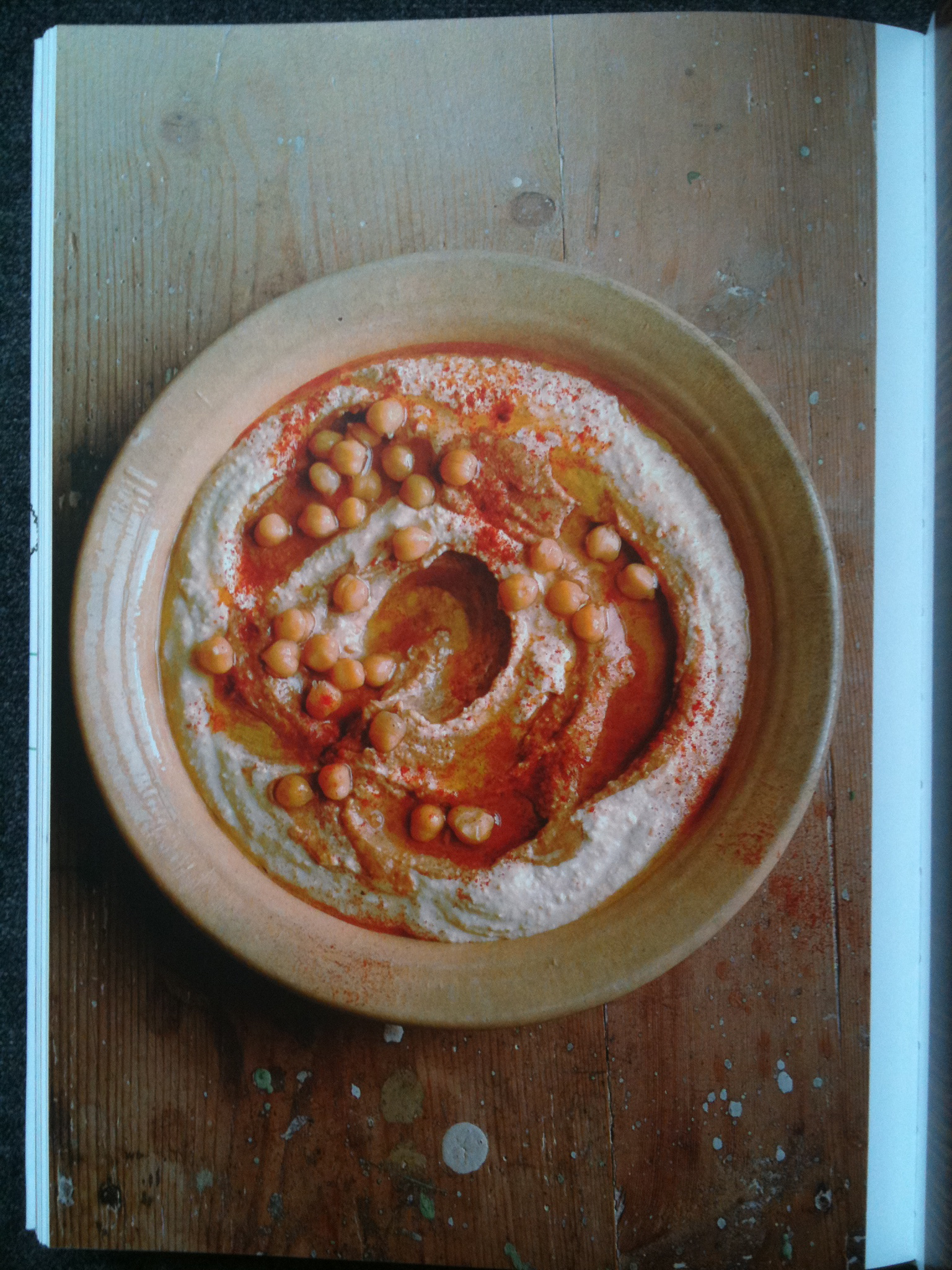
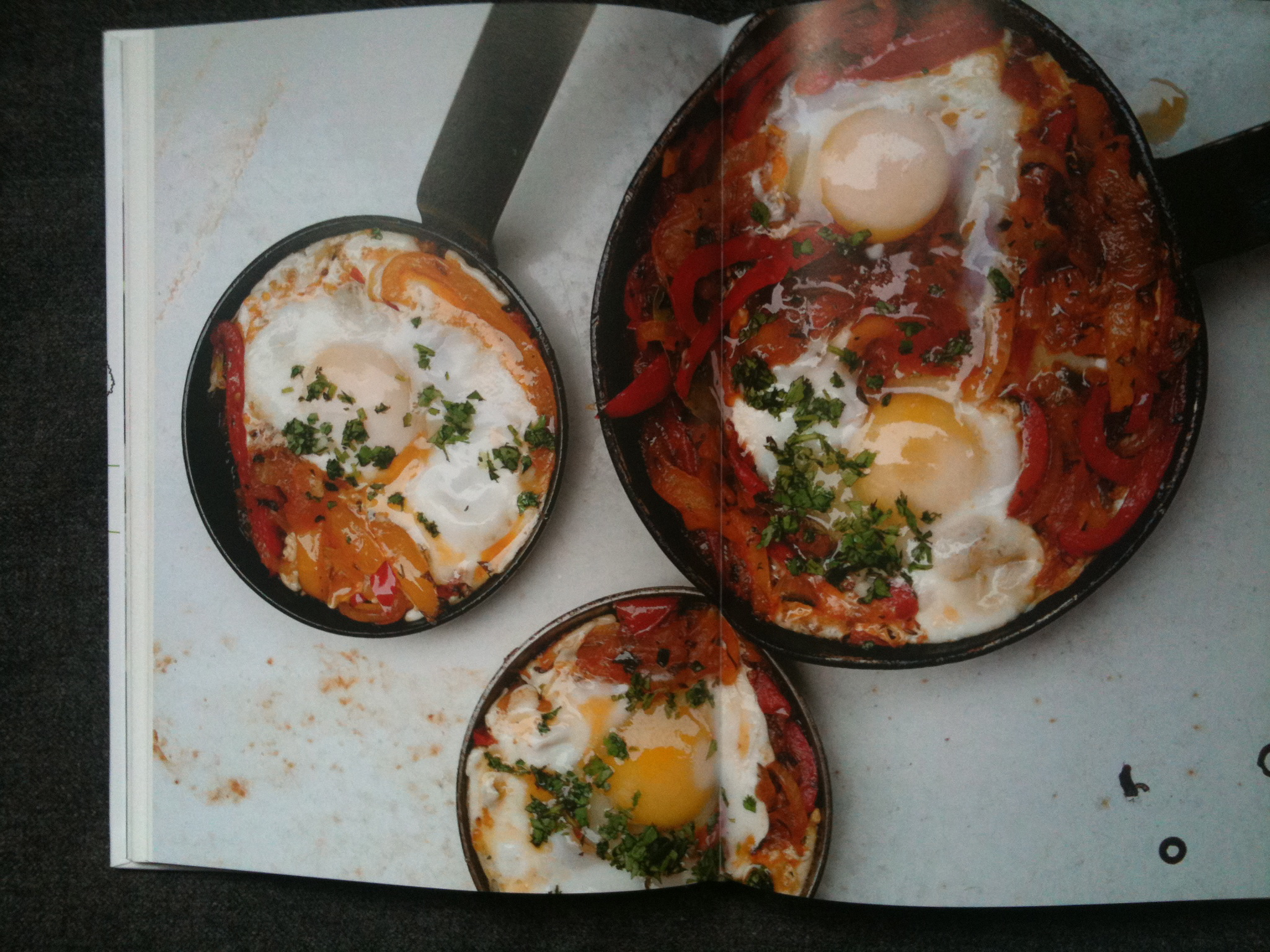
Let’s keep going. The pictures also conform to a series of types. Most are direct plunging views straight down, either onto pans purportedly ready for serving, or onto plates of food purporting to be just served and ready to eat. These are given a stylistic identity of a sort by a recurring trick that I might call acceptable grubbiness. A number of them are photographed on a background representing a Country Kitchen Table (or is it an Inner Urban Regenerated Industrial District Kitchen Table?) which has spots of paint on it.
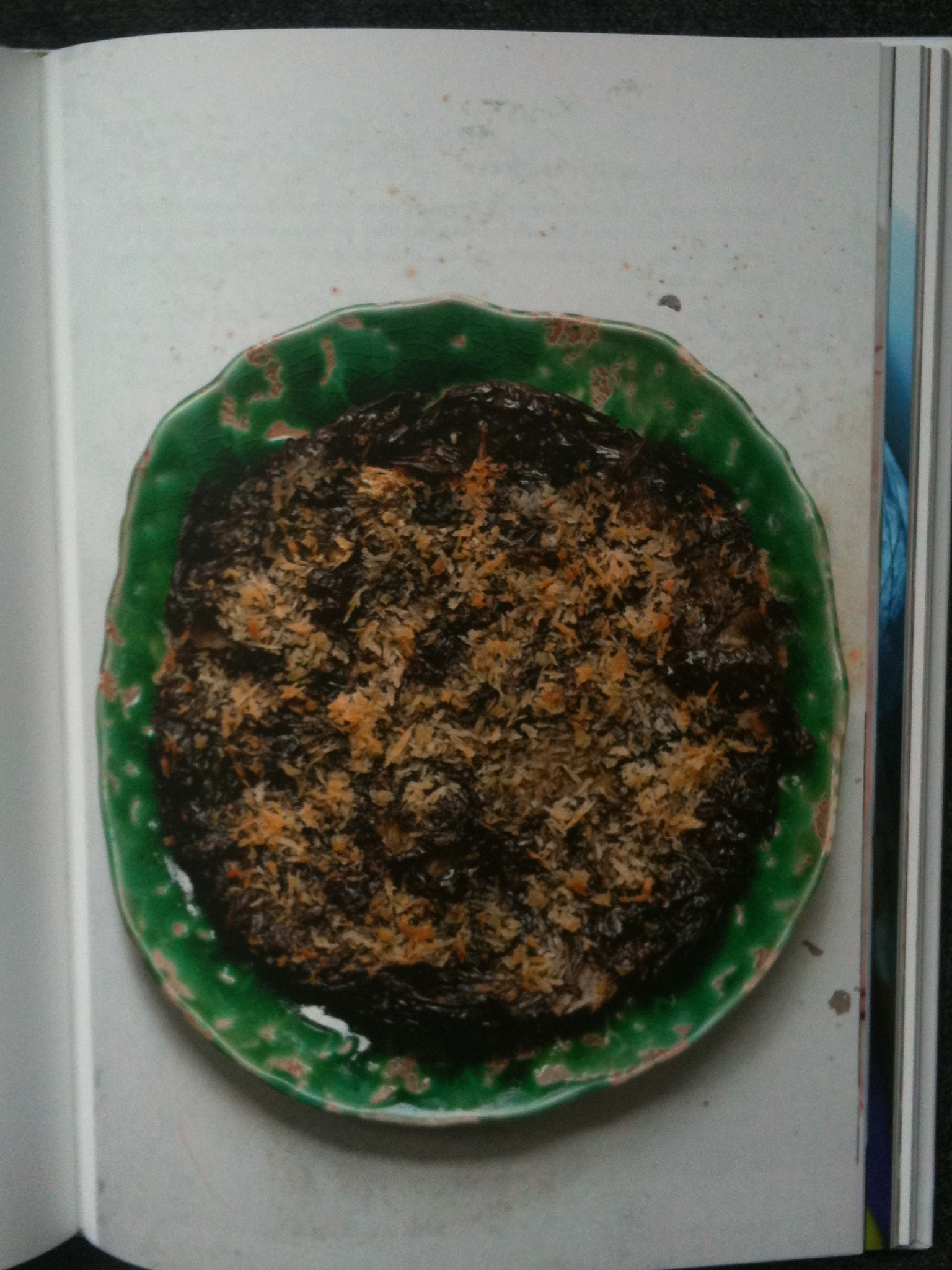
These spots are important. They speak of energetic creativity, of people so concerned with the eternal verities of ingredients each more achingly authentic than the next that a little errant paint is neither here nor there. The vine leaf, herb and yogurt pie is shown on a lightly chipped plate itself on a surface of lightly chipped paint. There are carefully indicative minor spillages in many pictures (designed to convey the artistic and creative nature of a process not entirely controllable to the last degree). Utensils have a degree of visible wear. This is photography by allusion. Comfortable use is to be applauded; shining newness is just ever so slightly…nouveau.
Acceptable grubbiness is an art of innuendo and sometimes the photographer has overplayed his hand. (Acceptable grubbiness was perfected by Irving Penn, by the way, in the food pictures he made for Vogue, who deployed it with a touch which ran more to a few genteel crumbs and the occasional joke mouse: a far lighter sprinkling than this out-and-out mugging). Ottolenghi’s ‘smoky frittata’ is shown in a pan that has clearly been allowed to accumulate highly carcinogenic carbonized deposits for a number of years. A dishcloth (with an oily stain) is artfully disposed to protect the imaginary hand of the imaginary cook from the imaginary heat of the pan which was no doubt stone cold by the time the picture came to be taken. And beyond all of that? A surface, which might conceivably be Corian or some similar fancy worktop, but which I suspect of being a roll of wallpaper lining paper disposed for its neutral texture and colour, shows oily stains of its own.
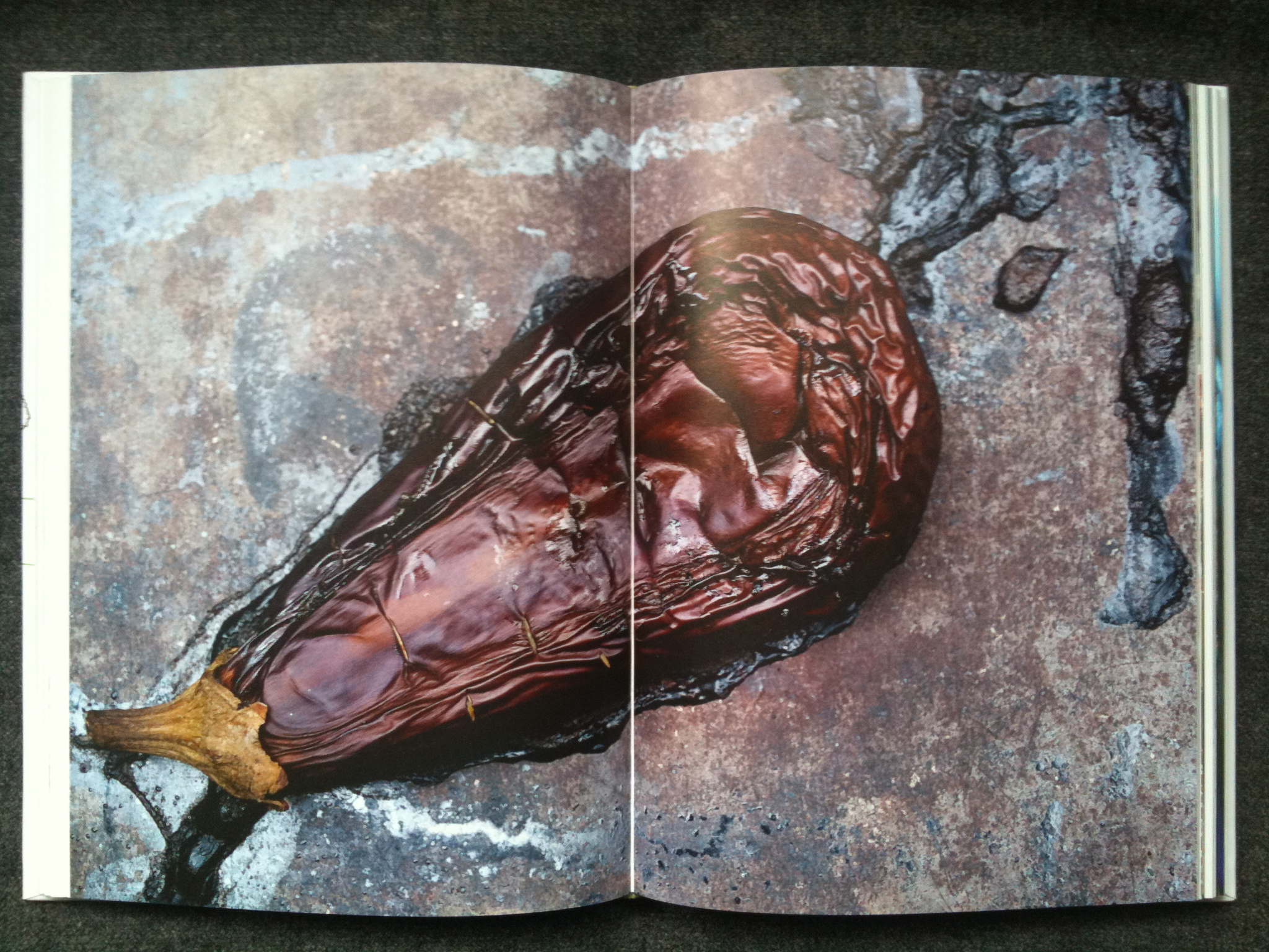
The picture has been open at my elbow for the two or three minutes it has taken to write these words, and let me tell you, I would no more eat the depicted smoky frittata than I would lick the linoleum in my local A&E. I have seen cleaner burger vans in lay-bys on the long slow drive down to Cornwall. This is grubbiness pushed too far. On the double spread pp.118-119 (in a section entitled without hint of either irony or wit The Mighty Aubergine) is a picture which looks at first sight, and at second, and at third, exactly like a horrified, peering, too-close-for-comfort view of road kill. It is actually an aubergine.
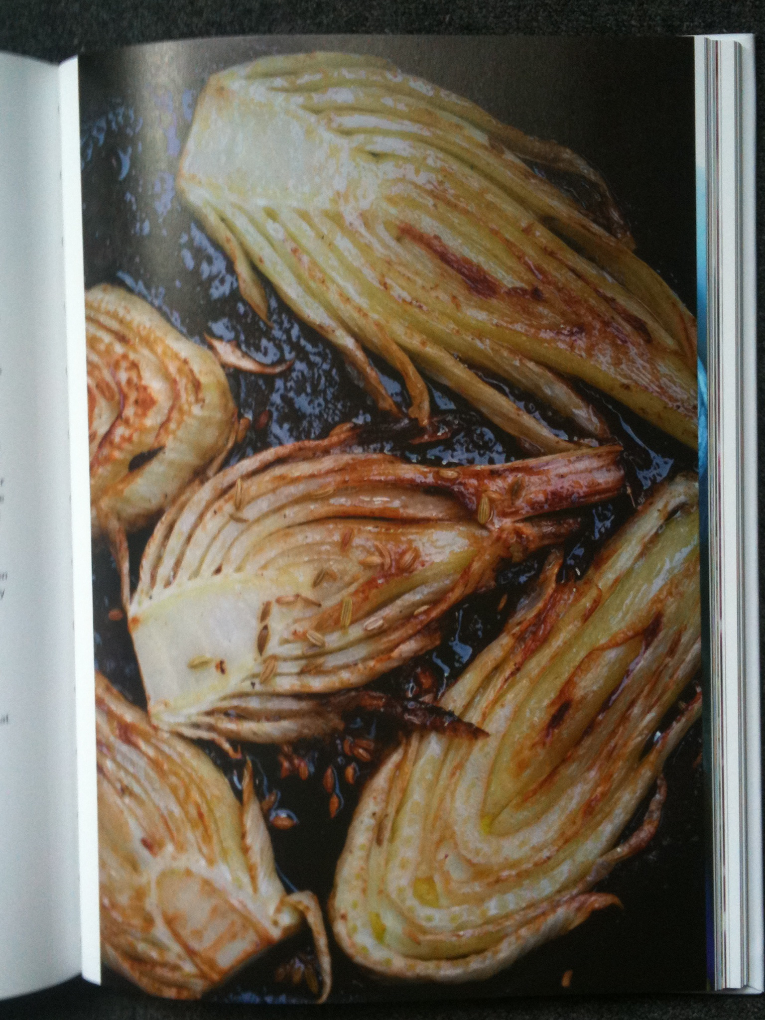
And then there’s the oil. My god ! The oil ! I am told that Plenty is quite a good cookbook. But there is a chasm between cooking food and photographing it. Pictures which glisten and gleam and shine are attractive in a porny way. These certainly have the wet thing going on. I can’t believe that the food stylists and the photographer followed the recipes with due restraint when it came to the oil. Or if they did, the food is simply inedible.
The pictures in this book are competent in a dreary sort of way. The man who made them is a craftsman, of considerable standing in his speciality. They do a job. But as illustrations of a light modern imaginative new style of multicultural cooking, they simply aren’t credible. It’s as though the publishers failed to see that they were using Rubens to illustrate a Pilates manual.
Yet this is not a hopeless outfit well down the Isthmian League. This sold as one of the great exemplars of words and pictures working together. And nobody seems to have minded that the photography is of a standard only just above poor. It’s an endless accumulation of coded ‘lifestyle’ hints masquerading as an attempt to communicate enthusiasm for the subject. The pictures are full of dotty non-sequiturs, of which the acceptable grubbiness is only an example. On page 45, a dish (of black pepper tofu) looks for all the world like a grisly something Susan Meiselas might have uncovered in Nicaragua. It’s dished up on a table which has inscribed plainly upon it, and plainly left there for us to read, the single word ‘JURY’. What on earth this means, I have no idea at all. Was this revolting-looking dish served up in some contest, to be judged? It cannot have been. Was it adduced in evidence in a war crimes’ tribunal? It looks like it ought to have been. What kind of demented picture editor allows the single word JURY to make a mad mystery out of a perfectly simple picture, even of tofu? What on earth possessed the photographer to allow such a thing to go forward?
This is one of the top-selling picture books of this year or last. The photographs (all plunging and oily as they are) are an essential component of that success. It is a hugely successful photobook. It begs to be judged as a book of pictures. Yet nobody has applied even the slightest suggestion of informed thought to the pictures, either during the production process or since. The chef-author is feted as a poet in tofu, but the photographer is just a good name in the trade. I have not seen more than a word of serious criticism of these pictures since the book came out (and that word has, more often than not, been ‘luscious’). It seems the pictures are assumed to be OK because they couldn’t be expected to be better than OK. No wonder photography is still treated as marginal.
The photographer, in fact, is Jonathan Lovekin, who has been the photographic servant of a food writer, Nigel Slater, established longer than Yotam Ottolenghi. Slater particularly asked for Lovekin when Slater was working for Marie Claire, and Lovekin had some stuff published in Elle Deco. Observer, Observer Food Monthly, Appetite, Real Food…Where Slater has gone, Lovekin has followed, can of oil always at the ready, like an Indian railway man or a San Fernando Valley deputy assistant director in the adult film business. Success breeding success as it does, it must have been obvious that Lovekin was the right man for the Ottolenghi job. The publisher probably didn’t even ask if the imagery was appropriate in feeling, or tone or skill. Just get the guy to do the gig. If it’s good enough for Slater….
Lovekin has on his website a showreel (he makes food films, too) which is beyond parody. Spermy liquids and metaphorically exhausted foodstuffs (such as figs), all soused in a soundtrack of Alison Goldfrapp shouting about sex in Ooh La La. There are several separate credibility gaps here. Jonathan Lovekin’s film clients include Bird’s Eye and Macdonald’s. Blow the genteel multicultural sensibilities of the Tel Aviv beaches as lauded by Ottolenghi. It’s just a job. It’s far from clear that even the photographer takes his pictures seriously.
The big appreciation of food has become a substitute for culture. Who needs to read books or even newspapers about complicated places abroad when all you need to do is go shopping more sensitively than your neighbours? Who needs to think through complex matrices of history and economy to understand elsewhere, at least as messy as home? So much easier to enjoy the one-upmanship of food. Bet you don’t know what Shakshuka is. I do, now. Ottolenghi, Plenty, p. 87 (illustrated on a double page following). It’s a North African dish with many variations, of course; I’m surprised you’d forgotten. “In a tiny alley in old Jaffa there’s a little restaurant serving food to customers sitting outside at shared shabby tables….” Abroad, safely wrapped up. The pretension of culture with none of the work, the risks, or the long slow accumulation. That packaging of culture calls for a particular kind of photography, apparently.
Photography in some of its forms has a long tradition of showing things as they really are. In other forms it has a long tradition of showing what somebody wants us to buy. Either way, it used to be the very minimum that the words and pictures worked harmoniously, pulling the reader in the same direction. This food stuff seems to have been put together by people who don’t even consider that pictures carry complex meanings. They can’t be bothered. They use photography as the lowest kind of space filler, capable of bright colours and that awful gloopy sheen and nothing remotely more subtle than that. We need perhaps to sharpen our eyes as readers. If the most successful food book of the moment can get away with pictures which are craftsmanlike but nothing more than that, it is because in that market we have come to accept that we need not really look at the pictures at all. All that glistens isn’t gold. It really isn’t. As viewers we are entitled to pictures which reward careful seeing, whatever the work they are doing. We shouldn’t have to run to “photobooks” to see proper photography. We shouldn’t be fed on slop, even in a cookbook.