
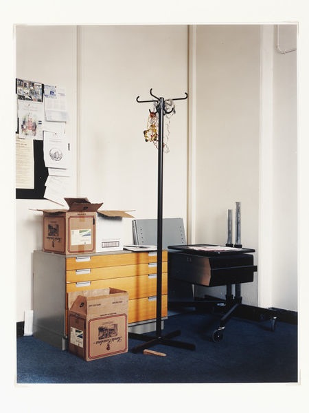
Nigel Shafran, from Visitor Figures. Not selected for the V&A’s Annual Review
“For those who like that sort of thing,” said Miss Brodie in her best Edinburgh voice, “That is the sort of thing they like.”
― Muriel Spark, The Prime of Miss Jean Brodie
I have recently been writing quite a lot about how we could possibly set standards by which to judge photographs. It is not just a recent preoccupation; it’s one I’ve been gnawing away at for a long time. Put very simply, I recognize the absurdity of applying any one family of criteria to all photographs (and the arrogance of any one person setting themselves up to do that). But do we really have so little common ground in judging them, torn between all the hundreds of different criteria that could apply, that we have to make a profound revelation of ourselves as users of pictures before we can make even a moderate assessment of the pictures themselves ?
I strongly feel that photography should be capable of analysis and should not simply be offered and received as a mere system of visual construction, incapable of bearing profound meanings beyond its surface connection to ‘reality’. Or worse : incapable of bearing profound meanings except as the visualization of something which takes its proper, finished form elsewhere, usually in a text. If it is to be capable of analysis, then some more meaningful scale of value must apply than the old one of mere badging. “Great” and “crap” can only get us so far in sharing ideas about photographs.
Photography loses much of its point if it is treated as free-for-all, unmoored in the broader culture. A picture out of context is often not much of a picture at all – until a curator or editor or somebody acting as one of those things comes along to give a new context. Although context is not everything, I do note how difficult it is ever to treat a photograph as ‘nothing’ or ‘nothing much’ after reading detailed analysis of what it is and where it comes from. On the other hand, I am more and more dismayed by that form of photography (being practised specially by that odd subsection of photographers who are academic researchers) in which the utter neutrality of the pictures, in a style derived from late post-modern post-documentary, amounts to an admission of defeat. Those pictures convey nothing at all without the words. Much academic photography is in fact merely the prop or scaffold for academic writing. It gives up on all the rich forms of expression in photography and falls back to its humble function of … illustration.
I suppose in my role as a critic of photographs, I spend my time trudging between the more nearly closed image (made by the photographer, distributed by publishers of various kinds, sold, copied and Instagrammed … ) and the more nearly open one seen by viewers. By the first, I mean those pictures which are doing the work expected of them, functionally. By the second, I mean that viewers come always (in theory) to every single new picture in a state of hot tension in case that picture might be the one which might bring wonderment or some kind of truth or any one of the dozens of strong emotions photographs can carry. I have argued for years that there is an imbalance between the lazy garbage that many photographers and their distributors are happy to release over their names, and the heightened alertness viewers bring to photographs for the fraction of a second it takes to see if they deserve that concentration. We receive photographs like cricketers in the slips, muscles tensed in advance, ready to move high or low. More often than not, we might as well have relaxed.
Photography is almost always an applied art first. Pictures have traditionally moved from the world of work to the gallery, where they have rested. If a small (recently, an increasing) minority has been destined direct to the esoteric (and in many regards incredibly old-fashioned) world of the collector and the dealer, that minority is still just that. The analysis of art provides many clues as to ways of making sense of photographs; but photography is bigger than art as it is bigger than journalism or advertising or police evidence files.
Pictures commonly do have jobs to do. The connotations are mildly snobbish, still today. Think of the words traditionally tied to photography: socially disparaging like craft or trade, technically disparaging, like smudger or snapper, or simply mildly contemptuous, like hobby or pastime. Don McCullin rebuked one of the journalistic colleagues he once travelled with (I think it was James Cameron) who introduced him as my photographer. It is not remarkable that McCullin had to correct him. But that Cameron could say such a thing would be incredible if it didn’t happen every day. The disparagement exists because users of photography still, after it being so vital and so dominant for so long, have not settled on meaningful standards by which it can be judged. Or they have — but only within the tiny subsets in which they each operate. Good gardening picture. Bad wedding picture. Good picture to show how rich I am. Bad picture to illustrate the massacre that took place last night. Good picture of our logo. Bad picture for.…
We need to learn to be sensitive to disparagement of photography, maybe in the same process as we need to learn to be sensitive to photographs themselves. Because photography, whether you like it or not, is not confined to those subsets. Photography is the literacy of all those of us who are no longer ‘well-read’.
My friend and erstwhile colleague Stephen Mayes talks with fervour about how stock photography – disparaged, despised stock – can drive societal change in ways that we haven’t yet begun to codify. If the stock industry begins to show same sex couples raising children – and it does because customers are there to pay for those pictures – then that becomes the social norm whether there is a hinterland of disapprovers or not. Stock is an incredibly powerful influencing system; yet we think of it as a lowly trade practice, far beneath analysis. Popular music and film act as the literacy of those who are no longer well read, too. There are occasional outbursts of contempt for those things, yet it is rare for the industrial consumption of tunes or movies to be treated with the disdain so customarily reserved for our industrial consumption of imagery. Pictures do good or bad work, all over the place, all the time. And as a society we have simply not equipped ourselves to work out how they do what they do.
So I keep worrying away at this question of standards. One argument goes like this: If it’s an applied art, maybe the standards of the application override or overrule the standards of the art. How would that work? Is a crap photograph capable of being a good fashion photograph? Maybe it is. Indeed, I do believe that is a very fair assessment of how it can work. If – as I, following many others – have written in the past, photography changes status very fluidly as the individual image moves from context to context, then maybe the standards by which to assess it have to be fluid, too. And maybe they do. I am gravitating to (and have published in various forms) a notion that a good user of pictures, acting as an editor or curator or collector or just a kid pinning an eclectic group of pictures to a bedroom wall, can give sense and context to pictures which had none at all before her intervention. The logical consequence of that is inescapable: that it is the user and the use to whom and to which standards of quality apply, and not the photographic raw material. The very same picture would then have different standards applied to it in the varying contexts in which it falls. That is our experience of pictures; it feels right.
I want to keep gnawing.
It is a truth (if not universally, then widely) acknowledged that whatever Nigel Shafran does is very good. As a matter of fact, I’m among those who acknowledge it, or very largely so. He makes sequences of compelling emotional order. A very great majority of what he chooses to release really is very well seen, very well expressed, of interest and so on. A smaller proportion is even better than that: choose your word. Shafran is certainly capable of making great images – leave aside for a moment whether that actually means anything at all in the context of the paragraph above – and has proved so many times in my view. I have long been a fan. I also know him a bit and like him very well as a person. In fact we shared a pint of beer and half a dozen oysters only the other day. I need to state all of that unequivocally here, at the outset. Because I want to take Shafran to some extent as my guinea pig. I want to enquire here into how we get our certainties about what makes or unmakes a good photograph; I want to pick away at easy words like good and great as they are applied to pictures.

Nigel Shafran, from Visitor Figures. Not selected for the V&A’s Annual Review

Nigel Shafran, from Visitor Figures. Not selected for the V&A’s Annual Review

Nigel Shafran, from Visitor Figures. Not selected for the V&A’s Annual Review
Shafran last summer (2015) had a few pictures included in an exhibition at Somerset House which had been curated by Martin Barnes, of the V&A. Called Beneath the Surface, and drawn from the V&A’s own holdings, the exhibition (among other things) mounted a clever and convincing argument that to read pictures only for what they show is often to miss the point; that every picture in the V&A is there for reasons, and those reasons add up to a rich extra narrative intimately connected to the pictures but also stretching far beyond them. You could, if you liked jargon, refer to the metadata behind the pictures, or more plainly to the backstory of how they came to be where they are and what they are. You could talk in terms of material culture in this context, too.
A few years earlier, Barnes had commissioned Shafran to make some pictures for the V&A’s annual review, and his group of pictures in Beneath the Surface came from that commission. Shafran published those as Visitor Figures: Out-takes from the V&A Museum Annual Review 2012-13. (It’s an odd subtitle. They are not, properly speaking, out-takes. Of the nine pictures chosen to illustrate the V&A Annual Review, six reappear in the book. )
Notice that the inclusion of Shafran’s group in the Somerset House show is not neutral. It is (or it could be taken as) a vindication by the curator of his earlier decision as commissioner.
There is at first glance nothing particularly odd in the V&A commissioning Shafran – commissioning any photographer – to illustrate its own internal documents. The V&A is the national treasury of the art of photography; its collections are second-to-none and its curatorial concern has been high-level and constant for many years. Of course it should commission photographers to do stuff, every year.
Lots of organizations think they are vaguely daring in asking a photographer to work on their annual review who might not be quite limited to the awful standard annual-report vocabulary of process-and-people; suits-and-high vis; discipline-and-creative freedom — all presented in totally spurious cahoots. Not everybody who reads this will have seen an annual report. Take it from me, the majority of them are as miserably unimaginative and cheap in their photography as they are in their prose, leaden porridge of commercial cliché and caution and convention. Collectively, they add to the wholly justifiable despair one can have about the management function and the functionaries who perform it.
But consider. Shafran is not apparently a corporate photographer. It is obvious that it took some courage for Martin Barnes to commission him. Shafran is a notably independent minded photographer; one of the tribe who think of themselves as artists and not as craftsmen. He might have been disinclined to toe whatever management line was laid out for him to toe. Even worse, in corporate terms, he might have been … unmanageable. Also – much more surprisingly – the other way. It took a great deal of courage for Shafran to accept the commission. Imagine if by the mere mischance of having been mistaken for the kind of artist who could put artistry aside for the length of a corporate brochure, he had happened to sour relations with the major museum in his discipline for ever. That can happen. It has happened.
But this was not, as it happens, Shafran’s first commission from the V&A. A number of other pictures were commissioned from him in 1999 to celebrate Lord Armstrong’s completion of his tenure as Chairman of the Board of Trustees.
Nigel Shafran, After Gillian Varley’s leaving party, Victoria & Albert Museum, 1999
So maybe there was considerably less risk involved than appears. Maybe Shafran — who was a high-flying commercial photographer in the youthful fashion-lifestyle end of the business before he was ever an independent artist, and who now judiciously manages the commercially-driven aspects of his work to take advantage of the energy and reputation that flows from those of his personal projects which have no very heavy commercial outcome — is a “safe pair of hands” (how uniquely British that phrase is, deriving as it does from cricket, the mysterious game which now makes its second appearance in these lines). If that’s so, we may need to rethink the pictures. Maybe getting Shafran to do your annual review pictures is precisely the corporate norm as geared to the V&A rather than a widget maker, profit taker or corporate shaker. And if that is so, in turn, then maybe we need to look again.
What does the V&A need to show? A number of its values are set. Since the Blairite formulation of culture – that it had to pay its way in societal terms – which has been wholly accepted by the Conservatives-with-Blairite-DNA who run Britain now, the agenda for national museums has been completely clear. Budgets are going to be cut every year (because the people who rule don’t really believe in culture in spite of ample demonstrations that it actually brings real benefits), but they will be cut harder if the mission statement cannot be shown to be met. Culture needs to be accessible and inclusive, to be devoted to (and a successful partner in) education. It needs to show value for the national pound spent on it, and to demonstrate herculean efforts at raising money commercially so as not to look like it might be scrounging. It needs to show high-level scholarship on the international level and leadership in as many as possible of the fields in which it operates. It needs to host blockbuster manifestations, if only to keep a profile next to others in creative industries for whom blockbusting is the only aim they own. It needs to be a considerate employer, devoted to the principles of equal opportunities, health and safety, and so on. Everybody who has ever tried to earn a living in the cultural fields will recognize that these employment ends stop short of actually paying decent wages, of course. Culture is supposed to be a great gift for the people who consume it, and the people who work at it are supposed to enjoy it so much that they can routinely be exploited for unfair or uncompetitive rates of pay. But that is a separate question. Its political masters judge the V&A by the way in which it meets this agenda. Culture needs for ever to prove that it is paying its way, and a great museum never loses sight of that.

Nigel Shafran, from Visitor Figures. Selected for the V&A’s Annual Review

Nigel Shafran, from Visitor Figures. Selected for the V&A’s Annual Review
Nigel Shafran, from Visitor Figures. Selected for the V&A’s Annual Review
So Nigel Shafran’s pictures for the annual review had a lot riding on them. That his style is notably informal (I mean that he does not tend to use any set-up by which he has total control over his subject matter, in the matters of lighting or excluding accidental elements) should not obscure that. Informal pictures can still perform a very formal role, as advertisers, for example, know very well. Take the Shafran pictures included in the final edit of the V&A report: we have specific views of the conservation process, of scholarship in action, of education, of the wide visitor profile, of the appeal of the blockbuster exhibitions… We even have, in the last picture used, a view of the Madejski garden crowded with visitors on a winter’s evening for some performance or event, a picture of the impact (it’s a jargon term for the number of people you reach and how you affect them) you can achieve through private funding. This is a remarkably on-message selection of pictures for a radical photographer. They’re good or bad in other terms, and that can be discussed. But in corporate terms, which after all, are the terms under which they were commissioned, made and selected, they are very good. Or — to put in the terms I suggested above — these pictures were applied to the V&A’s purposes, and in the terms of that application, they were good.
Pages 54 & 55 of the Annual Review of the Victoria and Albert Museum, 2012/13. The little tiny not-very-inspiring corporate portrait in the upper left (of some executives executing something or other) is, rather surprisingly, by Nigel Shafran. Are there any standards other than those of the job in hand by which this is a ‘good’ picture ?
Shafran has had, as any successful photographer must have had, a succession of relations with picture editors and editors, with gallerists and curators, with publishers and critics and commercial clients. Maybe the manner in which he has run those relations is more important than the actual content of the pictures. That is a quite shocking thing to say to people who believe that the pictures are very fine and do their work irrespective of other considerations. But it is true in every business that what one might call the ancillary skills are vitally important. You need to be on time, to be personable, to be on budget and on message, to be civil, to be flexible to the needs of the customer, to be discreet, to be prepared to put up with a certain amount of executive bullshit and so on. These are skills which we try and persuade our sons and daughters to develop and maintain, whatever business they intend to pursue.
In something like photography, where very, very few people trust their own taste in the primary activity itself — where few can really confidently tell a good picture from a bad — it may well be that the ancillary skills hold more weight in the judgment of quality than in a business where more widely shared standards apply. The crudest standard is simply money. I forget which titan of the Thatcher era said “money is the way we keep the score”, and the barbarism is quite plain. Yet there is an element of truth there, too. A photographer who earns good money must be a good photographer, no? It rather depends what you mean by good.
If coming to a judgment on the primary activity is difficult, then the same few half-judgments will be carried much further. That is certainly true in photography, where the absurd replacement of individual judgment by the crudest reliance on name checking is very common. White Cube represents him: must be good. Michael Mack publishes her: must be good. He is in the collection at MOMA: must be good. She went to the Royal College of Art; must be good… These (although they exist everywhere) are not the kinds of judgments you hear so much in creative businesses which have a functioning shared vocabulary of standards. A properly weighty CV for a film-maker might impress you; but if the last documentary she made is crap, you have every confidence in identifying that, and if you are in a position to hire such people, you might well hire another.
In photography, where there is so much choice of practitioners, and where an acute compiler could use such a vast range of forms of expression, timidity and conservatism are the rule rather than the exception. There are adventurous and confident editors and curators and publishers and art directors; but they are outnumbered in the thousands to one by those with little knowledge of the antecedents, narrow ambition for any set of photographs, and zero confidence in their own eye. They are the ones who will keep coming back to the ancillary skills since they admit they can make nothing of the primary ones. Being able to do business with a photographer comes to be not a complement to finding the pictures strong or moving or original or well expressed, but something that stands in place of those things.
I said loud and clear: I admire Nigel Shafran and think him a fine photographer. He has (deftly understated) technical mastery, great reflexes, a powerfully original sense of what is worth noticing in photographs. He has an old-fashioned sense of beauty coupled with a post-modern feel that beauty will be found in whatever you look at beautifully. He has acute moral antennae, becoming modesty, humanity, wide-ranging curiosity and culture. But I don’t think that the judgments which brought a group of his prints to the lower floor of Somerset House in London in the summer of 2015 are really derived from any of that.

Nigel Shafran, from Visitor Figures. Not selected for the V&A’s Annual Review
Nigel Shafran, from Visitor Figures. Not selected for the V&A’s Annual Review
It doesn’t in the end matter to the V&A whether the pictures they publish in their annual report are in any profound sense good pictures. Those pictures had work to do in their original guise. Then they reappear ten or a hundred times bigger, as fine prints in a major exhibition, and it begins to look as though somebody is asking us to take them seriously in contexts beyond their original one. But that somebody is the same as the person who commissioned them in the first place, who inevitably has something invested in how we regard them. Shafran then republishes them in a self-published book, and it looks as though he is making the same transition: the pictures are moving from ‘job’ to ‘work’. Some time in the future, somebody will start to hold those pictures up to others, to compare what they are and what they do, and will come to conclusions about their cultural weight and worth. But long before that has happened, they will have been described as good or even great pictures, and I don’t think we know that they are yet.
We don’t have the habit of assessing photographs in the round. We don’t tend to share a vocabulary by which we can agree in describing their route from ‘a good job well done’ to anything more general than that. It may be impossible to arrive at such a vocabulary. But it surely is worth trying to keep an eye for one. And maybe it starts by asking what the job they were doing was and what it is. It’s no good being snobbish about ‘applied art’. It’s no good being snobbish, like Miss Jean Brodie, about the sort of things people like. It’s photography : it’s working at something or it isn’t worth a damn.
Post Scriptum:
I reviewed Beneath the Surface at the time for Photomonitor:
You will see that the thoughts I develop here were not quite developed there: but it does no harm to admit to thinking about the same pictures for more than the immediate purpose at hand. One of the things we don’t do, I think, is give pictures the chance for the second and third and nth reading.

Just to reiterate, it was the V&A Design team (I was at the moment the senior graphic designer at the V&A responsible for the design of the review 2012/13 ) who commissioned Nigel Shafran.
The in-house design team at the V&A has created extraordinary designs for campaigns, exhibitions and also internal communications over the years, including this review, and they should be credited correctly for their creative effort. (Especially when it comes to telling the story behind a succesful project … ).
Following the work done for the Annual Review 12/13, I co-edited and designed the photo book Visitor Figures with Nigel Shafran, published by Shafran in 2015.
Please amend where necessary if it is possible.
Clara Sancho
LikeLike
Nigel Shafran kindly writes to correct a mistake:
” .. you bring up some very interesting points, although there is one aspect I wanted to point out, and that is that the original annual report was not commissioned by Martin Barnes, but by Jane Scherbaum and Clara Sancho in the V&A Design department.
Martin didn’t have part of the project until towards the end, where he kindly supported me
in getting the work included [ in some way ] in the Annual review as it was near to being rejected.”
I’m of course happy to acknowledge my mistake, to apologize for it, and to thank Nigel for pointing it out. But I think I will leave the piece as written all the same, since Martin Barnes committed himself to those pictures and was engaged with them from an early stage as I describe, even if not as their original commissioner.
FH
LikeLike