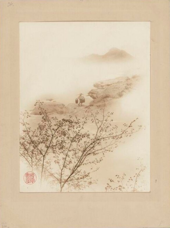
Light and Magic – Pictorialist Photography, at the Tate to February 2027 and then at the Seoul Museum of Art
The Oxford philosopher C.E.M. Joad was sometimes an agnostic, a pacifist for a while, a socialist who somehow became very close to Mosley’s New Party and claimed his intellectual descent especially from H.G.Wells and Bernard Shaw.It’s not very clear that he was ever a very major philosopher, although he was certainly a fine teacher and had ‘colourful’ habits. He avoided conscription by running away to Snowdonia, and (less amusingly) was expelled from the Fabian Society for sexual misconduct at its summer school.
Cyril Joad acquired his considerable celebrity as a regular on The Brains Trust, a BBC programme (radio first, then television with the soundtrack replayed on radio later in the week) of the period of the Second World War and the years that followed. The Brains Trust achieved exceptional popularity; it reached more than twelve million people per episode, a huge figure in the broadcasting of the time. Joad could chat about all sorts of things on the programme, until his career came to its ignominious full stop. The BBC sacked him in 1948 for being found guilty at Tower Bridge Magistrates Court of defrauding the railways. It turned out that Joad, the most visible public ethicist of his time, used habitually to evade the fares and had something of an obsession about it. He had perhaps foolishly confessed to exactly that in print some years earlier: In The Testament of Joad, (1934) he had written: ” As a vagrant, I cheat the railway company whenever I can, returning on the next day with a cheap day return ticket or alleging, when I arrive ticketless at my destination, that I entered the train at a station nearer to it than was in fact the case.”
This decidedly unappealing character is really remembered for one thing above all. His catchphrase on The Brains Trust was to suck in air between his teeth or through his pipe and carefully enunciate, in response to any question put to him, “It really rather depends what you mean by that term.” Nice one, Cyril. You can get very stuck with any argument at all with that one.
And stuck may be what the curators of Light and Magic, the Tate’s show on Pictorialism in photography have got. It really depends what you mean by that term.
Pictorialism is tolerably well known at least in some aspects of its American, German, English and French highlights. It is much less well-known in its incarnations in other regions, and this sprawling show does do a signal service in showing photography from places such as Singapore, India, China and Brazil and placing it firmly in the international context. That could make a very exciting show in its own right. Light and Magic does a bit of that but only very sketchily, as one message among many.
Another big strand in this show is to make the argument that societies and associations and salons and clubs were instrumental in the spread of ideas in photography. That is very much less successfully presented within the show, for the very simple reason that it is not easily a subject for an exhibition. A doctoral thesis, a book, a podcast, an article: by all means. But to treat such a subject properly you need copious and precise detail. You need to track individuals, most notably among the speakers and competition judges and club officers and other ‘gatekeepers’ (as we would call them today) who made those clubs tick. What did they do that was part of their aims and what did they do by mistake? What did they believe in? You need to work out who the memberships were and how they changed over time. You need to see how the clubs allowed the dissemination of new technologies and facilitated the critical examination of older ones. You need to learn whether any particular style (Pictorialism as only one among them) was favoured and for what reasons.
Almost completely absent from this show, and maybe by deliberate choice, are the extraordinary photoclubs of Japan. This show doesn’t have a specified timeframe, but the 1960s are the limits of its range. A former curator of photographs at the Tate was especially interested in Japanese photography and made efforts to enrich its own collections in that regard. So at the very least, the Tate is the proud owner of lots of Japanese material that would have been relevant. Even in the Meiji period (1868-1912) Japan was rich in photoclubs; it was, as it happens, an era of passionate club-joining in Japan across many fields. But the bug continued long after. The Nihon Sashinkai (Japanese Photographic Association) was founded in 1924 and could easily have made a section of this show on its own. And many others, as late as you like. VIVO was an astonishing group of radical Japanese photographers of the end of the 1950s which included Daido Moriyama and Eikoh Hosoe. But you have to ask: was VIVO a club? They certainly believed in something of the expressive, personal, metaphorical attitude to photography that seems to be at the core of Pictorialism. Was it a collective, like the Magnum agency? And if so, why exactly don’t they fit into the parameters of this show? What is about the societies in general that makes them apt for inclusion in this exhibition or not apt? It seems to be largely the quite casual preferences of the curators.
And by the way, there is a thorny discussion to be had about where the line can be drawn between ‘camera clubs’ as opposed to ‘photographic societies’. In the photographic art world of our own time, the camera club is rather despised as the home of amateurish mawkishness and an obsession with technical perfection at the expense of good taste. Some of that stuff is the direct descendant of Pictorialism, but quite how and where we can winnow the wheat from the chaff is tricky.
And so on. All of this should be detailed painstaking research work presented in words and graphical charts and footnotes and appendices and all the apparatus criticus of good scholarship. The Tate has had some pleasant ideas in this line –– a wall of enlarged labels attesting that pictures were exhibited in such and such a society makes the biggest and most colourful and most eye-catching ‘piece’ in the whole show. But it is no more scholarly than a collection of beer mats on a pub ceiling or a group of hubcaps nailed to the outside of a garage. I love the backs of photographs and often wish I’d made a book of them (I may yet, of course).The back is often the place where the material history of the photographic object meets the aesthetic and factual content of the image itself. I was delighted to find here a handful of pictures hung next to a reproduction of their backs: plenty of stickers on many-times exhibited works, of course. But shown like this, as isolated examples of something which may or may not represent a tendency and may or may not show a development which happened, as meaningless as the nice graphic labels on grannie’s suitcase. The particular stickers on particular photographs could indeed be analysed to show connections between people and places and their pictures. But simply plumping them on a wall as a decorative way of showing that there were photo competitions is not scholarly nor does it make for a very eye-opening exhibition.
Many years ago I did some work on a curiously neglected British photographer called J.A. Sinclair (he died in 1940). Sinclair owned a famous photographic shop right on the corner of Whitehall and Trafalgar Square and grew to have many government contracts. But Sinclair was also very much throughout his career a photographic clubman. In his youth, he was a passionate advocate of lantern slides, and he criss-crossed the country giving illustrated talks in precisely the kinds of clubs that the Tate show alludes to. You can track his progress in the journals, and if you read not just the announcement of his talk to come but also the comments of the following month, you can often find articulate and constructive criticism of the contents. He gave the same lecture many times in succession, often travelling to do so –– an amazingly demanding schedule for an active businessman to undertake as an extra. Later in his career he became an active proponent of hand-held cameras and the quicker defter imagery you could make with them. He was responsible for the marketing of a very successful camera, the Sinclair Una, a small light very portable machine of the generation before the Ermanox and the Leica, whose mechanics were designed by his partner Arthur Newman. Although there was no doubt an element of self-promotion in his lecturing, there was also a perfectly genuine interest in converting strangers to what he believed in, in helping others, and in the advancement of his field. Sinclair took roles in the societies: often as the treasurer, where his business experience was plainly useful. He judged as many competitions as he was invited to, time-consuming work which might have paid his travel expenses but never enough to make it viable for money alone. There isn’t a biography of Sinclair, but even on this kind of brief sketch, I’m sure you can see that an examination of quite what the photographic societies represented to him is a far more complex weave of motivations and habits than the mere observed fact that the societies existed. Sinclair, by the way, was a Pictorialist through and through at first, (there are a few prints of his in the collection of the Royal Photographic Society to bear me out) and I would argue he continued to be motivated by Pictorialist ideas throughout his later career but … it rather depends what you mean by that term.
The Tate’s curators have quite rightly noted the importance of the photographic societies at home and abroad, and maybe that’s a very useful mark for present and future scholars to pursue. But this exhibition notes the existence of the phenomenon really explaining how it worked. The catalogue naturally gives more detail, but in the exhibition itself clubs or associations simply existed with neither reason nor context. Apart from anything else, photography as practised in the late nineteenth and the early part of the last century was a chemical activity which depended on recipes. To attend a meeting where you might learn how to make orotones or carbon prints a fraction better than you knew before was maybe the equivalent of looking up YouTube instruction today. You didn’t need to be radical or even ‘serious’ about photography to join. You might become serious, or you might not. The clubs and salon exhibitions represent a very interesting sub-section of the history of photography, full of things not yet properly appreciated or indeed appreciated at all. But the Tate has not scratched the surface in this show.
The third major strand of the exhibition is about the print itself. Again, without question, an area of terrific importance and one likely to become less and less familiar as the watershed between analogue and digital photography recedes into the past. Digital natives don’t as a rule understand the appeal of a good print, nor the vast repertoire of readings that different chemical processes could give to the same essential image. The whole modern lexicon of image filters derives from the variety of emotional readings one could give to a picture in differing chemistries but is (so far) infinitely cruder and poorer than the results obtained in old darkrooms and studios.
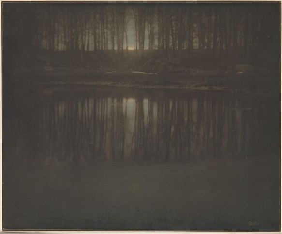
It’s almost impossible to tell on a screen, but this is a reproduction of the version made as a gum bichromate on a platinum base, and not as shown in the show.
And here again, the Tate show skates over its material so quickly it doesn’t leave much of a mark. It is a nice idea to have a section of pairs of prints by way of inviting us to see the differences between them. But in that section are two versions of Steichen’s great pond by moonlight. Both of them are photogravures, an early one and a modern one printed many years later. This is absurd. Nobody can come to conclusions about Steichen’s motives and manners and the technical means at his disposal by looking at a modern print made ‘after’ him. Especially as it was a print of a variant of this very image (owned by the Gilman Paper Company) which broke records twenty years ago when it was sold for very nearly 3 million dollars at Sotheby’s. But that was a worked gum-bichromate print over a platinum base – precisely the kind of distinction that this exhibition is asking us to appreciate. What on earth is the point of being the Tate if you can’t borrow the great Steichen gum-bichromate to put next to a photogravure precisely when you want gallery-goers to begin to understand the elegant complexities of the Pictorialist engagement with different printing processes ?
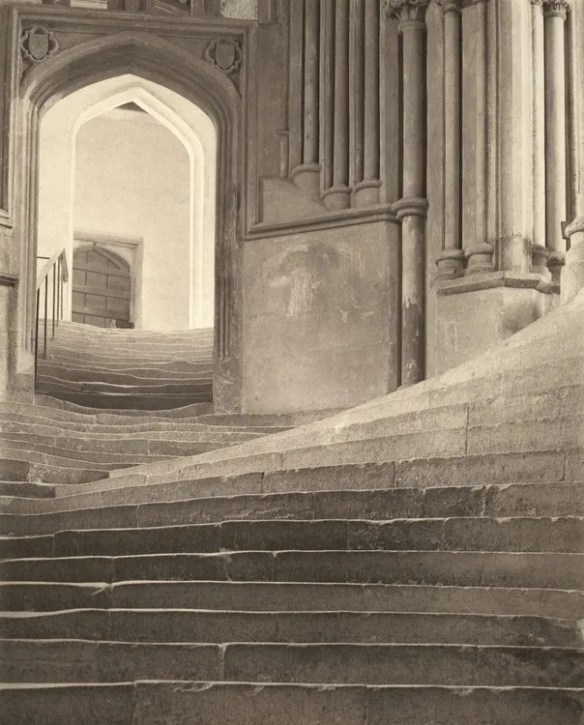
Our hosts (it seems the show was was curated by a group, each responsible for a section of the show and an essay in the catalogue) do this far too often. Two variants of Frederick Evans’ Sea of Steps? Certainly, here they are. But one of them is a modern one printed by Paul Caffell. Paul (he died in 2017) was a brilliant platinum printer and deserves to be seen in the Tate as often as you like. But not in the context of an exhibition asking us to think of the shifting ways in which different processes had different uses to the original photographers. That Sea of Steps is lovely; but it was a high-end commercial reproduction for well-heeled customers around the year 2000. That has nothing at all to do with Frederick Evans who died before the middle of the twentieth century having done what he did and believed what he believed with no notion of the vagaries of the commercial print market a long generation after his death. The curatorial decision-making process which could include such pictures in such a show is so badly flawed that it calls the whole show into question.
There are many ways of tackling the important business of the different types of printing process available to photographers at different times and places. One of them –– and surely it was the obvious starting-point in this show –– is to look carefully at the different reasons people made the prints they made. Light & Magic has asked us to consider a whole section devoted to the clubs and salons and specifically to their exhibitions. The exhibition labels we are invited to admire are applied to individual prints – exhibition prints, if you want to call them that. Only the exact print which was exhibited got the label; and if it was exhibited elsewhere, it got two.
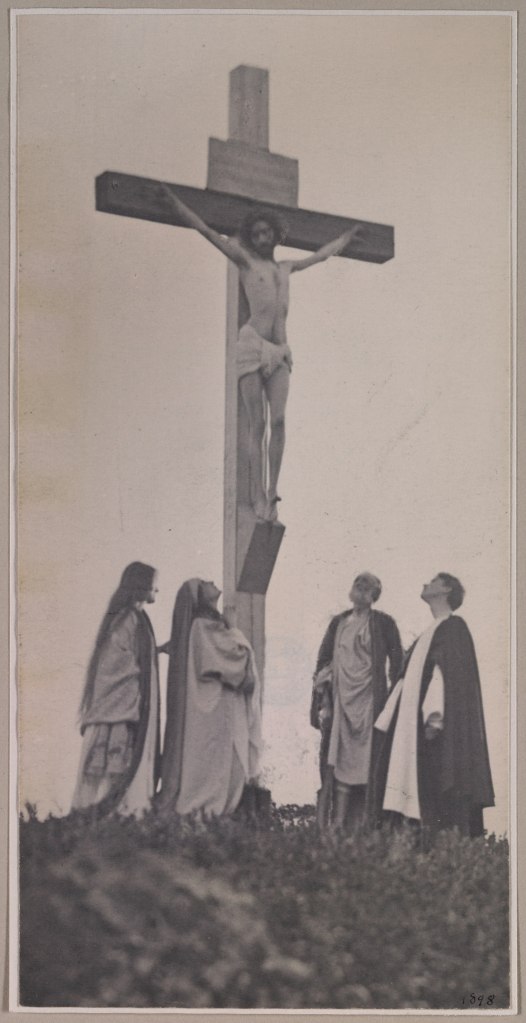
Day, for whom money really was no object, imported the wood for the cross from Syria.
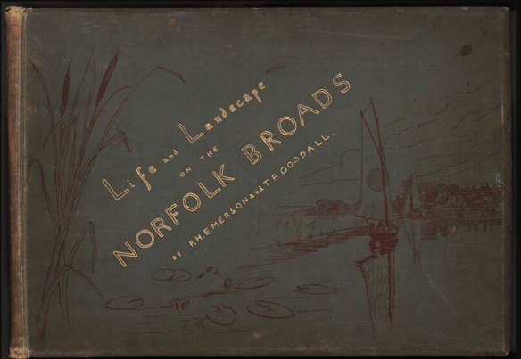
But many prints were made the other way, as multiples, often for inclusion in books. A print for reproduction is not an exhibition print. And like all photographers, Pictorialists (I know … it rather depends what I mean by that term) were interested in wide distribution as well as in specially fine exhibition display. But they were interested to different degrees and with differing means at their disposal. A photographer like Fred Holland Day, who could find the time to spend weeks getting himself up as a crucified Christ to make photographs with the complexity of production of a film, was not especially interested in reproduction of his images. He considered himself a fine artist, but he was also the privileged son of a Boston merchant, grew up in a vast mansion, and ran a perpetually loss-making publishing house purely for the love of the beautiful books he could make. A Stieglitz is a different proposition. Stieglitz was a proselytist for the new photography.He ran galleries to show the height of the art but he founded and ran Camera Work (it reproduced pictures mainly as exquisite photogravures) precisely to give a wider currency to the pictures he deemed worthy of inclusion. He dealt therefore in several different kinds of prints. A Peter Henry Emerson is a different proposition again. He was a theoretician of the possibilities of art photography.A critical writer of importance whose notion of ‘naturalistic photography’ acquired great influence. We see a splendid group in the show from his Life and Landscape on the Norfolk Broads – exquisite platinum prints. What about the less-expensive photogravure editions he made of his later works for different markets and for different reasons?
Printing processes had advantages and disadvantages, of course. It’s lovely to see a Tate show which acknowledges that they existed. Such an acknowledgement is more commonly reserved for specialist photographic environments. But the acknowledgement isn’t a replacement for explanation, analysis, exploration, illustration.
Another way of approaching the question of print processes would have been to explore the range between amateur and professional practitioners. Almost everybody the Tate Modern ever shows beyond photography would describe themselves as an artist. That is absolutely the case of many a good Pictorialist (I know, I know). But it is also emphatically not the case of many others. The compliment of ‘art photographer’ still is often bestowed on people who were really or still are practising commercial photographers first. A photograph changes its status according to its context much more than most visual media. Journalism on the day becomes art in the museum ten years later. So here we have some portraits by Madame Yevonde –– is it disingenuous to imagine that the great piles of them in the National Portrait Gallery made them an easy borrow? She was a commercial portraitist, and a very skilled and good one. But everything about her, including her use of the rare Vivex colour print process, her flamboyant style, the very manner of making photographs, was deliberately aimed at getting the next commission through the studio door. Is this efficient professionalism not somehow to be distinguished from the camp play-acting of Holland Day? They were engaged in utterly different activities, even though both involved cameras and darkrooms. That strains the single word Pictorialism a lot. If these people really were doing something separate but which the curators want us to consider as distinctly and closely related, we need a good deal more explanation and argument as to how and why. There are many and subtle gradations in photography between amateur and professional, between artist and ‘practitioner,’ and they change with time and place and prejudice: but to make a vast show of one long-lasting tendency in photography without alluding to any of that at all is to admit defeat. And maybe again, this is a flaw not of the show in particular but of the very idea that one can turn doctoral research work into an exhibition and simply hope for the best. There have been many, many happier transitions from research to exhibition.
One point is that the attempt to introduce a new mainly digitally literate audience to Pictorialism has to start with some acknowledgement of theory. Whatever else Pictorialism was or became, it was richly informed by arguments about imagery which were mainly couched in words. Pictorialism was a peg on which to hang one’s hat. Light and Magic skirts some of this: that’s why those Emersons of the Norfolk Broads are here. But the theoretical to-ing and fro-ing lasted a generation or more. Those salons and clubs were as much devoted to illustrating competing theories –- for or against, to a greater degree or a lesser – as they were about welcoming new adherents to the arcana of photography by passing on obscure improvements in coating papers. The theory is barely present in the whole of the show. Yet theory did not lurk obscurely behind late nineteenth- and early twentieth-century art-photographers: it positively motivated them. It made them take the pictures they did in the ways they did. Where are the great enquirers into photography who tried to make sense of its evolving (often contrasting) positions? Where, to name only two, are Sadakichi Hartmann or Francis Wey?
Then there is the museology of this show. There is a darkroom in there, more or less persuasively complete. But surely there were better ways of showing a digital generation what printing a photograph could be. A darkroom is just a den of obsolete technology until it’s populated by a person making things appear as if by magic. I have to say that I was delighted to find a copy of USSR in Construction in a vitrine: it is (in spite of its thoroughly unprepossessing title) one of the great treasuries of the photographic world. I can even see how to argue that it was somehow a Pictorialist journal. But simply to include it without making that argument is a little odd. It was the great propaganda magazine of the Soviet period, published in Western European languages mainly for propagandizing export. It was nominally devoted to progress, modernity, objectivity, the future. Glad to see it, although more than a little puzzled to meet it here.
That vitrine was exciting. Far too little use was made of other museum display expertise. Almost no video screens, for example. They should absolutely have been here, turning the pages of albums or journals for us. Not just for fun, but because it was in those pages that Pictorialism went around the world. Maybe even more excitingly, they could have allowed us to see the backlit imagery which is simply not here: lantern slides could be an important Pictorialist medium and so above all were autochromes.
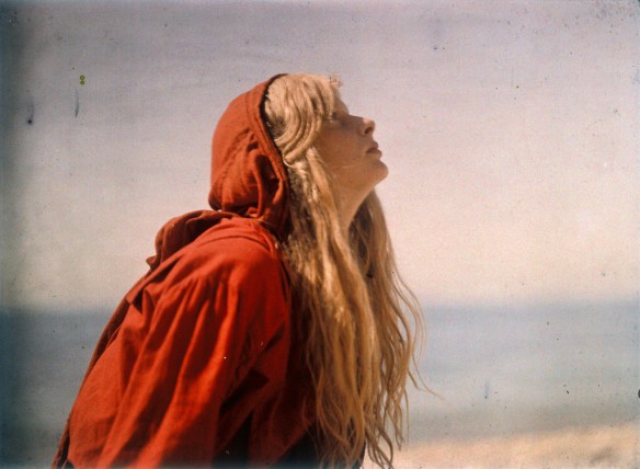
Autochromes are among the lovely colour processes (they were made using potato starch – something you could never learn without going to a salon or reading a journal) and for that reason lots of photographers exploited their slightly dreamy grain to make pictures which looked or were ‘arty’. Let’s avoid the word Pictorialist for a second.Too much depends on… what you mean by that term. Autochromes by their very existence reek of nostalgia, of a gentler and stiller world, of late summer afternoons and autumn mornings. They were immensely attractive to the Pictorialist turn of mind. Partly, of course, to be practical, that’s because they demanded long slow exposures and so people and things in them had to be at peace for a while. UK readers, at least, will be reminded of the strong flavour of autochromes by the pictures of Christina Bevan on the beach by Durdle Door in Dorset made by Mervyn O’ Gorman in 1913.These (they’re in the Royal Society of Photography collection) became an internet sensation a few years ago precisely for their aggregation of dreaminess and striking modernity. Because autochromes, dreamy as you like, were also thoroughly modern; they delivered accurate and legible colour at a time when that was rare. When the French financier Albert Kahn decided he wanted to inventory the whole world (his project lasted roughly from 1910 until the crash of 1929) he sent dozens of photographers travelling all over the place: they came back with many sorts of material; chief among them were 70,000-odd autochrome photographs. Factual, accurate, precise, catalogued and properly captioned.There isn’t a single autochrome in the show, and the catalogue index doesn’t refer to them at all (they are mentioned in passing in a ‘List of Key Terms’).
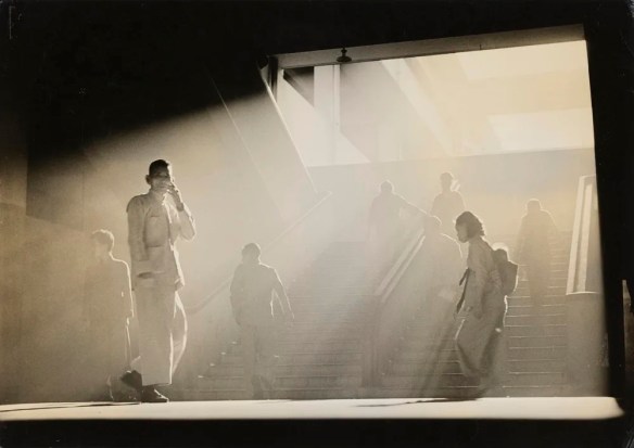
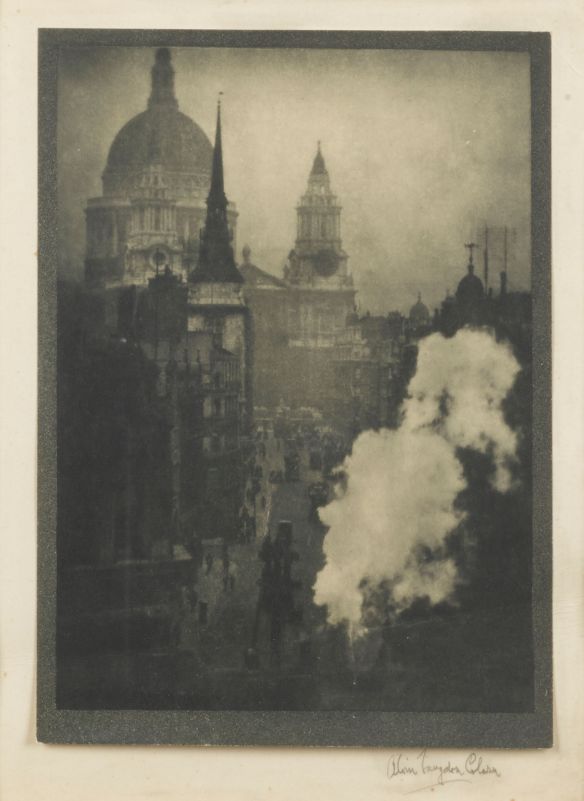
That tension between a vaguely backward-looking harking for artistic respectability and a very forward-looking exploitation of the very latest advances in optics, printing technology, chemistry, distribution methods and so on is absolutely at the heart of the Pictorialist story.Curiously, it’s for that reason that some pictures included in Light and Magic which mightily stretch the definition of the term actually do justify their presence. Nobody would easily call Max Dupain a Pictorialist, or Rodchenko, or the great Hong Kong photographer Fan Ho.Yet here they all are.
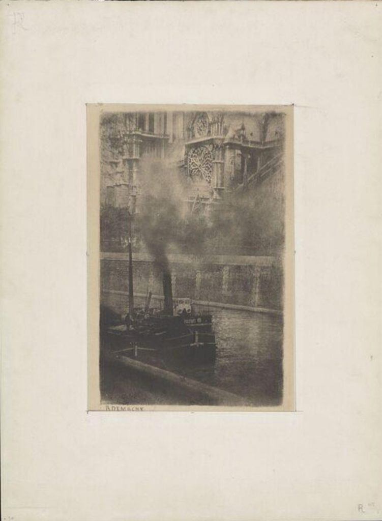
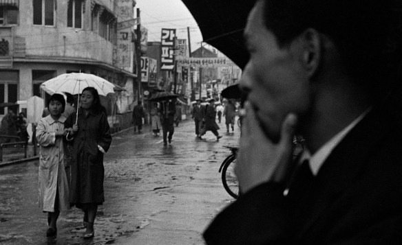
There is a wonderful print here by Korean photographer Han Youngsoo of a street scene with a very close-up face taking up the whole right side of the frame. Witness, participant, voyeur? Nothing archaising or arty about it at all. None of those photographers would ever have lightly used the term Pictorialist about themselves. Yet Pictorialists did struggle very frequently to tackle real world subjects. Robert Demachy’s great study of Notre Dame in Paris is really a study of a modern steam tug working its way through what was in effect an industrial port. Alvin Langdon Coburn’s London is an industrial town, and although some of its smoky effects are picturesque, they also represent money being forged or smelted. Even Emerson, on the Broads, was showing the workings of a threatened agricultural workforce. The steam train that drives across a bridge in one of the series (not shown here) is absolutely to be compared to the steam tug in Turner’s Fighting Téméraire : the lovely but now-useless old way of doing things challenged and ultimately replaced by the less lovely but ruthlessly effective new. I don’t think the members of the PhotoCine Clube Bandeirante, of São Paulo were in any way Pictorialists. I’m delighted to meet them (I knew some of the names but not by any means all) and seem to see a passionate desire to tackle the newest of the new. The show makes no serious effort to explain what they’re doing in this company.
And that in the end may be the crux. There are too many strands in this show, each important in itself, but imperfectly bound together to tell us something about Pictorialism. It’s certainly a welcome attempt to push the Tate’s audience’s appreciation of ‘art’ photography back by several decades. I have to say it seems to me not to come close to the standard required of a show at the Tate: it is incoherent and often sketchy. In terms of museology, of theory, even of display, it has very serious shortcomings. Apart from anything else, the Tate has enormous rooms with very high ceilings. The great majority of this show consists of single lines of relatively small art works, all hung at a regulation sensible eye-height . There are a handful of double-hung pictures, but not for any very discernible reason except to fit them in. With the exception of the pretty but under-contextualised wall of competition labels, it’s a very dull show to look at. That can be overlooked because the prints after all are the size they are. But the incoherence really grates. There are, for example, two rooms near the beginning which are clearly themed by subject treated: a room of dance photography and a room of portraits. ‘Great!’, we might think, as we go around the show. ‘At least I understand how this is to be sequenced’. No rooms themed by subject follow. We jump to something else.
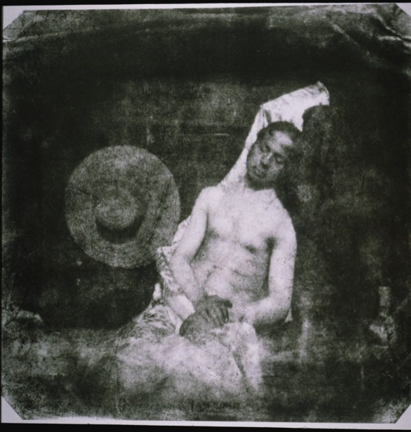
The show doesn’t do much illuminating its subject: you could spend hours in there and still be none the wiser as to what Pictorialism purported to be, was, or became. The subtitle of the show, by the way, is “The Birth of Art Photography”. That’s a nonsense. If there has to be a birth of such a thing, let’s give it to the first self-consciously and deliberately non-factual photograph, Hippolyte Bayard’s Self-Portrait as A Drowned Man, of 1840. The story goes that Bayard was cross that Daguerre had received a pension from the French state for his invention of photography and that Bayard felt that his own researches merited at least something of the kind. He wasn’t drowned. It was a metaphor. It was a true rendering of his feelings, but not necessarily by any means a true depiction of something that had existed, really, in the world. It looks expressive and renders emotion very well. It is by any standards closer to art than to documentary or record or any of those more factual things. And it was the first such thing.
And yet. Rather like the photographic salons it refers to, the show has one enormous strength. It contains an awful lot of pictures. Not all of them are original prints made near the time the image was made, and that shouldn’t have happened. But most of them are, and that represents a huge pleasure. It was a pleasure to renew acquaintance with some and to meet others for the first time. No point lamenting those who might have been here but are not. It is a wide-ranging show, and its ponderously dutiful internationalism means that lots of names less familiar to the Western canons of photography are introduced. I enjoyed seeing many of them, and so will you. It does also contain some of the worst pictures ever to make into the Tate. I offer you the grimly mawkish St. Catherine by Emma Rayson Barton, a sub-sub-Julia Margaret Cameron of spectacularly little merit. Or perhaps, if you’d like a little competition here, two portraits of actors by Cavendish Morton which look like the photobooth pictures you get when you weren’t quite ready for the flash.
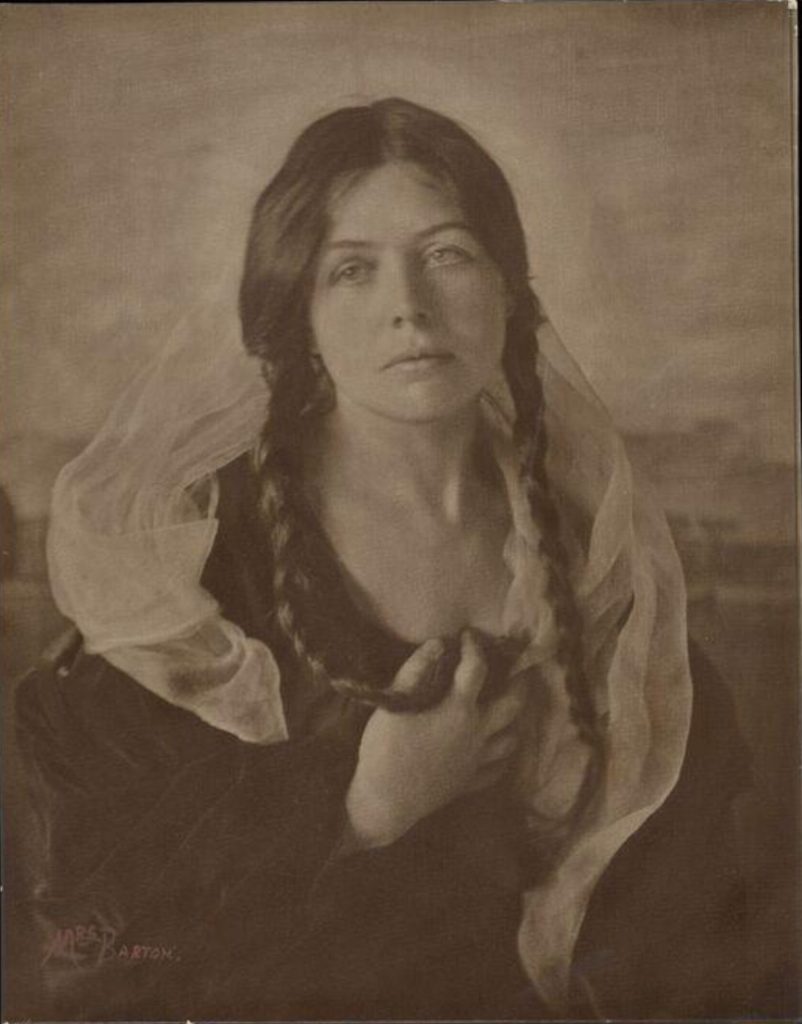
One can find interest in anything. But this, surely, is one of the least interesting artworks ever to make it to the wall at the Tate.
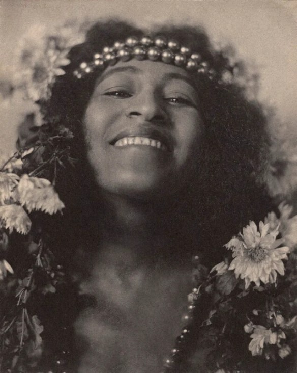
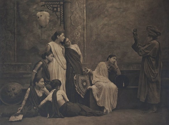
On the other hand, it’s full of treasures. Always glad to see a William Mortensen (A Californian photographer far too little known) and here’s one. I was surprised by a quiet but very moving 1920s series of group portraits of ethnically Greek refuges from Asia Minor by Elli Sougioultzoglou-Seraidari, formally constructed in pyramidal compositions, and very different indeed to her better-known (and more obviously Pictorialist) studies of dancers by the Acropolis. I even laughed out loud at one inclusion: a splendid group called The Mystic Sign from an album called Art Studies by a photographer unkown to me called Shapoor N. Bedwar. It’s a drapery study, if you like. It plainly involved a relatively long exposure, because the artfully disposed group of women to the left all lean heavily on each other (or in one case on a bench), frozen by the photographer’s repeated instruction to stay still. They prop each other up solidly but rather at the expense of grace. To the right, a man in a turban makes some kind of gesture. We’re asked by the title to suppose him to be making a mystical sign but to this modern eye, it is unquestionable: he’s taking a picture of the group with a small light digital camera.
It’s like going to a car-boot sale. You’re bound to find things to look at, even if they weren’t what you expected and bear no relation to their neighbours.
And here, by the way, is a diffident attempt at explanation which might help: photography has since its very beginnings been pulled in two directions. Inward looking and outward looking. The daguerreotype was crisp, beautifully free of grain, magnifiable almost at will. It promoted precise seeing. In essence it invited really close and clear scrutiny of the outside world. The daguerreotype is therefore the grandfather of the outward-looking tendency. It was, however, extremely difficult to reproduce and in practice quite difficult to see except in the hand, where it could be turned to catch the light. The calotype, on the other hand, was full of texture, often blurred, and apparently by its very make-up expressive of mood and temperament and other personal qualities in the author. As such, the calotype is the grandfather of the inward-looking tendency. It was however, relatively easy to reproduce. So there are tensions and complexities between inward and outward photography right from the outset. Neither tendency is an absolute.
Every photograph and every photographer takes its place or his or her place on a scale somewhere between the two tendencies. One way of identifying some of that is by working out whether photographers were more interested in what they saw than in the manner of seeing it. Sports photographers, for example, have always gravitated to the first: This is what happened. Pictorialists, for what it’s worth, tended the other way: This is how I feel about something. Plenty of photographers have used elements of pictorialism (maybe without the capital letter) to get their messages across, and plenty still do. That’s all. I wish the Tate’s curators had started there.


I loved your essay today.You nailed the problem with the exhibition perfectly.:::Just sharing: I have been writing about my meeting artists and more.I hope you enjoy. Remembering Artists From Another Time: Nancy Graves â RICHARD SCHULMANschulmanphotography.comRichard SchulmanWebsite:Schulmanphotography.comInstagram:instagram.com/rschulmanphotography1-917-862-1398On Oct 24, 2026,
LikeLike