
Christiane Feser, Partition 48, 2016. Represented by Anita Beckers. This is an angled detailed view of a work that is cut, layered and built well above the plain surface. One of many pieces deliberately shown for the first time as an Unseen Fair Premiere.
It’s a rare thing – for those of us in the business of extrapolating tendencies from the amorphous bulk of any creative activity – to see an unmistakable trend. I’m sure the fashion writer who says “Roman legionary sandals will be in this year” worries that no such sandal will be seen again. For once, at the Unseen Photo Fair in Amsterdam, there was no mistake. It’s not quite a rule, because there are still plenty of exceptions, but it’s all-but a rule: You want to be taken seriously as an artist using photography? Any surface you like so long as it’s not flat.
The varieties of finished result that this allows are many. But the essential tendency is definite. Flat pictures are what you get on screens when you make image searches. Flat pictures are what you get when you are asked to view a fact or a purported fact. Sportsman scores. This is what our tulips look like. Mimi has graduated. The managing director shakes hands. I was at the Victoria Falls. Those kinds of pictures are curiously neutral. Nobody who uses them cares very much what the photographer thought about what was photographed. In the jargon of art theory, they are transparent: they act as a time-shifter, to get you to a place where you were not. In the end, it doesn’t much matter who made them; and in most cases the viewers don’t ask and don’t care. Those pictures are viewed fast, and normally not viewed again. Can you remember the lead picture in the newspaper yesterday? You probably didn’t even buy the paper, but you did walk past it. The picture had a function, yesterday.
For artists, this is all complete anathema. Artists want you to care what they feel, and are not so much bothered by the facts of what they saw. They want to engage you for long enough that you are in their way of working — and by extension, their way of feeling — for a moment. They want to reach you with a packet of thoughts and prejudices and opinions and emotions. They want you to be persuaded by their argument and moved by their appeal.
For me, who have been watching these divisions for a long time, Unseen 2016 was the first time it was completely clear that there is an actual schism here. For me, factual photography is camera operation. It is sometimes made on machines which are incorporated in other machines (mobile phones, usually), sometimes by super-sophisticated systems for getting pictures from the real world they allude to into the distribution channels through which they will be consumed. If you go to a football game today, where camera operators work in public, you can see that the vast bulk of the labour is in captioning, editing, and otherwise equipping pictures with metadata, and then above all, getting them away down the airwaves as quickly as possible. There is very little labour in really getting across the emotion of the scene, the operator’s thoughts about it, or anything else so weak as feeling. The schism has happened: there is no room for any of the imagery which results from this kind of activity at a fair devoted to art photography. Artist-photographers rather despise camera-operators and undervalue the skills they deploy. Camera-operators have a tendency to be dismissive about art, and to overvalue the technical. But audiences like both, use both, and respond to different elements of each. I have not yet met a person who collects art photographs and doesn’t look at Facebook or at sports pictures or at the pack-shots in magazines which make him want to buy stuff.
Camera-operation is by nature un-self-conscious. If you’re making pictures for rapid consumption, you can’t much care about the culture of imagery that went before you. Selfie? Low-end commercial job photographing pizzas and kebabs to be stuck on the window of a fast-food place? Hard news from Mosul? However skillful you are, however learned your background, you make those pictures for what’s in them, not for allusion or comment. That stuff has a tremendous vitality. Exclude it from your entire narrowed conception of photography and you exclude more than the machine way of seeing. After all, a very great deal of the new self-conscious photography of the art world is anchored in re-editing or otherwise re-working precisely this kind of vital, fast, vulgar, energetic photography that went before.
Nothing wrong with rethinking things, of course, and nothing wrong with an art that looks to its own roots for the well-springs of its content. But there is something uncomfortable in the way new snobbish self-conscious photography is ferociously consuming old vulgar vigorous photography while at the very same time despising it for its … vulgarity.
I felt this more strongly than before at Unseen this year.
Jump Cuts 1, 2015, by Katrien de Blauwer, represented by Filles Du Calvaire
Some galleries took so literally the new orthodoxies that they showed almost nothing on a plain flat surface at all. Filles Du Calvaire, for example, from Paris, showed an artist who sticks pins in pin-ups, another who embroiders over dismembered nudes, and a third who makes collages. This third is the only one of the three worth a damn: Katrien de Blauwer, who makes rather small collages of salvaged black and white imagery. At first sight they look simply like design work – book covers, say, in which two simple elements make an allusion together. They are not complicated things, but de Blauwer plays them with great virtuosity. Often mounted on thick card of a buff or manila colour, with some pleasure taken in the material seaming and matching of the images, they add up to very much more than the sum of their parts. de Blauwer muses autobiographically in these pieces, which are elegant and light but not trite for all that. She is visibly different to all those artists who find a technique (it may well be as recognizable as hers), but use it to brand themselves in a highly competitive environment, forgetting (or not being able) to have anything to say in that technique or any other. Of course the message needs to be expressed in a medium that suits it; but it does help to have some kind of message in the first place.
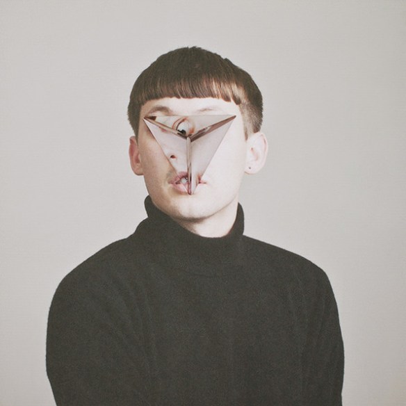
One from the series Cosmic Surgery by Alma Haser. Represented by The Photographers’ Gallery
There are ways and ways of making surfaces, of course. Embroidering photographs has been a thing for perhaps too long, now. Maurizio Anzeri made such exciting things a few years ago when his stitching added sharp bite and wit to the reading of character in the (found; vernacular) portraits that he brought so startlingly to life. Today at Unseen the London Photographers’ Gallery showed him succumbing to a tired but doubtless lucrative formula in a series of landscapes overstitched. The technique adds nothing to the pictures. They look like telegraph lines have been allowed to wander over the view. Or just doodles, done in thread rather than in felt-pen, but not more interesting for that. Just down the wall, the Photographers’ Gallery also had the work of Alma Haser, who builds curious origami structures into portrait photographs, challenging our assumptions of how we read a photograph or read a face. This is a career that has been developing interestingly for a while; there is certainly a danger that such an idiosyncratic technique will become formulaic, but it hasn’t yet. The origami shapes obscure the middle of the face, but are clearly made up of folded sheets of the same portrait. There is a cubist quality to the unmaking of anatomy, but also an endearing one. The folded paper must have been very gently stroked into shape for quite a while in each case, and those caresses remain folded in to the finished portrait.
The Unseen organisers are good at keeping their functions in view. It’s a show dedicated to new work. Galleries don’t always play the game, though. I came around a corner face to face with one of Araki’s horribly jaunty bondage scenes, for example. Araki is an incontinent artist, and those bondage pictures don’t get more interesting on the hundredth or thousandth viewing. If the special point of Unseen is new work, then showing tired old work (and specially, bad tired old work) should be considered a definite loss of cool for that gallery. Reflex, Amsterdam, do take note.
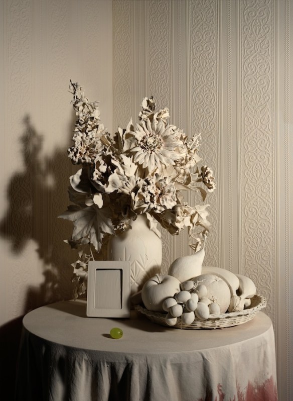
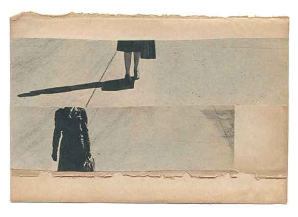
Trompe L’Oeil 2012, by Jonny Briggs, represented by mc2.
Araki had a show at FOAM (the Amsterdam photo museum which collaborates closely with the Unseen fair) a few years ago. That may be why he was shoe horned into the fair. The British artist Jonny Briggs won a FOAM award for emerging talent a couple of years ago. So in his case it is entirely appropriate that he should be included in a gallery display by the mc2 gallery, from Milan. Briggs is definitely in the no-flat surface camp: he is endlessly and wittily inventive in the kinds of damage he can do to pictures, but endlessly successful in re-thinking them, too. He sometimes cuts framed family snapshots (frame, glass, mount, backboard, picture and all) on a diagonal and shoves the two parts along the fault line until one head is on somebody else’s body. These sound awful described like that, but a thoughtful family-dynamic or family-history scrutiny emerges which is not at all unlike what one finds in a certain kind of literary fiction. I liked a piece in which Briggs had recreated a corner of his grandmother’s sitting room, and spray-painted every detail in the kind of ‘magnolia’ house paint that was the more genteel version of white a few years ago. Briggs left just enough unsprayed (one grape and a little bit of tablecloth, since you ask) to stop the thing being simply a horrible off-white sculpture. There is a sculptural act behind it, but it remains wholly a photographic gesture. Better still, it comments with controlled melancholy on the monochrome tradition of respectful photography that makes up a part of every family’s history.
Briggs has also found a way to re-use the little trick the film maker Chris Marker used a number of years ago, of crumpling portrayed faces, re-smoothing them, then re-photographing the sheet (Marker used the name Crush-Art to refer to these pieces). The wrinkles and creases add a layer rich in meaning to the otherwise smooth picture. Marker’s ones came from magazines, and the creasing told of the throw-away culture, of consumerism, of the way your face might not be your fortune in a month or a year once the wrinkles had grown. Marker worked brilliantly around photography (his masterpiece, La Jetée, is a film made of sequenced still photographs) and it is interesting how the ideas he pioneered, including changing surfaces, but including also harvesting and re-working imagery from largely unpretentious sources, are now so central to the language currently in use.
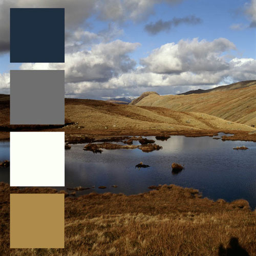
John Hilliard. Lakeland Palette 1, 2016. Represented by Kopeikin Gallery.
Not every treatment of the surface of photographs is a physical change like collage or creasing. John Hilliard’s Palette series (shown at Unseen at the Kopeikin Gallery from Los Angeles) is a self-conscious and formal exercise in testing perception. He samples the colours from a scene, and then includes blocks of those colours in it. The blocks are large enough to prevent us seeing the scene itself. This works much better when he does it to paintings or photographed views than it does when he picks colours from the spines of books in a library. In paintings, he makes us see just how much of the emotional effect comes from specific choices of colour. But with the books, where there is no overall emotional effect in question, nothing much happens.
Interestingly, a hipper, updated, but much less rich version of this process was also on show in the fair. Jan Rosseel’s current series on the Aesthetics of Violence does not much more than remind us that if you search on Google images for James Foley, say, you will get a lot of one particular orange, that of the jumpsuit in which prisoners of ISIS are executed. This seems a dead-end, although the series is only just begun and may develop.
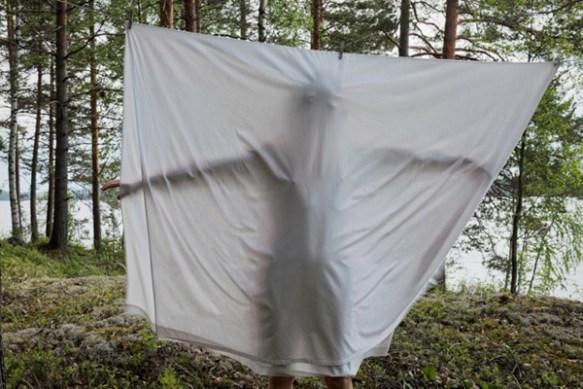
Elina Brotherus, Bedsheet, 2014, from the Annunciation series. Brotherus was represented at Unseen by Camara Oscura, from Madrid
Sometimes, the play with surface can be wholly included within an image. Elina Brotherus’ Annunication series, about her own inability to have a child, is powerful for all sorts of reasons. But there is one print within it in which she is seen shadowy through a bedsheet hanging on a line. Here the sheet – in addition to its more usual lexicon of references, to domesticity, to conception, to wrapping corpses and so on, also takes the form of a photograph: a creased and not very square photograph showing a ghostly figure. You could say that as a print, this does simply have a flat traditional photo surface. But you can’t help but notice that with the figure on the sheet, it has been given another layer within that. It doesn’t always have to be a miniature sculpture or the record of an installation.
Unseen promotes a number of associated activities around the fair. There are talks (often interesting), a photo book market (de rigueur nowadays at photo fairs, and often not interesting), an associated festival. The Dutch photographer and film-maker Anton Corbijn was asked to curate a show in the (wonderful) Het Schip museum, around the corner from the site of the fair. As if to cement his perception of the rift away from camera-operators who make flat prints, Corbijn chose to make a show (Touched, it’s called) on a sample of hand-working processes and techniques. Sometimes it’s as simple as taking pleasure in the creases and stamps on an old picture from an archive, sometimes a self-consciously antiquarian revisiting of archaic processes. Some of the things Corbijn has chosen are marvellously beautiful, others less so. I worry about a banally sexist picture of a girl on all fours licking the wheels of a car, turned into a huge cyanotype by Thomas Mailaender. It is not the less sexist because he’s a well known curator and plainly knows how sexist it is; nor does the fact that it’s made in a (not very well mastered) nineteenth century process make it ironic. That was a bad miss.
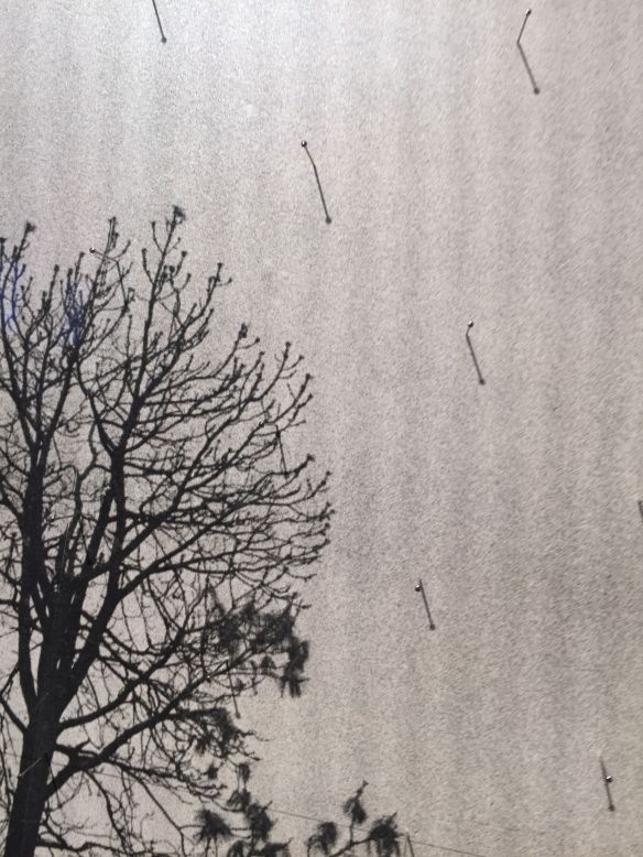
Detail of an untitled pinned xerox by Adam Jeppesen from Anton Corbijn’s Touched show at Het Schip in connection with Unseen.
Adam Jeppesen put long steel seamstresses’ pins in murky Xerox landscapes. The heads of the pins make points of light, exactly similar to the little glittering point of light that one sees in a real landscape – from mica, or moisture, or just shiny surfaces catching the sun. The shadows of the pins in the bright gallery lighting look like rain across the view. So by a simple manipulation, Jeppesen has given mystery and charm and wit and an element of narrative to a view that would without his pins have been rather…flat.
Day 79, from the White Rabbit series, by Maija Tammi. Represented by East Wing.
The best single display in the whole fair is a gallery display, though. East Wing, an interesting gallery from the Gulf, has taken a big risk in putting on a real show of loosely connected photographs on environmental themes. Here is where photography overlaps most obviously with sculpture, and therefore where the remove from flat prints is at it most distinct. Caleb Charland makes a variant of that school exercise where you make a battery from a lemon, by lighting a lamp from apples still on the tree. It’s an environmental piece of some seriousness, but it’s also absurd. Maija Tammi has made thoughtful work about the culture of cancerous cells, about death itself, and about our industrial relationship to it, and she has included camera-shaped boxes which you have to hold in your hand to peer and peek. Mandy Barker’s work on plastic has been developing for some time. In its latest advance, she looks at micro-particles of plastic as a species of a lunatic plankton, floating about the sea, and she has included a rather wonderful pastiche book of old-fashioned science as a way of getting us in to her subject. Yann Mingard has made a clever but unpretentious series of paired images comparing the ‘damaged’ light of Turner (it seems Turner’s famous skies were much affected by volcanic activity in his lifetime) with the hazy effects of pollution on skies in China today.
All four of these could easily be research projects in environmental science or in sustainable development. All four artists have the rigour, the search for evidence, the other careful habits of science. But all four thankfully have the wit and confidence to find ways of expressing themselves somewhere on the border between photography and sculpture. They jostle each other across the crowded walls of a gallery booth in an art fair, and no one who sees it leaves unmoved. It will take institutional buyers to buy such things, but it was good of East Wing to try it.
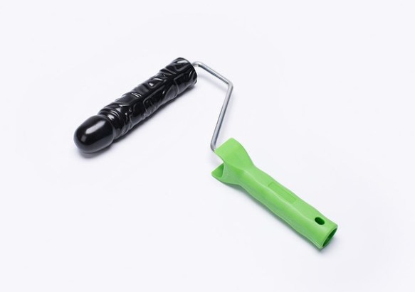
Of course, not all attempts to make new surfaces are interesting. There is plenty of room left for the pretentious, the idiotic, and the meretricious. It wouldn’t be an art fair if were not so. This is one from the series of Paint Rollers, 2016. By PUTPUT, represented at Unseen by Galerie Esther Woerdehoff
So there you have it. There’s plenty of room for pretention and foolishness. It wouldn’t be an art fair if there weren’t. But it’s also clear that a new generation of photographic artists are developing who quite knowingly want their messages to be read slowly and with thought, and who will break up that flat skiddy surface of the photograph we know so well to do that.
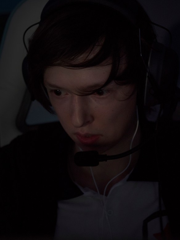
Diamond Prox, from the series Teen Spirit Island, by Joscha Steffens. Perhaps the exception that proves the rule. One of a glorious series of portraits of professional (and very successful) gamers, this really is a traditional flat print. It’s lit by the light from the screen only. It is usually shown as part of an installation (so that may be how it qualifies for non-flat, not-fast photography) that reflects on the twilight world of these highly sponsored superstars, who burn out in their early twenties as their reflexes get too slow to play.

Thiis was lovely to read
LikeLike