Open platforms were a civilizing influence, too
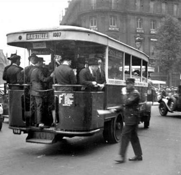
A little while ago I published here a little musing about the elegant human-scale double-ting that Paris buses make when in proximity with pedestrians. Today, the letter that I print below arrived, and I think it’s a delight. I’m grateful to Song Phanekam for taking the trouble to write, and to write so well. I like the way the blog has actually done what the internet js supposed to do, which is put people in touch who might otherwise not have any connection.
I must admit, I’m also amused that such a little thing as a double-ting is just as worthy of thinking about as weightier design.
So much so, that I propose, if somebody will sponsor it properly, to start a prize. It will be in honour of Mr. Kaminagai, and it will be awarded to designers or engineers who make or have made big improvements to life with very small inexpensive but thoughtful adjustments. Because you know what? A bus that modestly tings pedestrians out of its way is a civilizing influence on the city, and we need more of those.
Enjoy the letter; the author has kindly given me the go-ahead to reprint.
Dear Francis,
I just ran into your website after doing some research on Google about sound design… and I read your post <https://francishodgson.com/2013/11/18/small-noises-designing-for-people/>
Actually, I am in charge of the sound design of the automated audio passenger information systems at RATP. Reading posts like yours encourages me to keep RATP on that track!
I do agree with you, the small details in design can make the difference, as long as they have a purpose! Often, people would think that my job is to add sounds everywhere! Actually I screen every request in order to put the most appropriate sounds at the most relevant moments. And the most important thing: giving a sense of storytelling!
In many transport agencies, the audio announcements are way too numerous. For instance, I do love the London Tube, but the constant announcements is somewhat annoying and irritating… Based on many observations throughout the world, we came up with a very simple solution that you described very well in your post.
We have also banned unnecessary announcements such as ‘the next station is…’ (of course it is the next station, it will not be the one after that) or even any interchange information! We have quickly realised that most passengers have planned ahead their route: they know at which station to get off (to exit or to change). Therefore, the station name was considered as the most valuable information: hearing its name is enough to remind someone to alight.
And next time you will visit the Paris metro, you will notice that the voice you can hear on board is not the same depending of the line you use. As each line is color coded, we found that it would be adequate to have a different voice for each line. A way of creating a strong sound identity for each line, helping the visually impaired (and finally everyone) to recognise their favourite routes.
Regarding the bell designed for the bus, I have nothing more to say, you perfectly captured the meaning of that specific design!
Again, thank you for your article! I have added in cc. Mr Yo Kaminagai, who had first the idea of the station announcements with two inflections and the bus warning signal when he was in charge of design management at RATP. You have now the answer to your final question of your article!
Best regards,
Song Phanekham
Corporate visual identity | Corporate sound design
RATP
[The RATP is the Régie Autonome des Transports Parisiens, the Paris transport authority]
